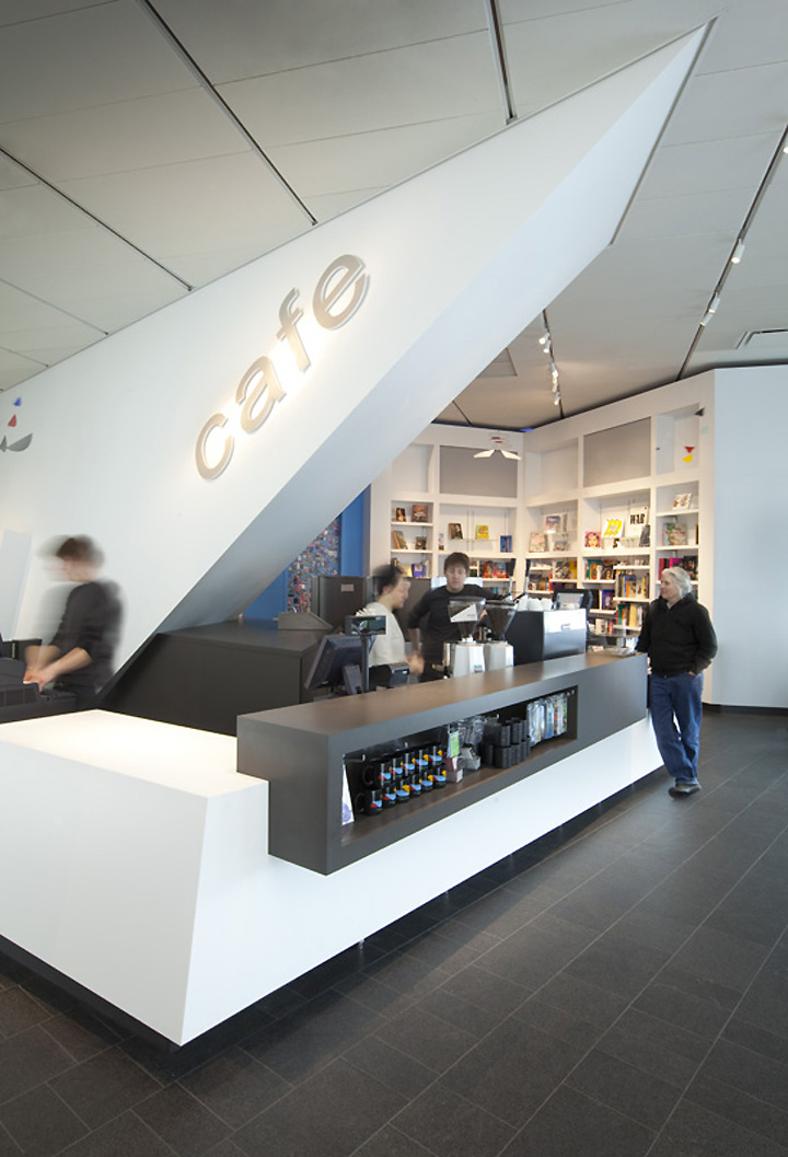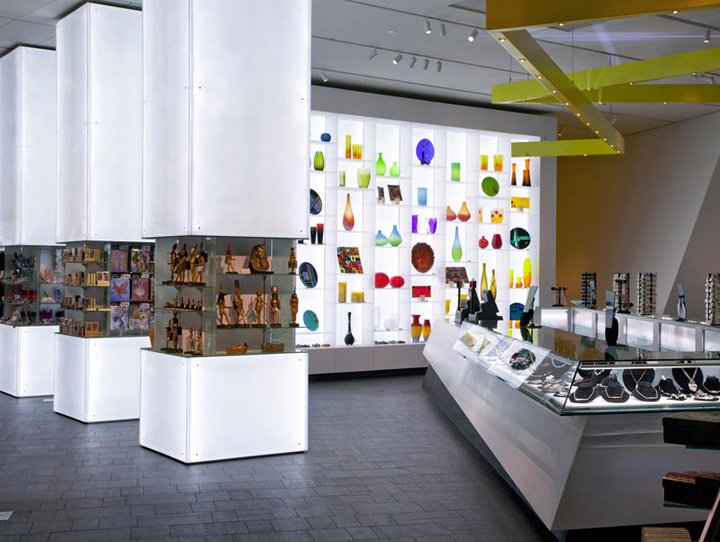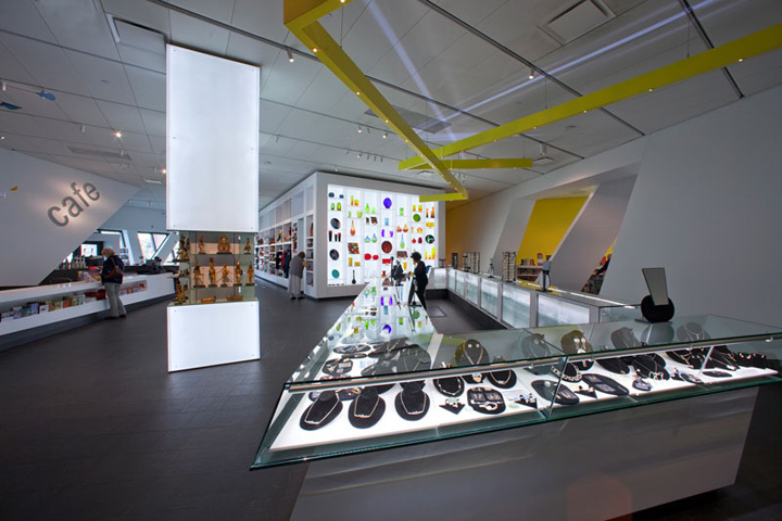


While an increase in sales was the primary motivation for the Denver Art Museum’s decision to fund a major relocation and redesign of their Denver Art Museum Shop, there are many other conceptual subtleties that make this project a fascinating study in high-end retail branding and design.

Retained by the Museum’s board in June of 2008, Roth + Sheppard Architects and a team of specialized consultants began an exhaustive study of the Shop’s potential repositioning catalyzed by a mandate to increase visibility and identity, visitor traffic and overall sales. After analyzing the Shop’s existing status and location, alternative available space, entrance options, visitor flow of arrival to the museum, and the natural movement of people through this popular architectural gem designed by architect Daniel Libeskind, Roth + Sheppard recommended that the Museum Shop be moved from the south end of the Hamilton Building to public space adjacent to the Museum’s existing entrance/exit.

Today, the Museum Shop’s new location and redesign have achieved the board’s critical goals by making it feel like a natural extension of the museum; successfully maximizing the Hamilton Building’s underutilized lobby; creating an intuitive entryway to the new Clifford Still Museum [set to open in 2011 just west of the DAM]; accomplishing a subtle, yet functional interpretation of Libeskind’s design parti, “two lines dancing,” within the new retail space. Both traffic and sales have increased supporting our initial recommendation of the shops relocation adjacent to the entry and egress path.
