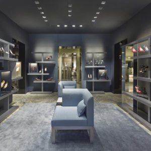


A new Flagship store for a luxury Retail brand- the First American brand in Russia. First floor – Accessories ; Second floor- Women’s Apparel; Third Floor- Men’s Apparel; Fit Rooms, and cash wraps. Polo Ralph Lauren’s brand is about life-style and aspiration.

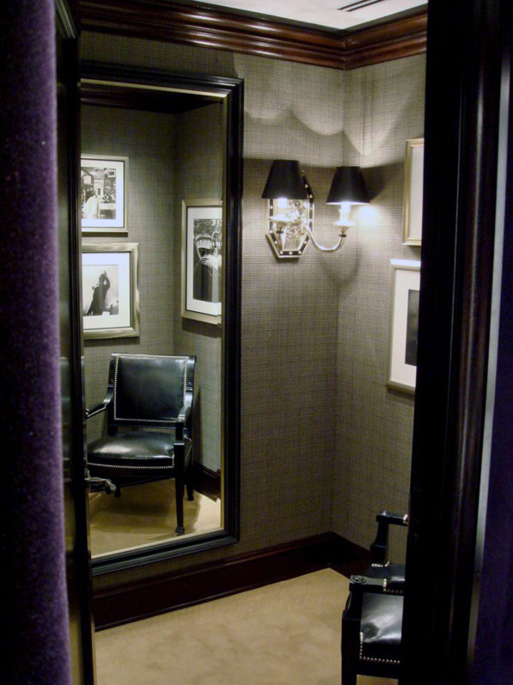
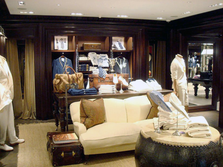
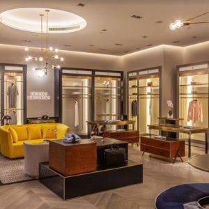
The store design is meant to provide the stage set for that life-style, looking more like been granted access to a private mansion-with its attendant public and private rooms -than a store. For this first Flagship in Moscow, the interior was to evoke the luxurious interiors of turn-of-the-century Russia as the setting for an iconic American brand: Anna Karenina meets Ralph Lauren.

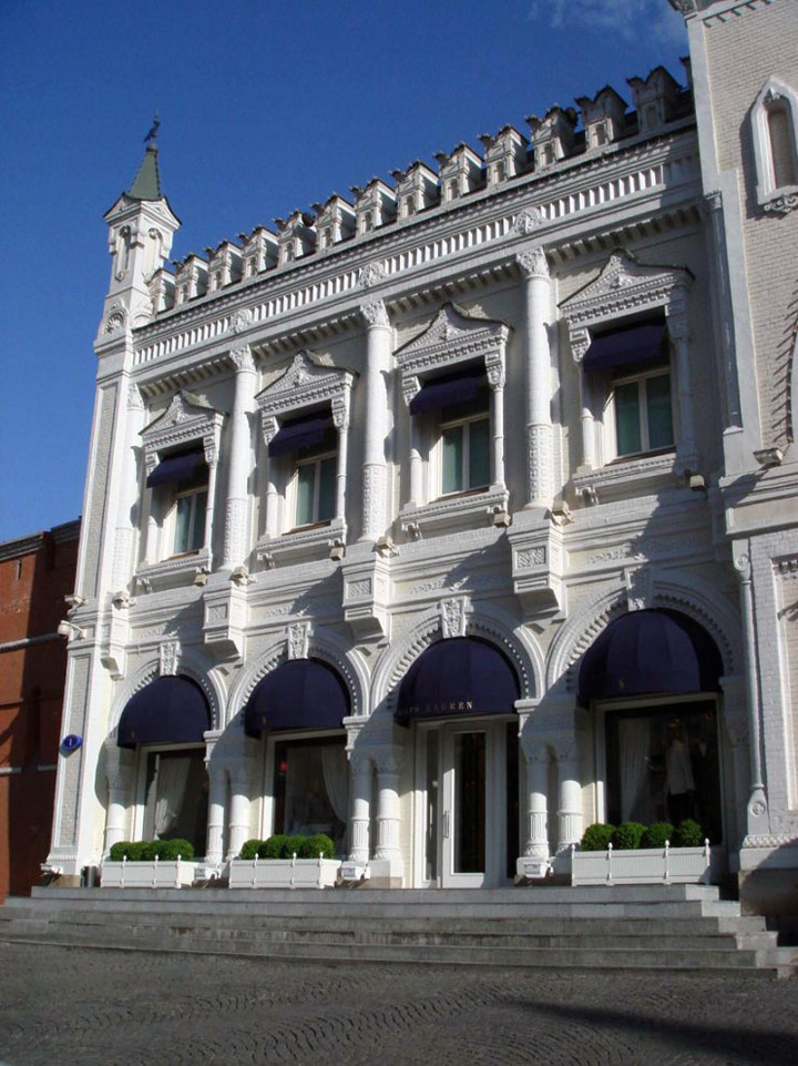
This three-level store for Polo Ralph Lauren’s first flagship store in Russia is located in an historic commercial building dating from the 1870’s. Located in Moscow’s city center, it is a short distance from Red Square. Known as ‘Tretyakovsky Passage,’ the building has a sculpted brick fade that is typical of turn of the century Russian buildings, including the red brick fortified walls of the nearby KremlinPalace.

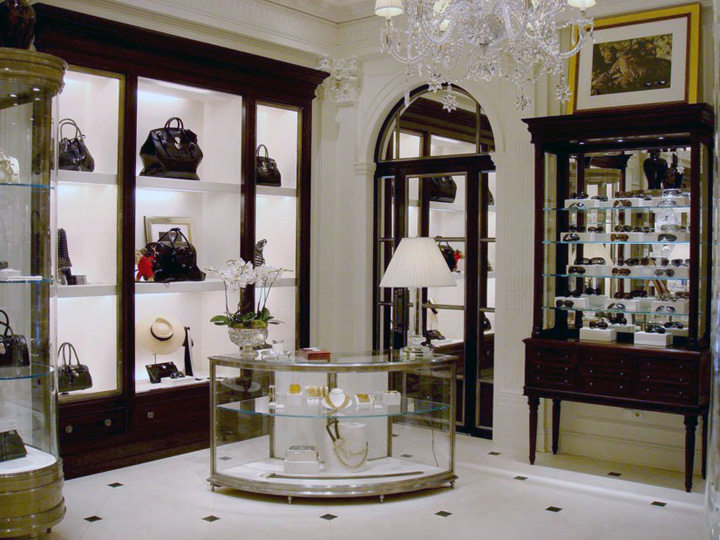
The store fronts on a main thoroughfare, with its primary entrance on one side of an enormous arched portal that leads to an interior passage of additional luxury shops. Half dome awnings over arched display windows and main entry distinguish the Polo brand on the facade. Within the store, architectural details evoke “classic” Russian style, reminiscent of the turn of the century. The ground floor has 14′ high vaulted ceilings adorned with decorative plaster moldings of ropes, wreaths and festoons.

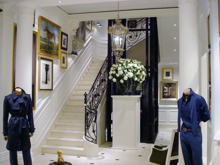
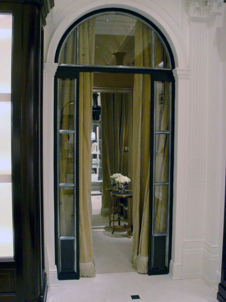
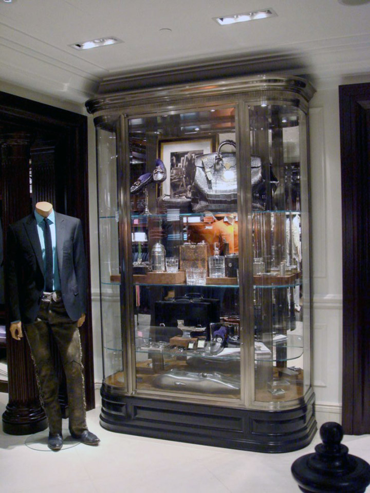
Arched doorways with custom antique silver frames reflect the arched window openings on the fade. The floors are made honed French limestone tiles with black marble insets. Custom display fixtures are detailed with in antique silver. Guests can travel to the two upper floors via a custom wrought iron and glass elevator or a French limestone staircase that wraps around the glass elevator shaft.

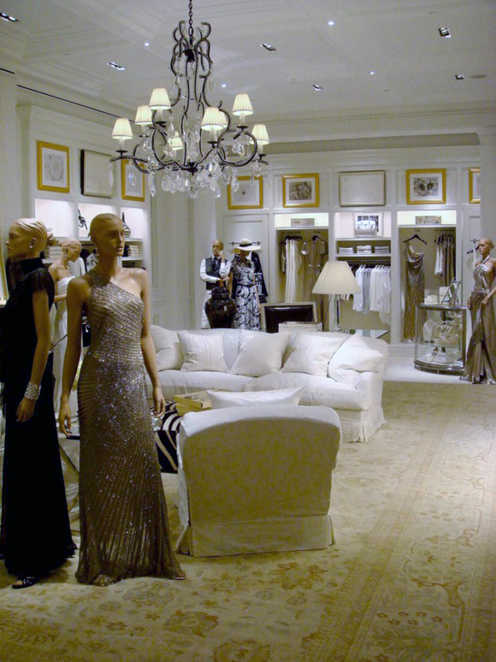
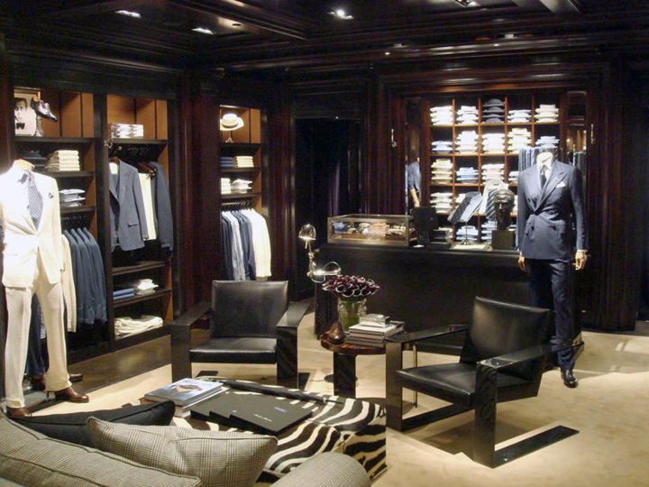
The stair has a custom wrought iron and antique silver railing that features motifs of vines and balls. The second floor is devoted to Women’s Collection with millwork of hand-painted white lacquer continuing the lighter, more feminine palette of limestone floors and white ceilings detailed with beams and crystal chandeliers. The third floor, which carries the Men’s Collection, evokes a more masculine feel created by the use of rich millwork of stained and ebonized. Accents of antique silver and leather accent the spaces throughout the store enhancing the exclusive ambience.

What were the principal design problems? Although intended as a commercial building, the existing foot print of this section of the Passage was anything but regular. Years of additions and renovations made for a highly irregular floor plan, with each floor a different footprint. The ground floor was a double height space with an existing storage room mezzanine. The top floor especially was a jumble of additive parts at odd angles, with a very low ceiling.

An additional challenge was that the plan on each floor was split in two by a massive structural wall that ran longitudinally through the space. The wall was punctured with several arched openings of varying widths in different locations on each floor. The client also stipulated that no supply air grilles be visible in the sales spaces.

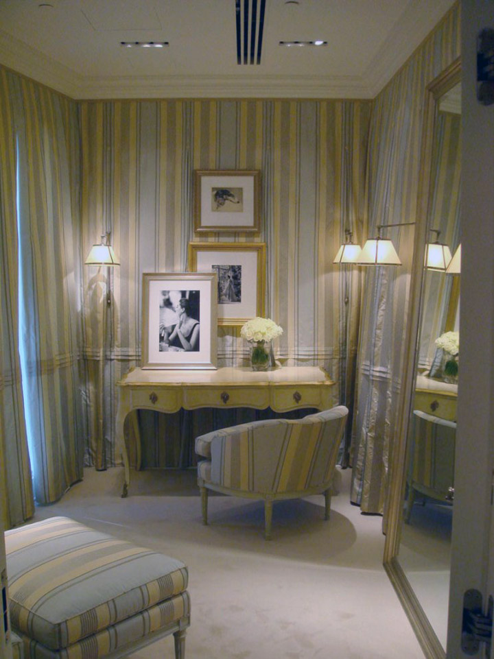
How were these problems addressed? Ralph Lauren stores done in the traditional style are all about rooms; rooms that look like studies, boudoirs, parlors and great halls. The additive nature of the plan lent itself well to the creation of distinct rooms. Similarly, the longitudinal structural wall became an organizing element in the plan of each floor. Schemes using the arches of the openings were tried and rejected, but the location of the openings determined entrances and exits into rooms. Supply air was delivered in a continuous slot incorporated into the crown moldings of each room.
Designed by Michael Neumann Architecture


http://www.architizer.com/en_us/projects/view/ralph-lauren-tretyakovsky-passage/2354/
