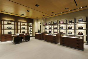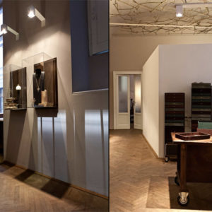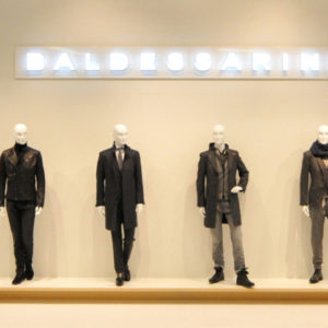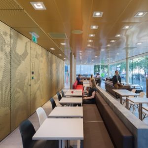
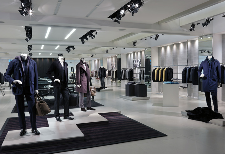

The new Canali Showroom in Milan was designed by GRASSICORREA architects within an ex-warehouse of the Richard Ginori Industry. To increase the area, the original single-floor building facing the Naviglio water channel was turned into a three-floor showroom by creating a new basement and mezzanine, maintaining the shell of the original building. With this important structural intervention a total of 1134 sqm were achieved.
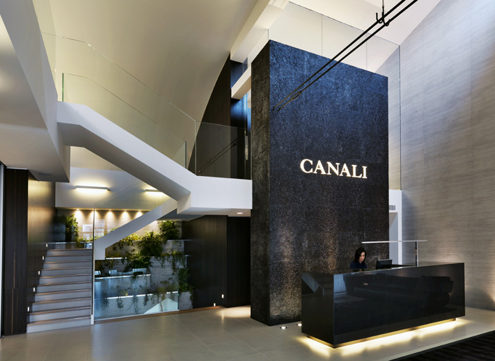
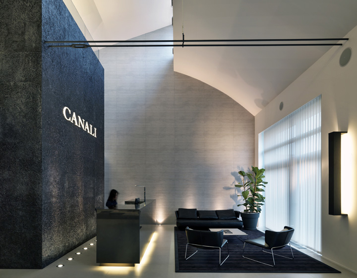
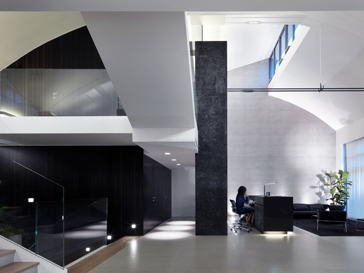
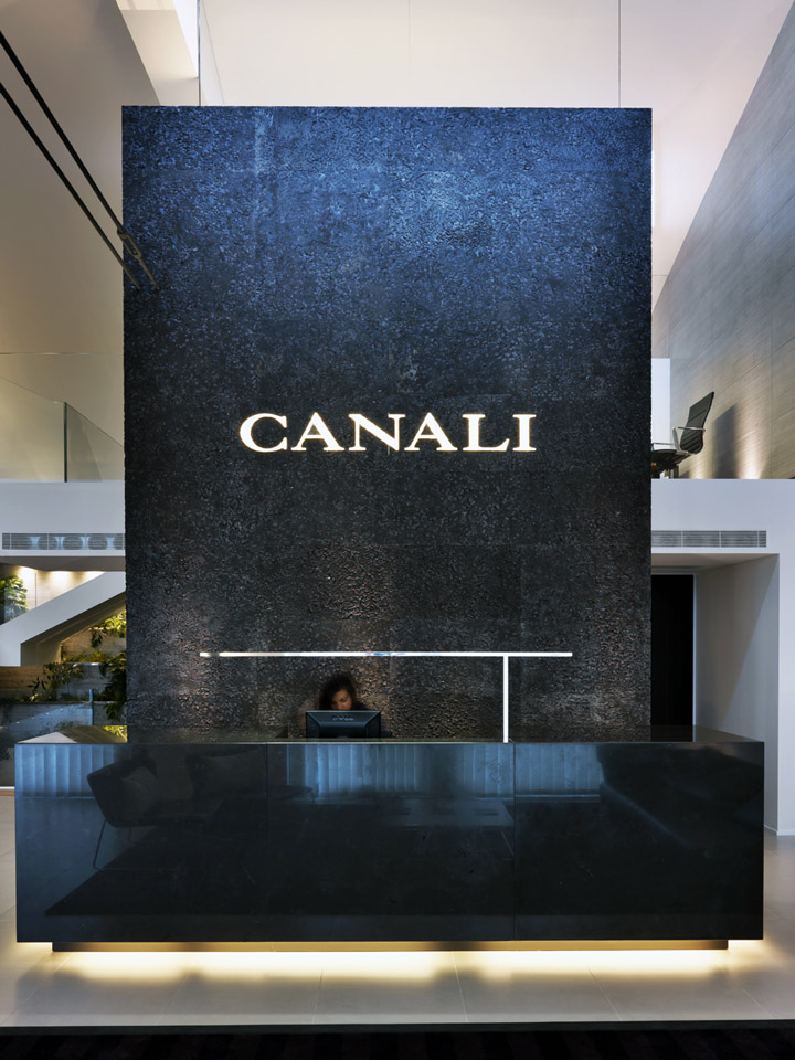
The new 3-level structure is connected vertically throughout volumes and staircases giving it a striking visual effect. The main highlight of the showroom is the large rock monolith at the entrance behind the reception. It is cladded in dark polychromatic granite with large prune-colour crystals. This stone has been treated with high-pressure water creating a rough texture.

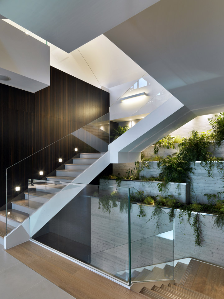
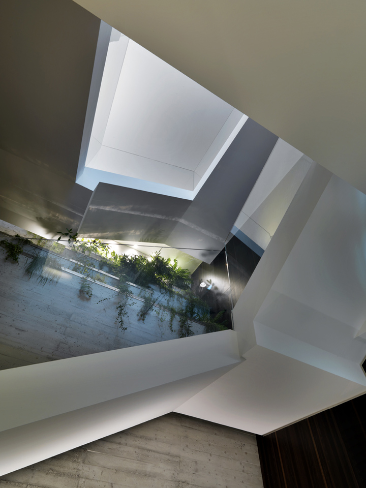
The main staircase in front of the entrance runs alongside a vertical garden made of concrete casted basins positioned one on top of another accompanying the visitor in his path. The ground floor area of 487 sqm includes: the reception and the main display/sale area in a large open-space. The request to have as much versatility as possible permitted to create a single polifunctional space that may open or close as a diaphragm for any desired sale and product display layout.
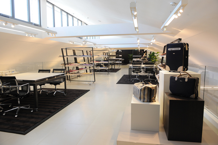
The open mezzanine of about 195 sqm was itself dedicated entirely to display and sale area and enjoys natural light through the skylights of the existing curved ceiling of the building. The lower level of 426 sqm houses most of the service areas including dining hall, kitchen, training/meeting room, offices, storage and technical rooms.

The materials used in the showroom have been carefully chosen to give the space not only a masculine and elegant atmosphere but to blend in a single style message. This array of materials and colours with their neutrality and strong message are intended to highlight the space and specially the merchandise. The light gray ceramic tiles wall-cladding in most walls has an horizontal texture that resembles casted concrete. Instead, the main vertical volumes are covered of an European oak wood veneer composite of narrow vertical stripes.
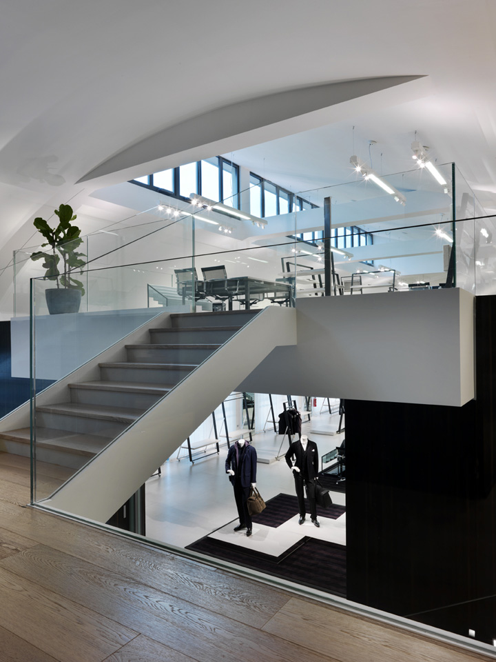
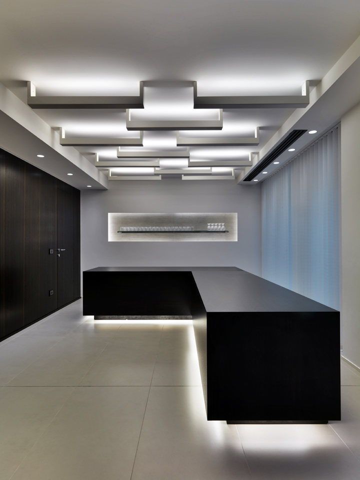
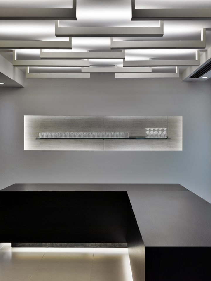
Two types of flooring were chosen: light warm gray colour ceramic tiles for the work and service areas and whitened oak wood for the offices and the staircases’ threads. All furniture and lighting were studied carefully following precise aesthetic and functional principles that blend harmonically to the rest of the structure. The lighting can be changed to create different scenarios in the display areas and LED lighting is mostly used to reduce power consumption and costs.

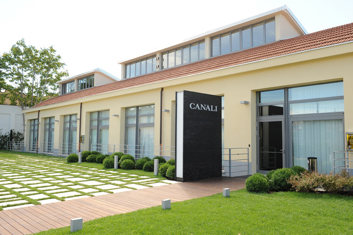
The moveable freestanding display elements were designed to be completely versatile and may be composed and changed according to the visual merchandising needs. The materials used are a contrast of opaque black treated metal and shiny stainless steel. At the front of the showroom there is a large garden with patio that may be used for exterior events.




Photos by: Andrea Martiradonna
Project Team: Duccio Grassi and Fernando Correa
Collaborators: Simone Innocenti
GRASSICORREA architects
Via Pantano, 30 – Milan, Italy
Tel +39 02 39660004


Add to collection
