
Add to collection
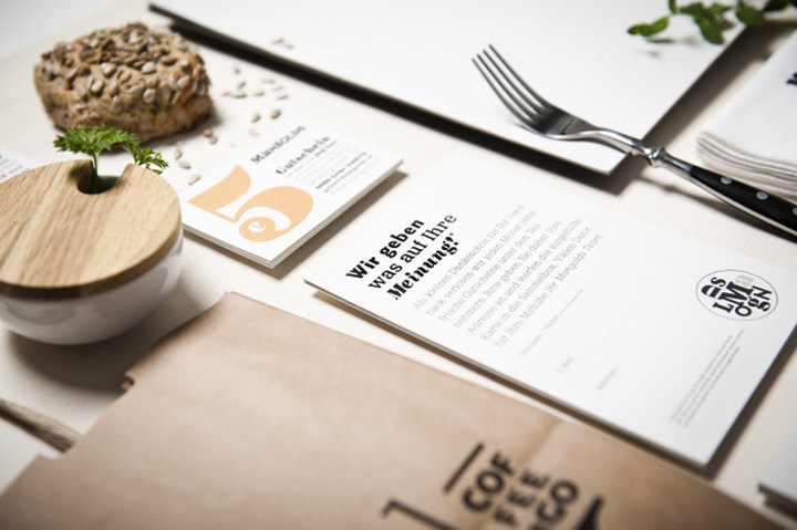

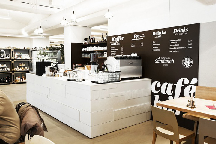
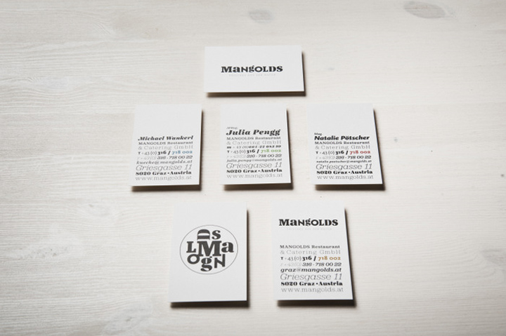
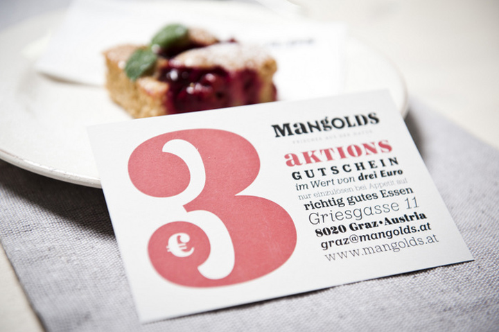
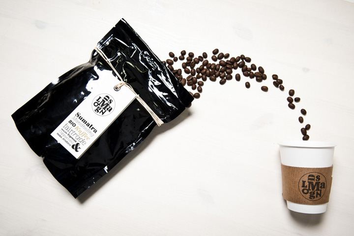
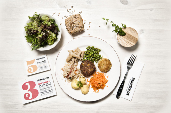
In the course of an extensive renovation in 2011, Mangolds, a well known vegetarian restaurant, entrusted moodley brand identity with their rebranding. For over 20 years Mangolds has been standing for very fresh and contemporary international cooking in Graz (Austria). By using different colours and a mix of typographies the new corporate identity shows perfectly Mangolds’ wide selection of food and the relaxed restaurant atmosphere in general (motto: health and joie de vivre).

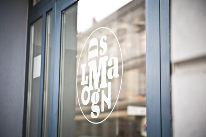
But the carefully detailed typography equally confirms Mangolds’ claim to be the first address for the enjoyment of fresh food – without eco-hippie and boring tofu! As a secondary lettering (similar to an “alphabetical jumble”) the circular modification of the word mark „Mangolds“ represents the delicious vegetable platters the restaurant is famous for.


http://www.scenologist.com/2012/02/mangolds-by-moodley/


Add to collection