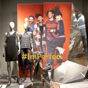
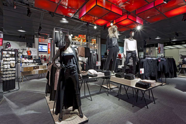

Lindex is a Swedish fashion chain with over 400 stores. It is known for its fast fashion offer, for both women and children, and its strong heritage as a lingerie brand. Dalziel and Pow were appointed in 2010 to help the brand reaffirm its position and enable it to grow more confidently across existing and emerging markets. We created a new store design, in-store graphic communications, ticketing, packaging and art direction, which were officially launched at a new flagship in Oslo in late 2011.

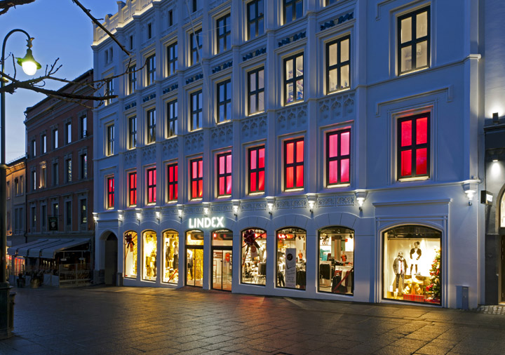
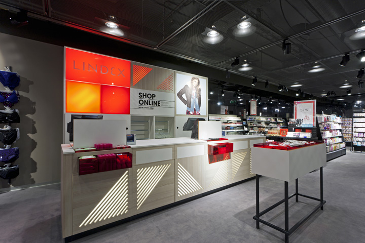
D&P have created a distinctive brand environment, celebrating the brand’s Scandinavian heritage through the use of texture and layering, pattern and natural materials. Key to the success of the Oslo store is standout on the high street. The windows of the white stone heritage façade are flooded in varying shades of red from the brand palette, attracting attention and a bold, single minded brand statement. The illuminated ceiling feature draws you in from the street, and the visual language then continues through the store from the dramatic atrium feature through to the cash desks.

The heart of the store is a large atrium feature. Inspired by the concept of ‘backstage’ the atrium is a large and dramatic vertical stage. A modular framework holds screens showing ‘behind the scenes’ content from the brands seasonal shoots, stylized and expressive mannequins and VM, large scale tone of voice statements and bold use of the brand colour palette. As well as attracting the customer to the back of the store it also creates intrigue and drives footfall up the escalators to the second floor.

The new in-store communications are based around two key concepts: firstly establishing Lindex as style leaders, and secondly celebrating Lindex’s understanding of fit. We tell the designers’ stories and give ideas and seasonal inspiration to the customer, these messages appearing on full walls – showcasing behind-the-scenes graphics, showing seasonal themes and trends – and continue through to ticket level product-specific inspiration. Large-scale fit guides, complete with new art direction by Dalziel and Pow, are featured around the store and integrated into the fitting rooms.

Strong colour and pattern bring an expressive and dynamic feel to the children’s department. A family of illustrations have been created with chatty quirky characters appearing on columns and within the fitting rooms, giving an element of fun and surprise at children’s eye level. Another key feature of the new store is the fitting rooms. The fitting rooms take on the feel of backstage at a fashion show, with an illuminated ceiling and a strong geometric floor pattern. The result is fresh and inspiring, helping to deliver inspiration and style ideas, complemented by great value product. This in turn delivers one of the company’s key values – that fashion is fun!
Contact:
David Wright
Group Marketing Director
d.wright@dalziel-pow.com
+44(0)20 7837 7117
www.dalziel-pow.com
