
A Touch of Pink
New designer, new look. Since visionary creative director Brian Rennie came on board, Basler has been flaunting its charms more boldly than ever. One can see it in the new showroom, too, where gleaming metal meets pink paint and butterfly applications, brought into harmony by the interior designers of Blocher Blocher Shops, Stuttgart. Düsseldorf/Stuttgart. A showroom is the calling card of a fashion brand. It distils a company’s self-image, sets the look, the signature. With Basler, that means femininity, elegance and joie de vivre. In Düsseldorf, the designers from Blocher Blocher Shops created the perfect setting for the label’s fashionable floral prints and jungle patterns from silk to satin.
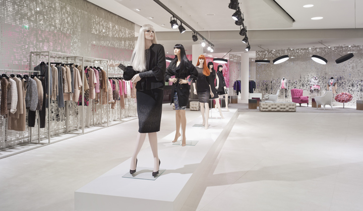
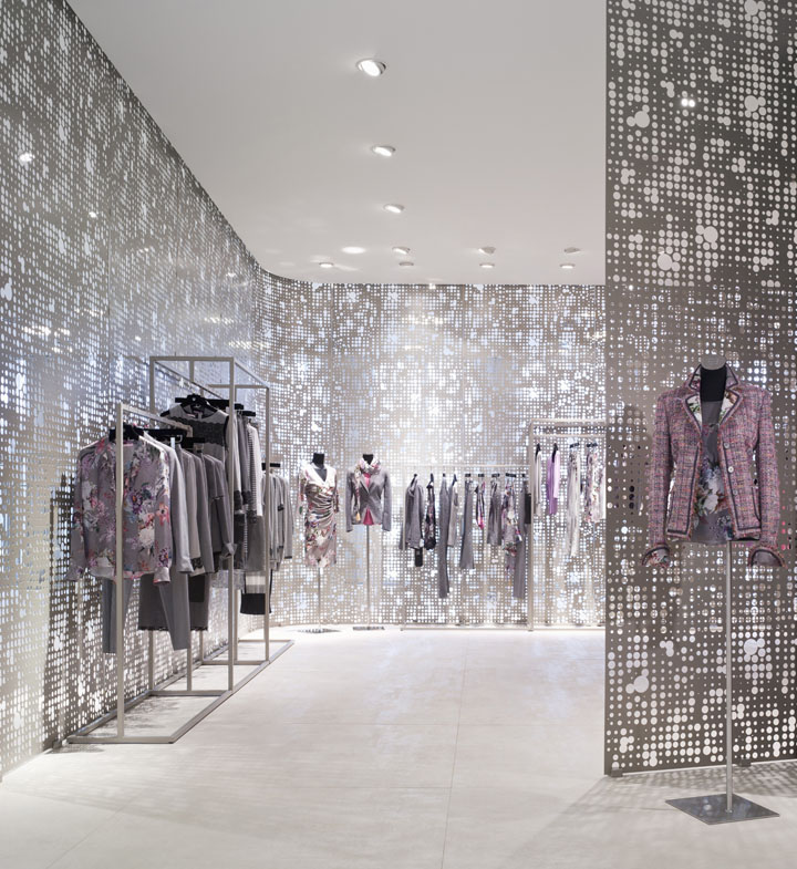
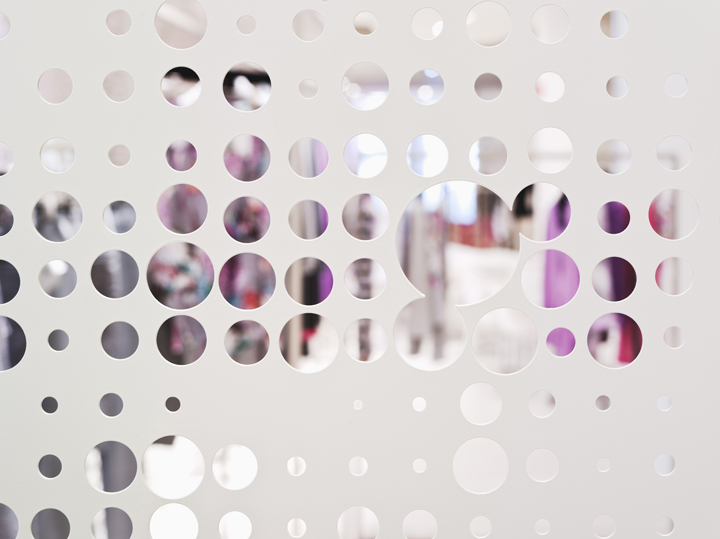
The interior designers faced the challenging task of turning the 1,000-square-metre space into a showroom that would be both impressive and intimate. Their answer: Three cubes, definded by perforated metal walls. These semi-transparent room dividers hang like curtains from suspended ceilings that are painted in varying tones of grey. Thus private spaces are created in which the Basler collections are presented on elegant barrens. The extended, rounded triangular shape formed by the cubes creates flowing pathways; there is no visible support structure to interfere with the sense of airiness.
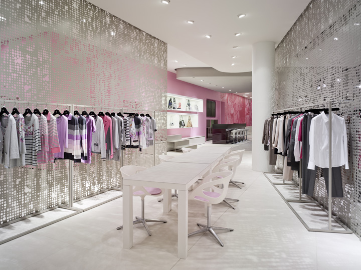
While the texture of the walls allows a glimpse of what lies beyond, the spatial context is preserved. The half-open areas offer seemingly endless new perspectives – from without as well as from within. At times one’s glance is drawn directly to the centre of the space; at other times, the half-transparency implies an intimate contrast to openness.
Style and Colour in Dialogue
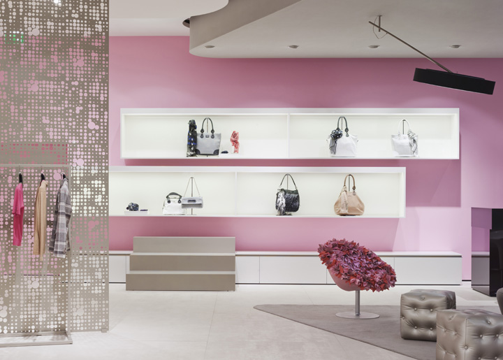
A light grey concrete wall embossed with Basler butterflies forms the backbone of the showroom – a play on the brand’s key visual that also runs through the collection. The grey wall meets a glass façade in front of which hangs a soft, golden-black curtain. The scene opens out onto the showroom’s colour sensation: The accessories wall, whose large-format floral pattern abandons itself to pure pink. Contrasting with this background, white backlit display boxes frame the handbag collection.

This dramatic setting is a playful interpretation of the basic concept of prominently placed outfit combinations. A white platform leads as a catwalk from the entryway to the centre. Behind it extends the lounge area whose floor plan reflects the shape of the adjacent cube. Here, a light grey carpet covers the showroom’s silvery stone flooring, and furnishings in pink, white and grey dot the landscape, all bathed in a soft light from round fixtures ringed in black – designed especially for the fashion label. A bar on site makes a visit even sweeter.

Just a Start
With its new appearance, Basler is embarking on an exciting journey without abandoning tradition: the same quality with an extra dash of glamour, and always with the style-conscious woman in mind. The layout concept has now been extended into the shop concept relaunch, also developed by Blocher Blocher Shops. Currently, the designers are planning the first store with the new signature in London. So they soon will come together in the British metropolis: Femininity and colour in fashion and architecture.
Project: Basler Showroom, Derendorfer Allee 12, Halle 30, Düsseldorf
Client: Basler Fashion GmbH, Goldbach
Area: 1.000 sqm
Interior Design|Shop Concept: Blocher Blocher Shops, Stuttgart
Wall Graphics|Visual Merchandising Photography: Blocher Blocher View, Stuttgart
Photo Credits: Klaus Mellenthin for Blocher Blocher View, Stuttgart
Shopfitting: Ganter Interior GmbH, Waldkirch
Lighting: elan Beleuchtungs- und Elektroanlagen GmbH, Cologne
Special Lights: PSLab GmbH Stuttgart


Add to collection

