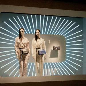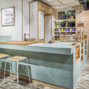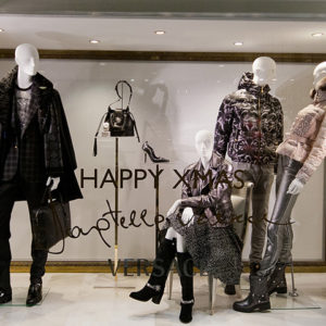


After several months of renovations, we have converted the existing two-level 12 734 square foot Garage space to now include both the Garage and Dynamite banners under the same roof. With Dynamite’s touches of glam and rich accents on the first floor catering to the sexy career woman, and Garage filling the lower level with authentic materials creating a truly chill-out space for eclectic teens.

Driven by creativity and innovation, Garage & Dynamite brands are now living under the same roof. Located on street level on one of the largest commercial arteries in Canada, where traffic is brought in by worldwide brands such as H&M, Zara, American Eagle and many more, there was no better opportunity than to make this two-story 12 700 sq.ft. space our flagship store.

The space was previously hosting the Garage banner. However, in order to stay competitive, we took advantage of the large space opportunity by bringing in Garage’s big sister brand Dynamite and re-invented the store for an ultimate shopping experience.

Now acting as a Canadian leader among the international brand landscape, both Garage & Dynamite continue to thrive in an ever-crowded marketplace. The brand’s core strength is rooted in a solid understanding of its customer and the ability to translate leading edge designs and innovative ideas into accessible fashions and a unique shopping experience that draws its inspiration from our two respective muses: ‘’Rachel’’ and ‘’Alexia’’.

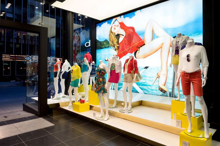
The first level Dynamite environment mirrors a mix and match of its muse Rachel, who is a confident and outgoing 28 year-old woman who thrives for a glam fashion look to answer her work, weekend and night out apparels. The design translates into her most seeked-out places, from an old Montreal loft-like vibe to a red carpet glam and sexy feel. The layout reveals pockets of discoveries allowing customers to circulate and stay awhile. Ambiance is supported by strong photography and mannequins allowing our customers to be inspired and to project themselves wearing the attire according to their lifestyle.
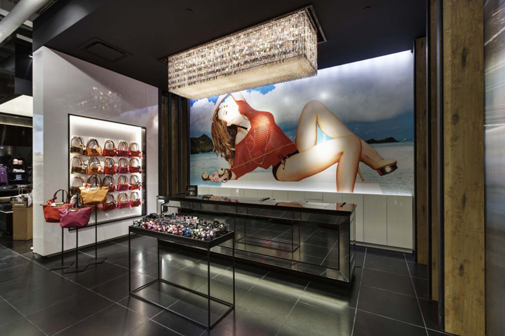
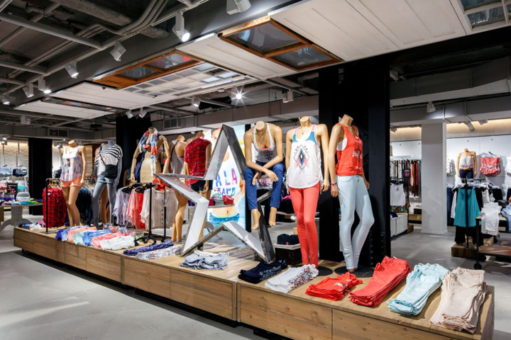
As for the Garage concept, it serves as a high-energy haven for its muse Alexia’s diverse lifestyle and eclectic tastes. Embodying the brand’s values, the space combines a wide array of engaging themes and entertaining elements representative of Alexia, a casually stylish 16 year-old teenager who projects a carefree, flirty appeal. From the moment she steps into the lower level Garage store, our customer becomes engaged in the story; she connects with the visuals and is inspired by the casual looks that are showcased.
Alexia and our customers feel welcome to treat the store as their own personal hang-out spot, with areas reminiscent of their own personal closet. Garage becomes a comfortable and happy space to relax in with their friends while discovering the latest fashion trends. Staying true to our brand image has brought on a successful increase in sales performance by allowing customers to embark on Rachel’s and Alexia’s story.
Integration of interior, storefront and merchandise displays
Although both banners share a same entrance and storefront, within the first steps through the large glass automatic doors, customers quickly understand that each respective brand is on a different level.

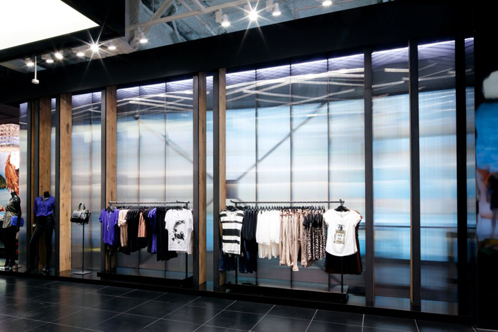
On one side, the Dynamite storefront serves as a transitional space where its window display, built as a linear tunnel, guides our customer as she enters the flagship. A strong illuminated poster, lit drop ceiling and an oversize quartz runway capture the customer’s attention. Amidst the open concept and high ceiling, her attention is kept at a one level merchandizing height throughout the store. The presence of a long linear distressed beam frames the impactful ‘’boutique style’’ setup. Lit ceilings running down the center of the store and in the accessory areas bring further attention to the impactful cluster of merchandise and glam furniture.
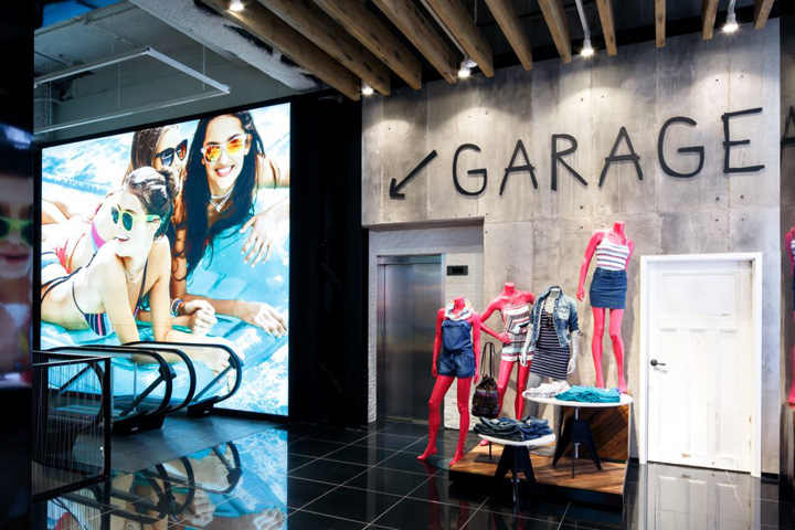
On the other side, the Garage window display is setting the tone for Alexia’s shopping experience. Its storefront and large vestibule, distinguished by an archway, is a gateway into Alexia’s world and a preview of what’s downstairs. The main linear cluster accentuated by the reclaimed doors and window setup installed above create a uniquely vibrant and happy environment showcasing the merchandise. The whole is surrounded by a system of interchangeable panels and a mix of glossy and distressed materials, creating an eclectic backdrop that surely keeps up with our trendy teenagers.
Materials used in creating the new concept
The Dynamite store design is a perfect balance of old and new elements; from the brick and concrete walls that evoke an authentic Montreal loft, to the cash’s crystal chandelier and barissol white glossy drop boxes that create a sexy, glam and chic feel. The choice of materials and fixtures also explores the harmony between new and old; long authentic hemlock spruce wood beam and brick, coupled with black chrome and bright brass.

As for the Garage store design, a mix and match of different materials were chosen in order to reflect ‘’Alexia’s’’ random and effortless style. A mix of reclaimed wood inserts, reclaimed doors and fossil pewter steal fixtures contrast with fluorescent pink steel, glass and marble inserts, creating an eclectic environment. The fitting rooms, with their multiple combinations of wall papers and antique chandeliers, are truly unique. Each of them reflects a distinct emotion and blend perfectly with the different personalities of our customers.

Since we were now housing the two brands, we thought it was essential to keep a certain uniform and authentic feel throughout the shell of the flagship store. Therefore, both floors are architecturally treated with similarities such as exposed black steel columns, white brick walls and concrete wall panels.

A bronze textured honeycomb polycarbonate wall divides the two brands while still allowing light to pass through. The customer is able to sense each brand’s essence by its respective furniture, its fixtures and its finishes, resulting in two totally different vibes.

Major investments were done on more environmental materials such as LED ambient and accent lighting, reclaimed wood and granite floor, resulting in less maintenance, longer longevity and higher energy efficiency. In addition, each banner received new custom-made fixtures.


Add to collection
