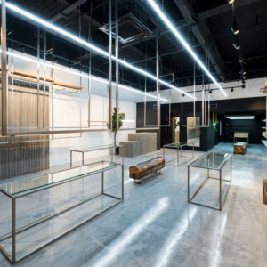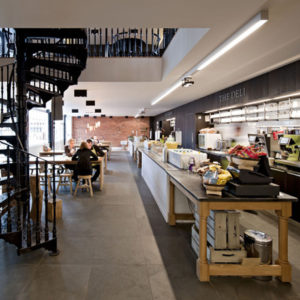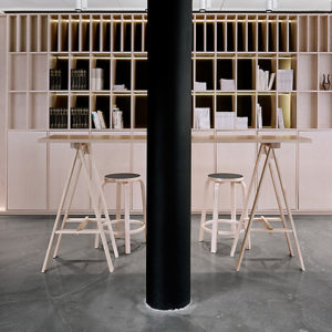


R&G brand is aimed at a younger segment of Rodd & Gunn’s target market. Most of the fixtures are ‘found’ objects to give the feeling of a ‘pop-up’ store. We worked closely with R&G‘s visual merchandising director, as the interiors depend heavily on the carefully chosen pieces of memorabilia and innovative merchandising presentation. The conventional fitout was limited to preserving the existing store’s shell and services. The shopfront is a mixture of a retained and recoloured facade and a newly added timber door.
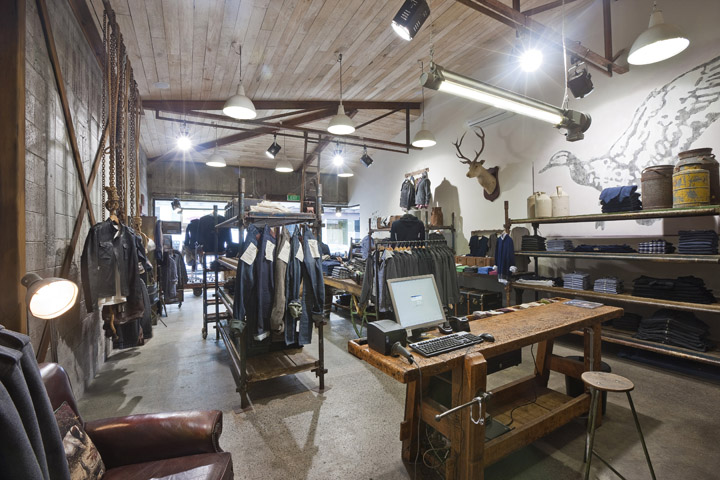
The R&G duck logo was subtly added to both the interior and exterior. Low-height stock room and fitting rooms were added to the rear. These were clad with a rough re-claimed timber as was the (formerly flush) ceiling. Lighting is also partly re-claimed including some chunky enclosed fluorescent fixtures originally designed for use in explosive environments such as gunpowder factories.

The concrete floor posed a significant challenge in that it was covered in around 50mm of old plaster coverings into which parts of old walls and various manholes were still embedded. Eventually this was all chipped and ground back till the original foundry floor was exposed. The original steel trusses and new structural steel braces were left untreated and exposed. Floor fixtures are a real mixture of industrial shelving, benches, trolley and racks.

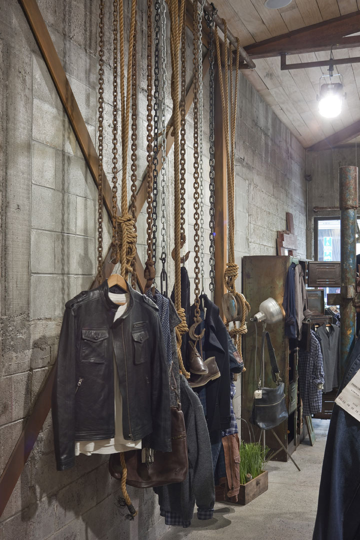
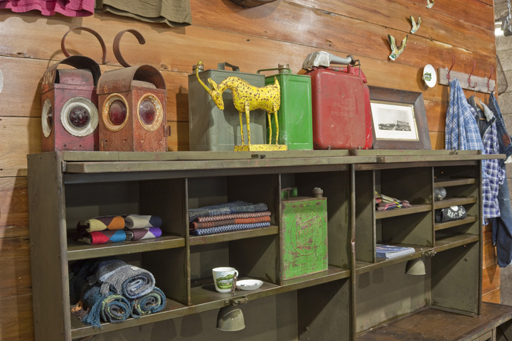
These were augmented with various vintage props such as chains, pulleys, pieces of furniture, pictures and even a ‘stags’ head as a nod towards the parent brands heritage. Some floor racks were custom made from simple water pipe.

The result is something different from both Rodd & Gunn and a typical menswear shop. However, we believe that it does showcase the product effectively and give this new brand a clear identity that also clearly signals to the market the attributes of ruggedness, honesty, edginess and durability for which the brand wants to be known.
Design Firm: Studio Gascoigne Ltd
Images: Derek Henderson


Add to collection
