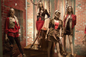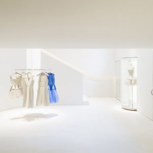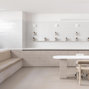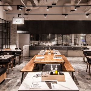


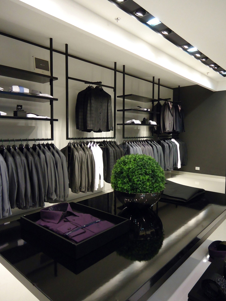
02JUNE Design Studios & LIGANOVA Brandretail Pvt Ltd were invited to do the new store design concept. The brief of the project was very clear – “to make an international standard store for men’s wear brand and make it SHARP”. The most important strategy followed in the store design was to use a mix of different materials, excellent presentation, correct communication and use them efficiently to deliver the correct customer experience for the store.

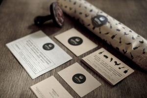
The store design was approached holistically, which means that the store design didn’t stop at completing the architectural part, however, it started from there, encompassing many other parameters for the brand. New Visual Language Strategy was developed for the brand where font definition as well as the tone of voice has been set for the brand. Unique props and in-store elements have also been developed for the brands which accentuate the brand relevance at the point of sale.

We have also set up a holistic Visual merchandising strategy in place for the brand to help sustain the beauty of the store and to enhance customer experience and sales. Special materials with high gloss finish have been used in the back panels of the wall fixtures.

Minute details of SS inlays have been added to the floor fixtures and specially selected carpets, wallpapers and cash desk material has also been incorporated in the design. Overall, the colour palette was kept neutral with Black and white being the main colour of the store and shades of grey complimenting highlight areas.



Add to collection
