
What was the scope of work?
To create a concept for a real “Italian Forneria”, a place where people could learn how to appreciate and buy special Italian bakery recipes, home made style.
Define the project goals and objectives
A first class food industry, wants to bring to the public the concept of a small gourmet grocer, that carries it’s name and tradition.
Describe why the project achieved the intended goals and objectives
Customers are flocking in to enjoying the products in store, to buy and take away or to order catering service.
Describe the brand promise
“Casa Bauducco” is using it’s nostalgic heritage and all the five senses to bring alive the Italian culinary craft.
Describe the intended customer journey
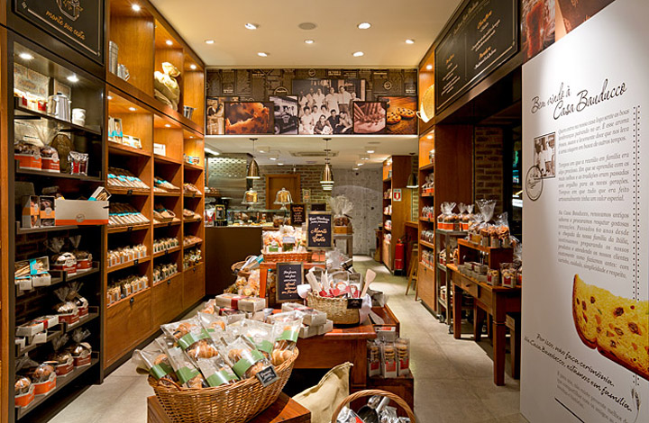
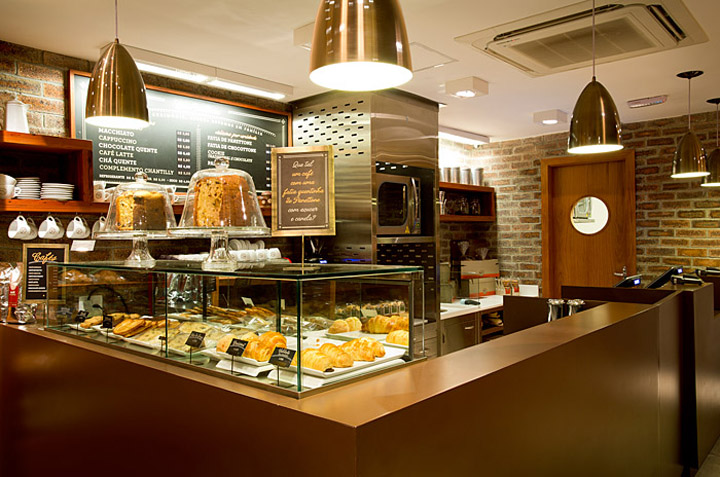
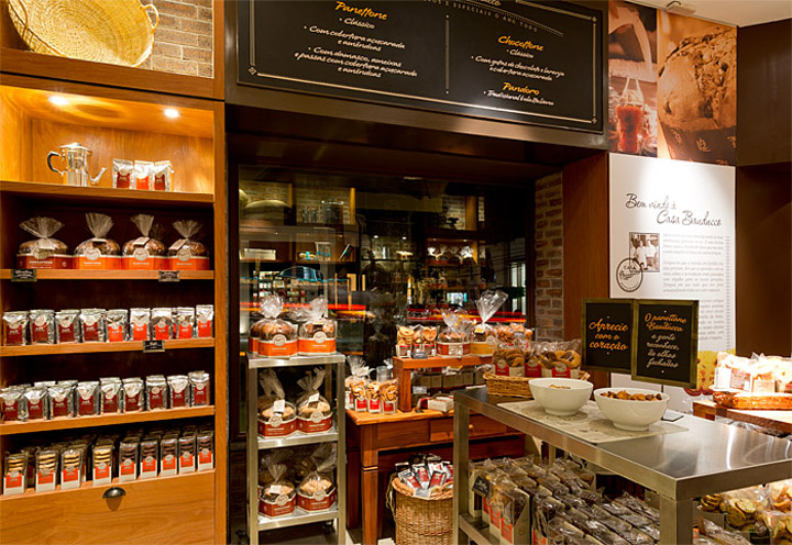
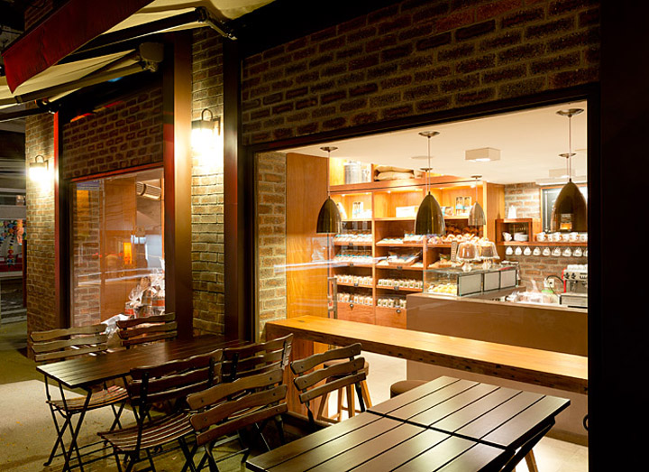
Being so small (650 sq feet) the layout promotes a free flow that allows the customer to browse freely between tables and wall shelves. There is a sales counter located in the back of the space for transactions and a coffee bar to draw the patrons past all the key products/displays. The seating was located outside to reinforce the European cafe look & feel.

Overall Design Concept
The Bauducco name, the interior design, materials, finishes plus the decoration with culinary products and kitchen utensils clearly enhances the “home made” proposition and the “love and care” that needs to be attached to the design concept. The abundance of tasty merchandise, carefully displayed on the fixtures do the rest.
Branding
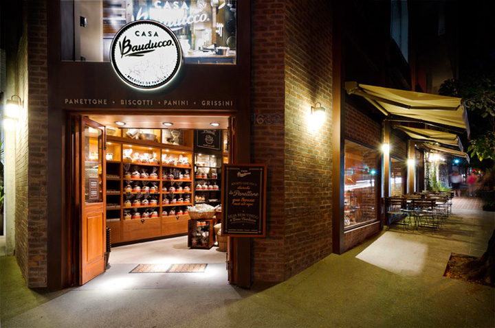
The project as a whole is very consistent to the brand’s promise. From the architecture to the hand writing, from the old scale to the solid wood, every detail has been thought to deliver the brand promise based on a traditional first class fresh bakery.
Environmental Graphics / Way finding
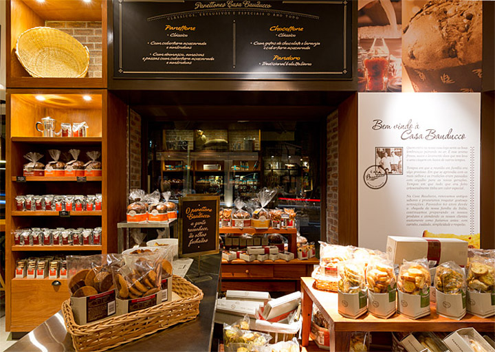
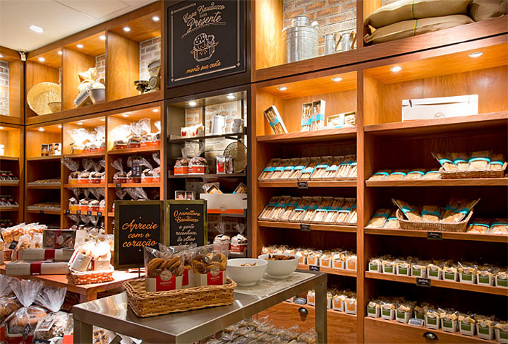
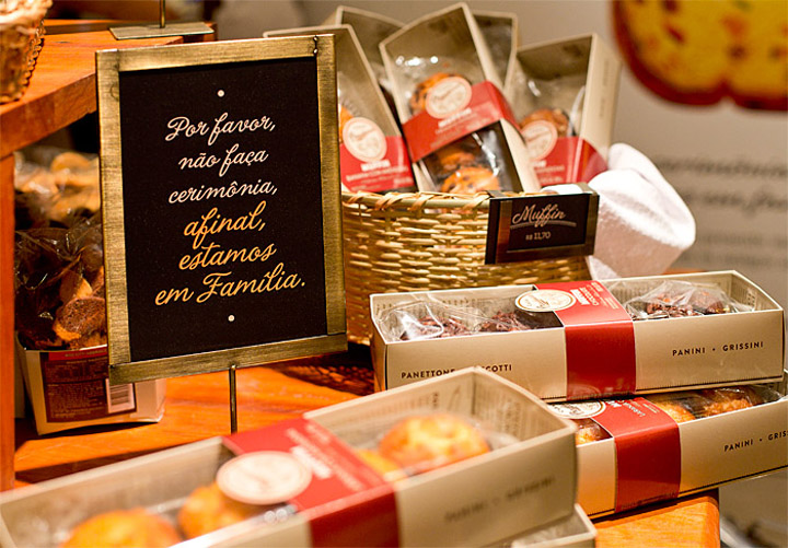
Pictures, storytelling, hand writing, recipes, communicate a warm, personal and authentic chronicle of the Bauducco’s family. The packaging by its own design and mass display serves the dual role of way finding
Circulation / Store Planning
The store is narrow, allowing just one row of tables between the wall fixture and the adjacent window / wall Fixturing. The main entrance is on the corner and there is a secondary access to serve the street seating’s.

Merchandising Fixturing
Aligned with the brand positioning, the option is for custom wooden fixtures, with shelves that can be adjusted on its height and inclination.
Finishes
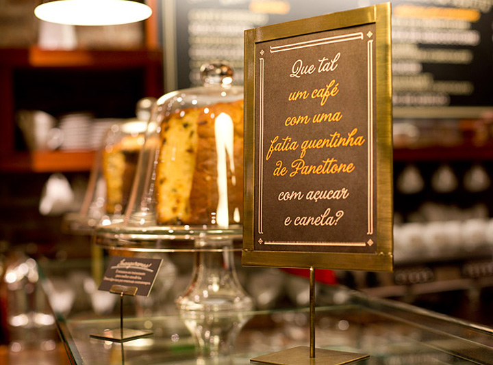
Solid, real material, like bricks, reclaimed wood, concrete slabs flooring guarantee the authenticity of the look and feel.

Overall Lighting
The lighting is a mixture of par (overall), cdm’s (window), and fluorescent tubes (coves). That ensures a warm even light.
Visual Merchandising
Despite the heavy personality of the store, the vm formula, with beautifully packaged products and signage stand out. The merchandising is enhanced with baskets, buckets and glasses and on the top shelves and strategic spots we can find a beautiful selection of culinary products and kitchen utensils props.
Designed by FAL Design Estratégico


Add to collection

