
From the beggining it became apparent that this initiative would be a milestone for Albacete, because FEDA has a high level of representation in the city, and because it offers many services to its companies. Besides, the new building aspires to endow new life to a new neighborhood which is being built between a hard industrial and services center, Campollano estate, and the city center.
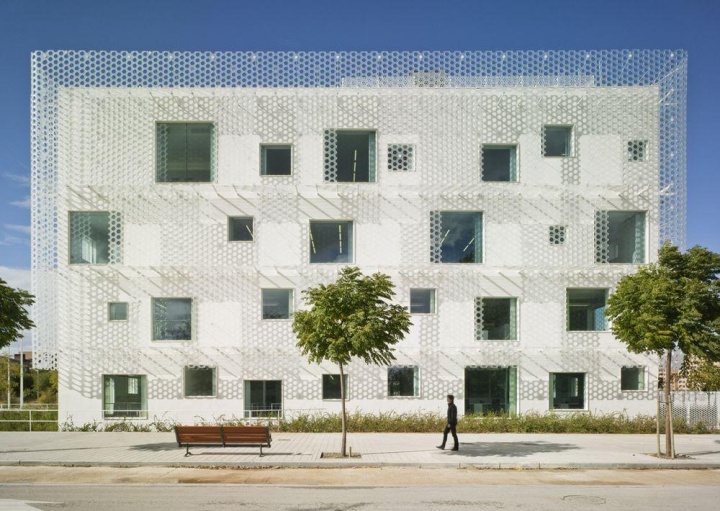
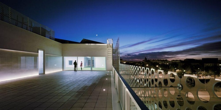
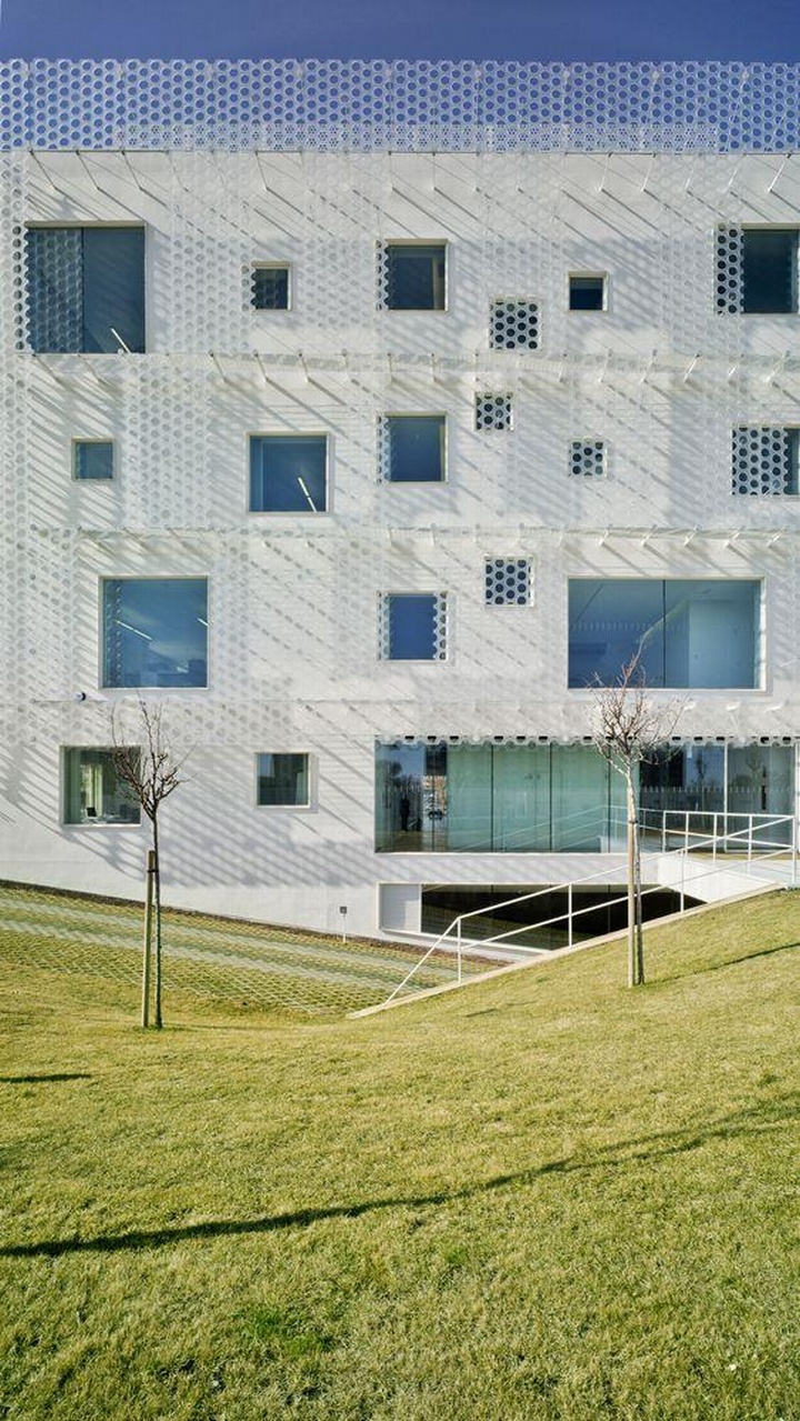
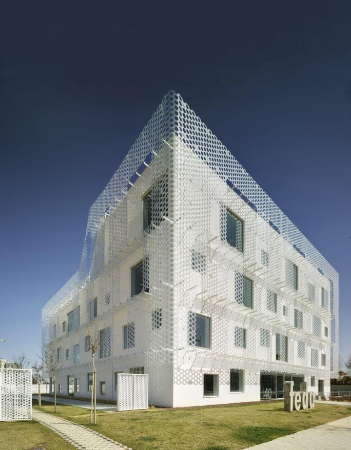
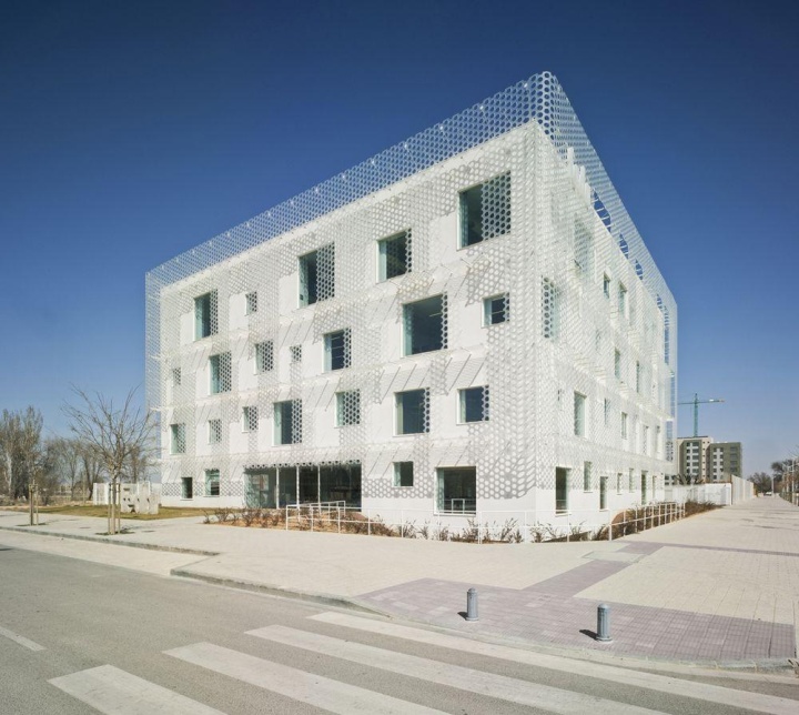
We have designed this project from the idea of ‘diffuse limits’ and ‘blur’ architecture. Our intention was to cover the volume of the building with a veil capable of bluring it and making it change. We wanted the building to react to the variations of weather and the movement of users with different levels of brightness and textures.
Looking at it from outside to inside, the skin would feel ‘fleshy’, full of shades and thick. And at the same time it would appear as a distant and undefined object, so that the observer doesn’t have a stable reference, and could not keep a static link to the building and remember only an image. On the contrary the building would respond to the user in movement generating different glances and changing perceptions.
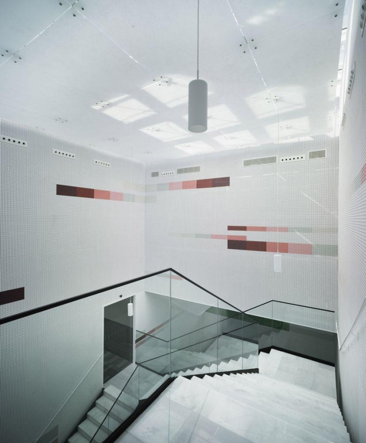
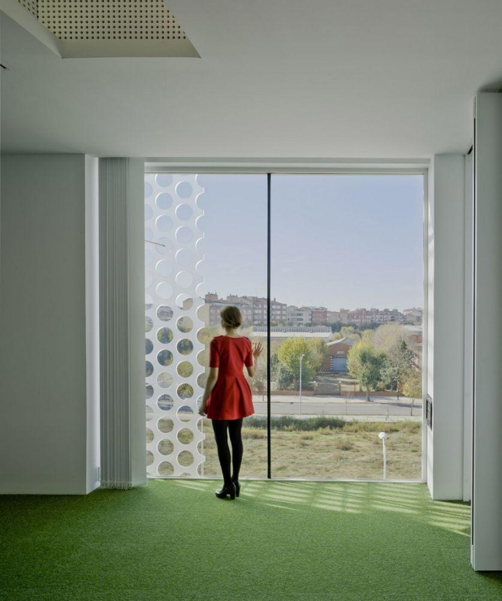
In the opposite view, this second skin had to be perceived as a space with constant shape and without scale changes. Likely, the inner façade with the windows is the one able to defragment the building because the windows are very large compared to the human scale. This makes the user relate with the exterior skin, that has small scale holes and polimeric texture, in a closer way. But, again this feeling is distorted by the separation of the two layers. From inside, the perception of the façade system had to “fluff up” the limits of the building.
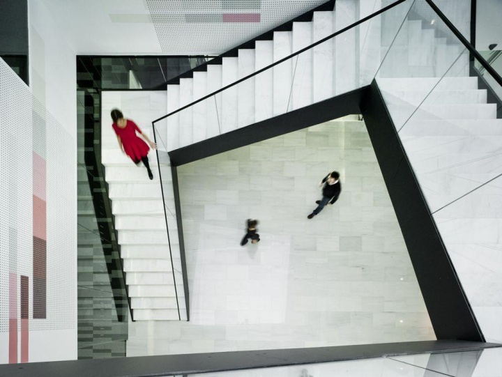
The project is solved between two poles: the strong and clear volume, compared to the delicate and blurring façade. The strength of the simple volume is balanced by the volatile and delicate effect that the façade system gives. All this creates a slight feeling of strangeness while perceiving this diffuse landmark.
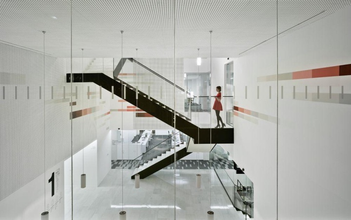
One of the most significant parameters at the architectural level has been the concretion of the program, its definition and characterization. And, in parallel, the opportunity for FEDA to upgrade their organizational processes. Together with the directors, workers and users we created a map of needs, and we did a rearrangement and reorganization of internal work processes.
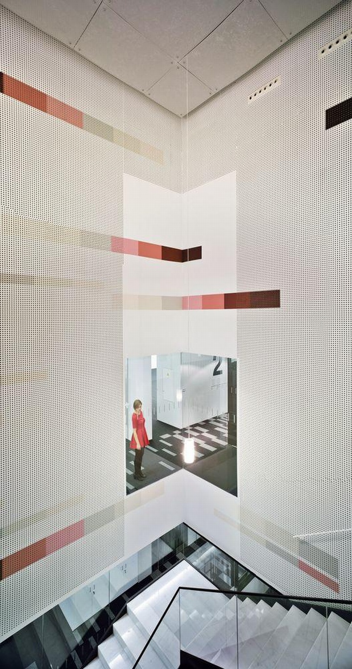
All this, permitted a spatial change: from a system of cubicles to a more open space floor, where the horizontality among self-managed teams is more evident, and helped with the implementation of technological informational and documentation systems. This new organization forced the project to solve two problems: first, the creation of a flexible and reprogrammable floors, and, second the adaptation of the working atmosphere.
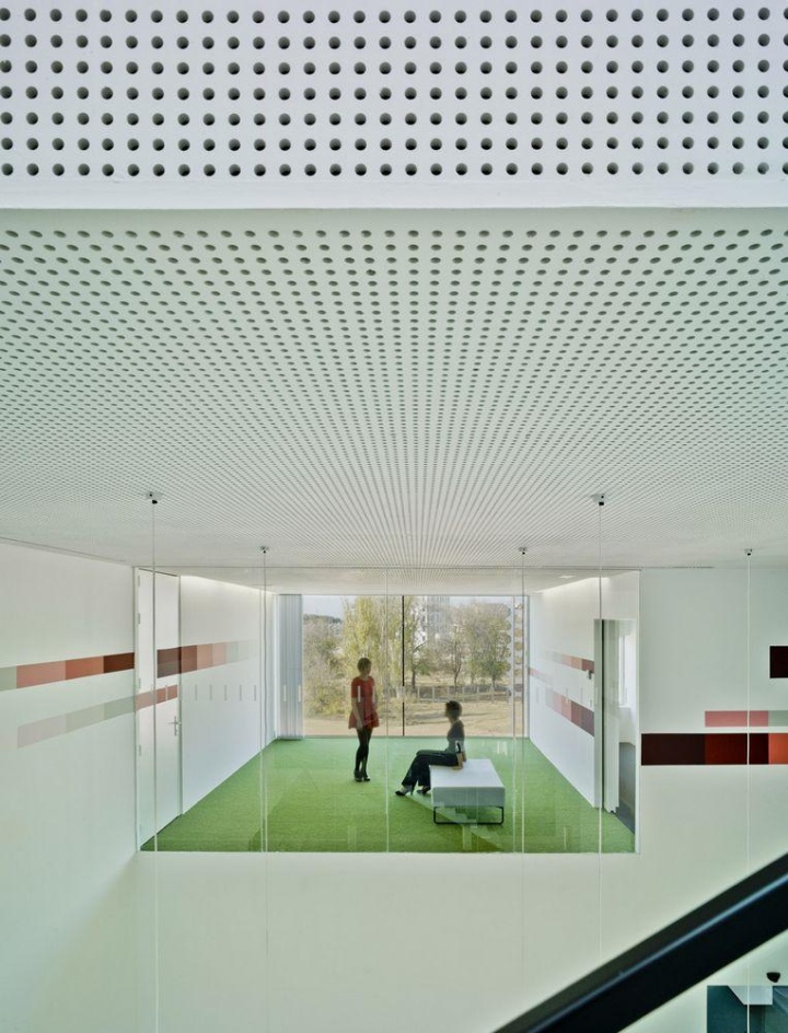
For the first problem we proposed a reticular structure with few columns, allowing a redistribution of the program according to the needs of the future; and second, a technical floor and ceiling that carries all facilities. With all this we can leave floors completely free for use. And regarding the second, FEDA required from the beginning that people who worked in the building will enjoy a high level of comfort, and, on our part, we wanted to create a ‘highly emotional’ spaces to work. The solving of the problem became a challenge.
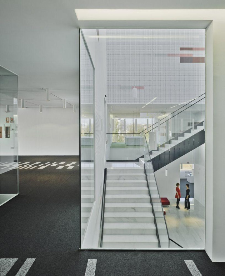
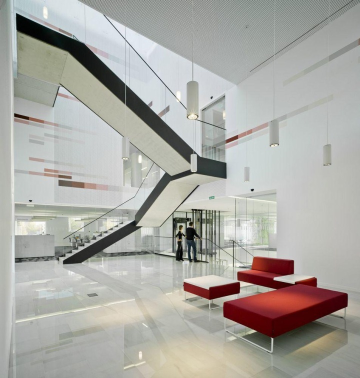
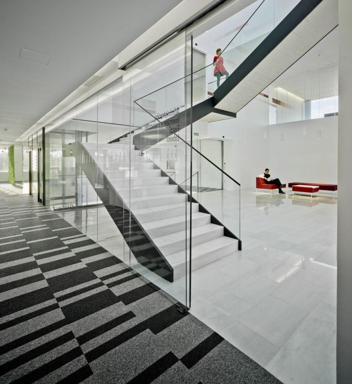
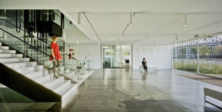
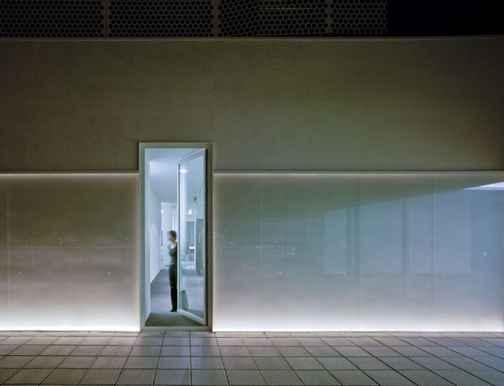
We tried to create a friendly relationship with the user. The small vegetation organizes the access. Its materiality, temperature, resonance … even the opening speed of the automatic doors, make the user subtly feel that he has entered into an attenuated area. And it’s interesting to note how people lower their voices naturally when they enter the building. We could not exactly say why, but it’s probably due to the lighting and its ability to dazzle, or the sound absorption without echoes, or the proportions of the space, or more probably, all this experiences combined.
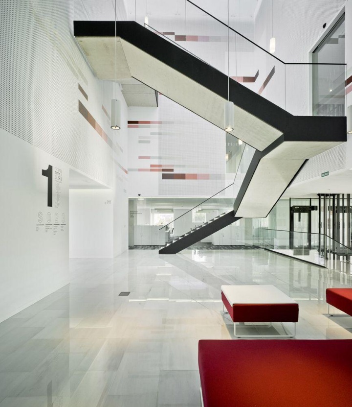
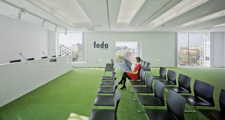
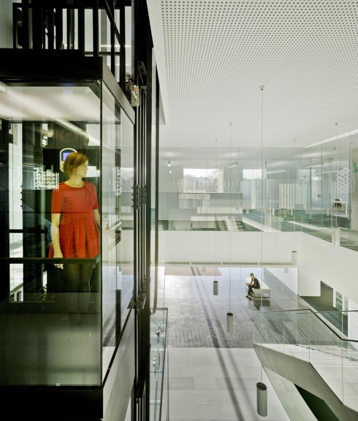
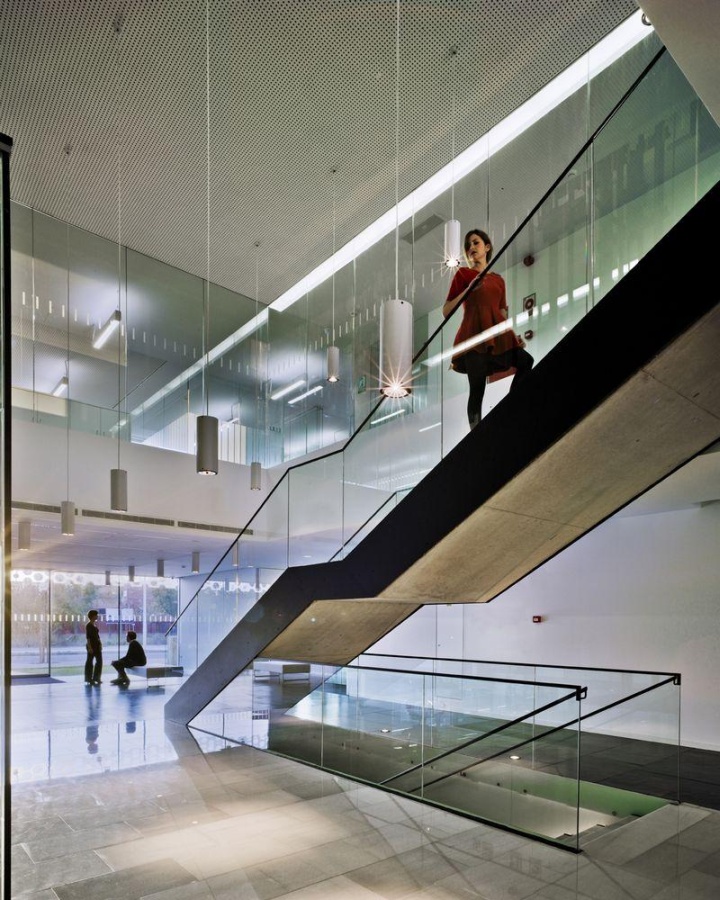
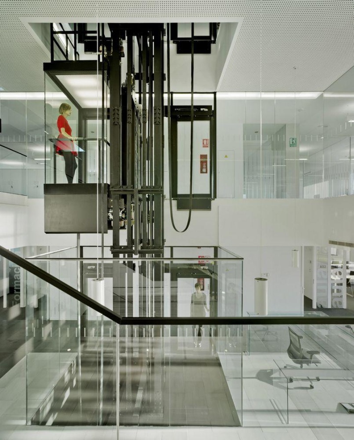
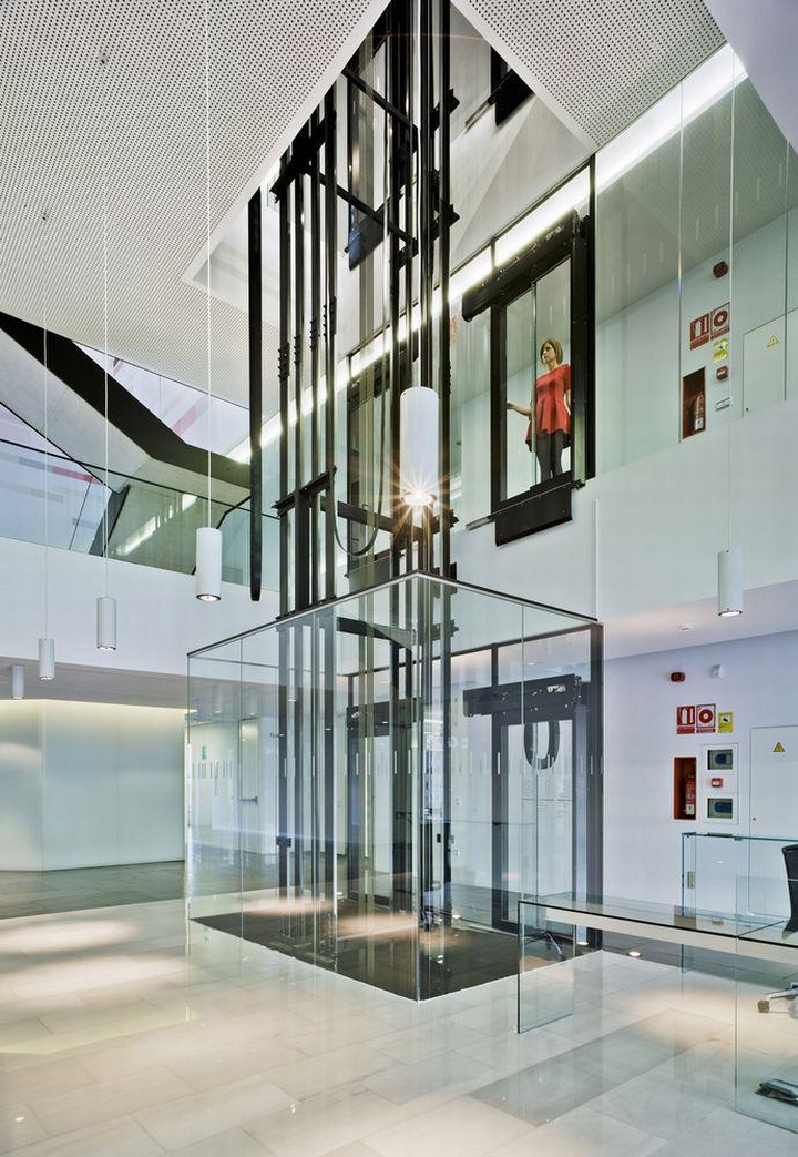
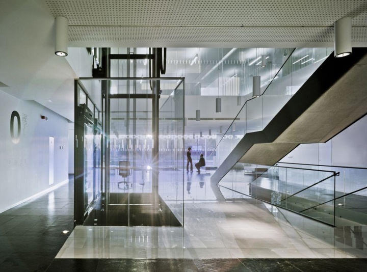
The access space extends from side to side of the floor between opposing facades. This is the first part of ‘interior void’ that articulates the building. From this space you can access all floors, and in it, information sites, exhibition and meeting places are located. We tried that this space had a very controlled atmosphere. You can feel how the perception of something heavy is inverted to the perception of lightweight.
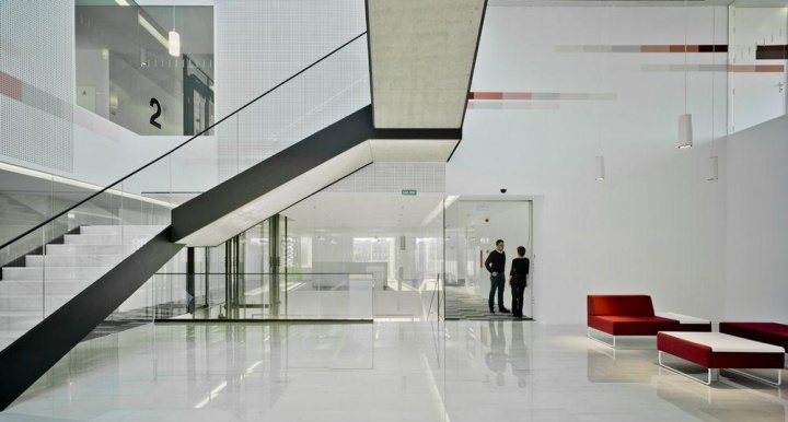
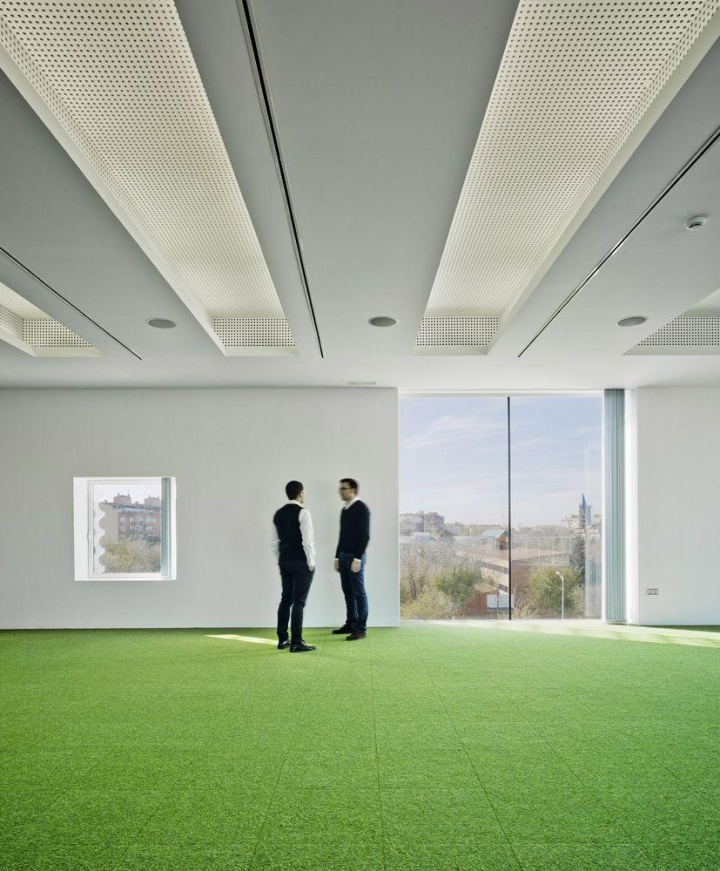
Where the lighting was different and the sound controlled, where always exists indoor-outdoor relationship. However the scale is not a person’s scale. We have tried to introduce the contradictions of the blurring exterior facade into the core of the building. And finally, we have designed open work spaces with high thermal and acoustic conditioning. We have built an extremely neutral area that invite users to bring their objects.

We want the workers build their workplaces in highly emotional way. We believe that this will build a new landscape less anodyne and more interesting and real. A transparent landscape whose reality becomes evident to someone who enters the enclosure to get the collective support of the organization.
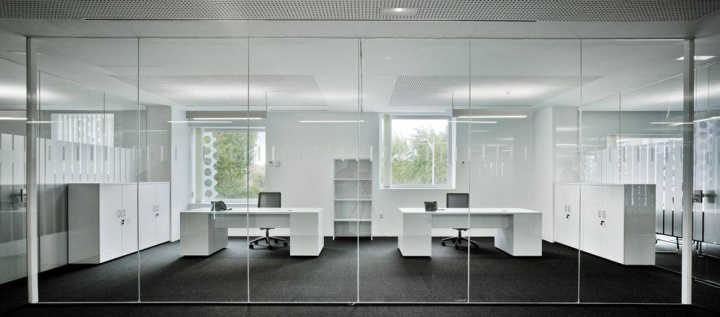
This project works the relationship between the person and the building through the materials and conditioning, trying to improve the sensory and emotional perception of the workspace by its workers, members and visitors. This is a way of re-humanizing architecture and, as far as we’re concerned, this is an obligatory step to rethinking workplaces.
Architects: Cor & Asociados
Photography: David Frutos
Photo Construction: Luisa Martí
Colaborators: Mar Melgarejo Torralba and Ayara Mendo Pérez (Conceptual design); Rubén Perea Ibáñez, Oscar Carpio Rodríguez and Juan M. Sánchez Guitiérrez (Constraction’s project phase); José Verdú Montesionos (Building Eng.); Soledad Rodríguez Capuano (Model); José M. Noguera Pardo (3D views)





Add to collection
