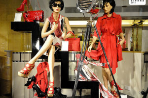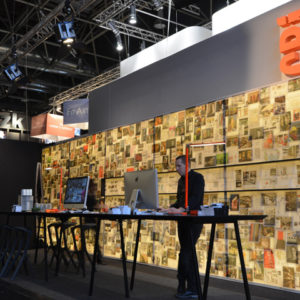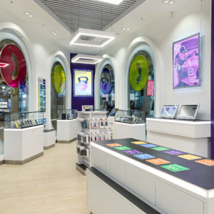
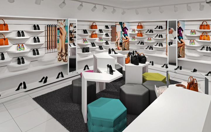

We have developed a new concept for the chain stores SHOES.RU – the network will be developed in Russia! We had to create a concept for a number of stores offering products worldwide (mostly Italian) brands, exclusive, trendy, colorful and “fresh”.
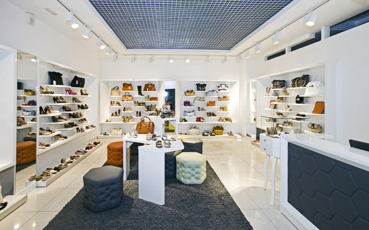
Task was difficult because every model is original and has a strong design (colors, shapes). Size of the boutique has caused high density of products. How to combine different characters? How to achieve visual equality for dozens of colors? How to smartly show accessories, jewelry, belts, watches together?
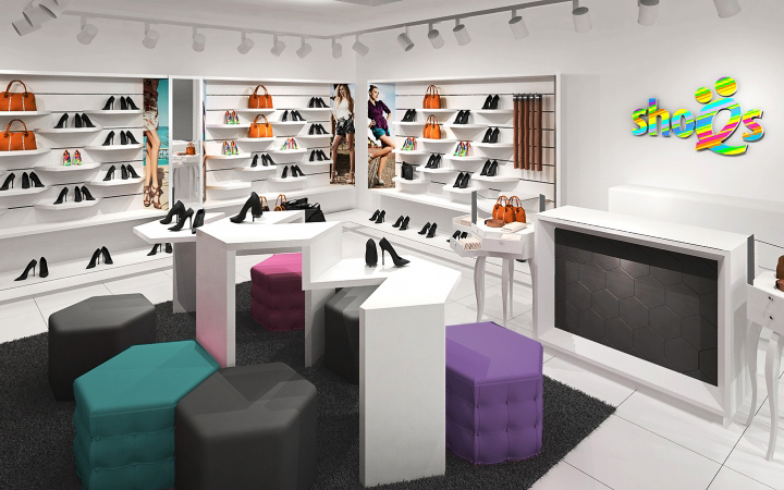
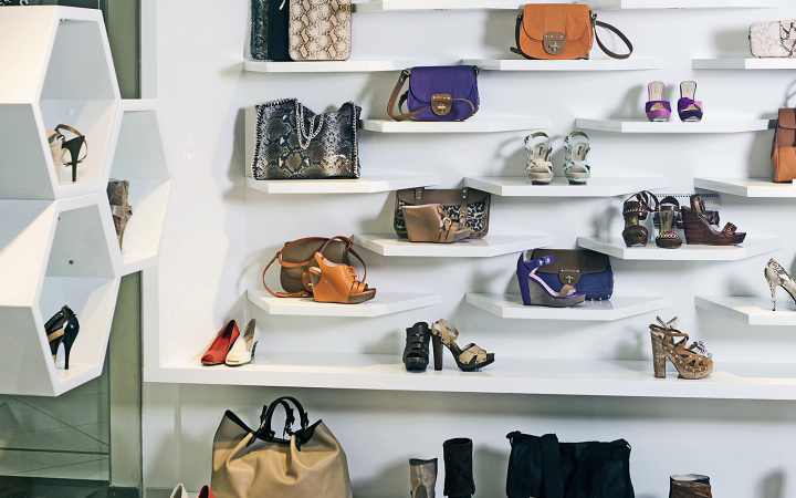
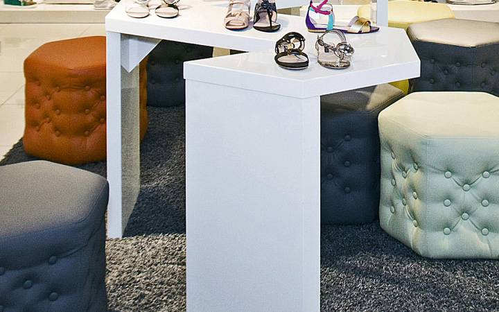
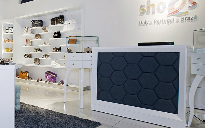
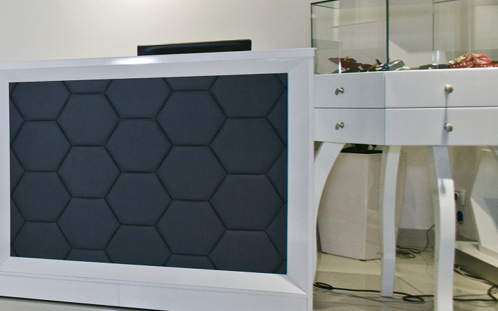
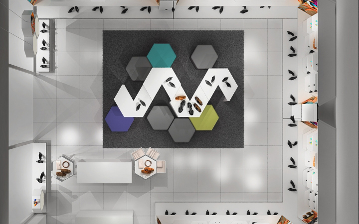
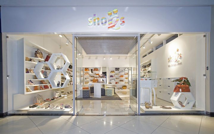
We decided to separate space for each product or product line. We’ve developed honeycomb-like single unit shelves for shoes. Jewellery is presented in elegant and detailed display cases with functional drawers.
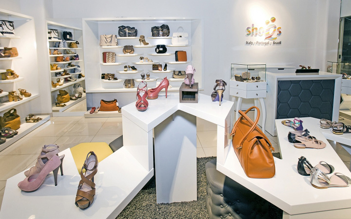
Exposure of products on a white, semi-matt background and good light (metal halide and halide sources) allows easy recognition of the products` color nuances. In contrast, we have added: footstools – soft (padded), in a variety of pastel colors, counter with soft front, extremely deep carpet. We`ve borrowed colors from the brand logo (the logo is not part of our project).
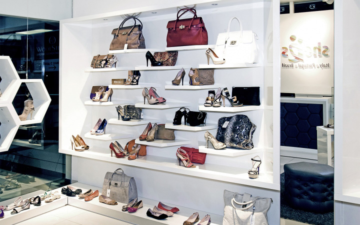
Light is an important part of this concept. Each shelf has a back-light. Graphics are back-lit, and main lighting is focused on the products shown in our unique table. On May the 1st, 2012, in the city of Vladimir SHOES.RU opened the first shop based on our project.
Designed by A+D design


Add to collection
