
One Workplace had already shifted the industry paradigm of sales and showrooms away from a transactional experience to one of collaboration and partnership. This leadership position makes One Workplace a formidable client partner, and the next iteration of their corporate headquarters needed to embody this innovation and progression. No longer a static showroom, the working showroom needed to demonstrate what is possible when great minds come together within the context of a multi-disciplinary design lab.
Blitz was a natural design partner for One Workplace. As a young firm who is redefining the architectural service model through their use of client-friendly technology and open platform, they had already established a track record for creating innovative workplaces for several of Silicon Valley’s most successful technology companies.

Working in partnership with One Workplace, Design Blitz realized the transformation inbuilt form, creating a working showroom representative of One Workplace’s evolution. A collaborative process, the project brought together Design Blitz’s expertise in workplace architecture and One Workplace’s special knowledge of furniture to create a layered environment.
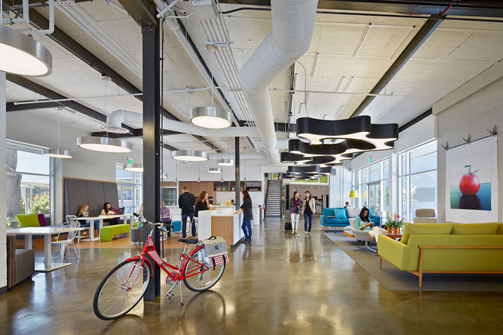
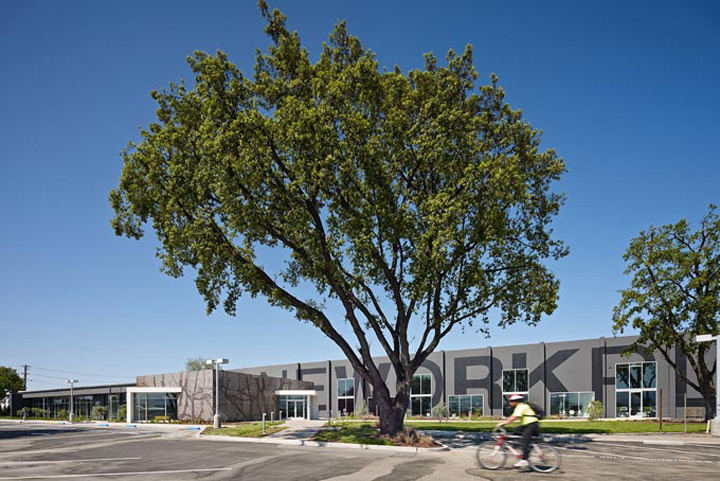
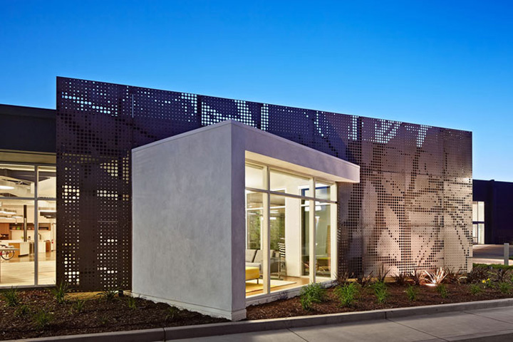
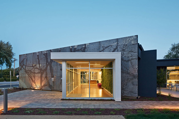
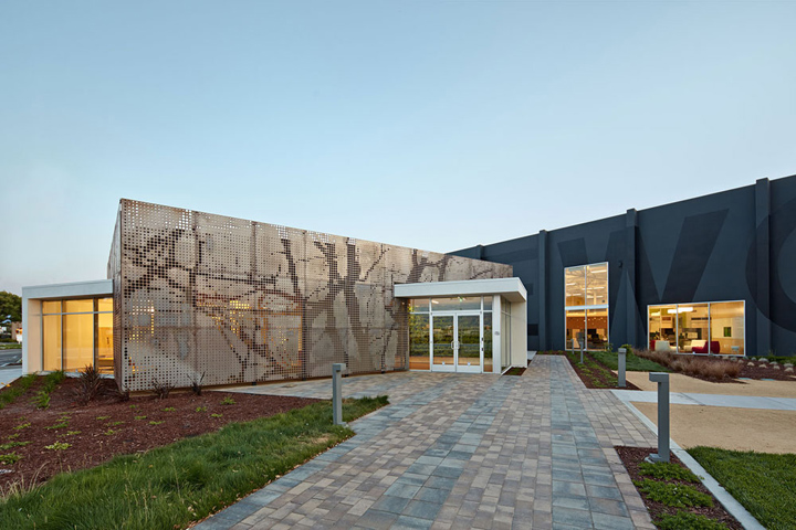
The project consists of 35,000 square feet of office, showroom and workspace. The project successfully connected an existing office building and 25,000 square feet of warehouse into the re-imagined workplace. Blitz’s design for the new facade and landscape improvements expand One Workplace’s space into a multi-functional indoor-outdoor environment. In addition to being an innovative design, the project demonstrates strong metrics for the economics of efficiency.

One Workplace moved from a 45,000 square foot space into the new 35,000 square foot space while increasing staff from 101 to 165. The increased efficiency was achieved by reduction in workstation foot print and a move by the majority of the sales team to a mobile work flow where workers do not have a dedicated workstation.
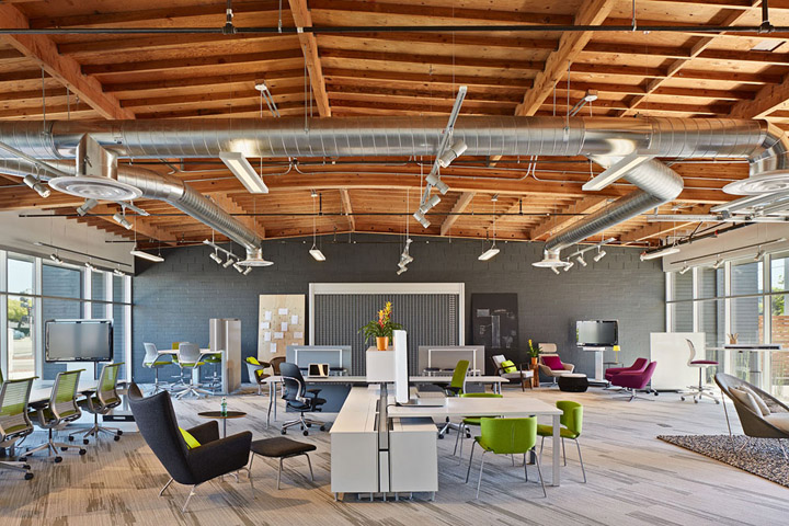
Mobile workers store their belongings at a centralized location and work either at a shared workstation or in the soft seating of the work cafe or alternate work areas. One Workplace is walking the walk when it comes to modern work typologies.
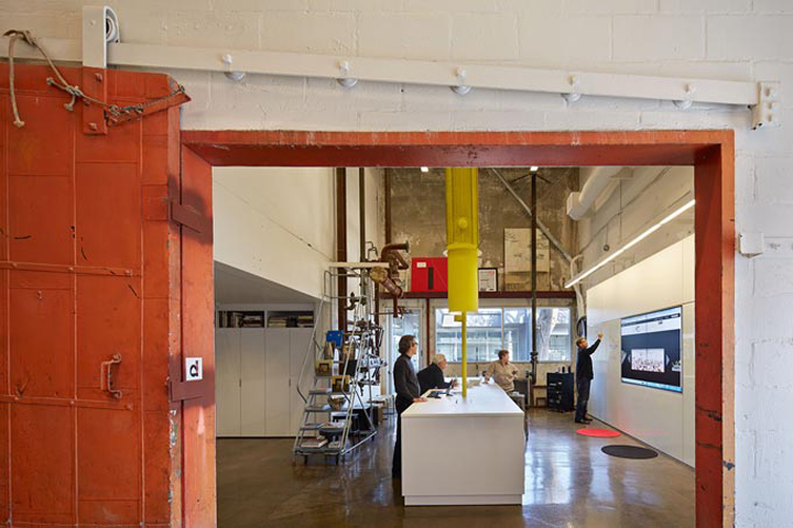
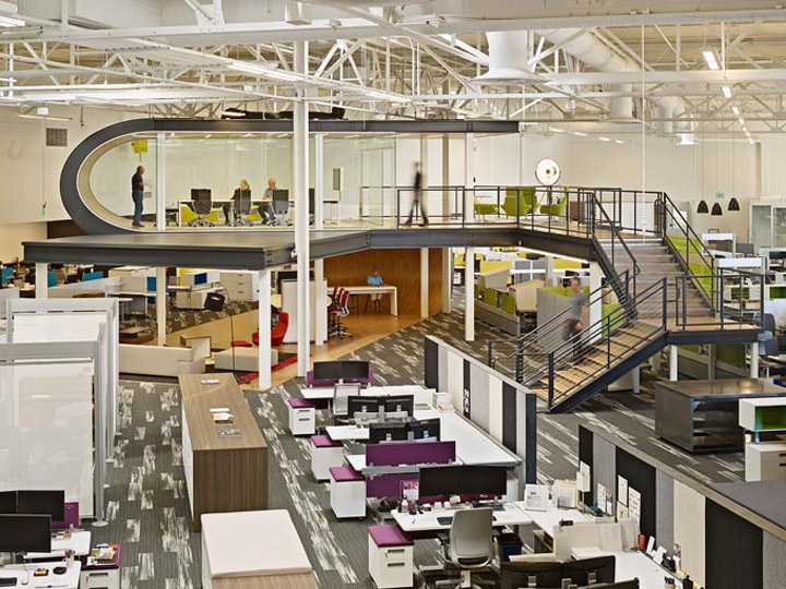
Blitz believes that its always more interesting to let a building’s structure speak for itself. They pride themselves on being reductionist architects, always first looking for what can be stripped away before trying to add anything new. This approach is evident in the One Workplace HQ where very few new walls were introduced to the project and design only really began after exploratory demolition had been completed. The result is a authentic architectural expression.

One Workplace is a family-owned and family-run company with three generations having worked in the company. The family has a strong Italian heritage and it was very important to celebrate the familial and communal quality of the project. During initial conversations, concepts of the kitchen as the family hub and the dining table as key elements kept emerging.
As such, Design Blitz used the kitchen as an opportunity to bring all users together and as the programmatic connection between the two buildings. Quite literally, the office meets in the middle. Upon entering the building you are immediately presented with the work-cafe. It is an area to meet and eat. Leading with this hospitality function ensures that customers and users encounter a warm and welcoming space.
During initial conversations with the One Workplace team, Blitz began mapping both the client and user experiences through the space. These mapping diagrams created the conceptual basis for the rest of the architectural interventions. The mapped experiences demonstrated that both customers and users would be sent out into the space to experiences a series of carefully planned touch points and then brought back to their starting point – much like the path taken by a boomerang.
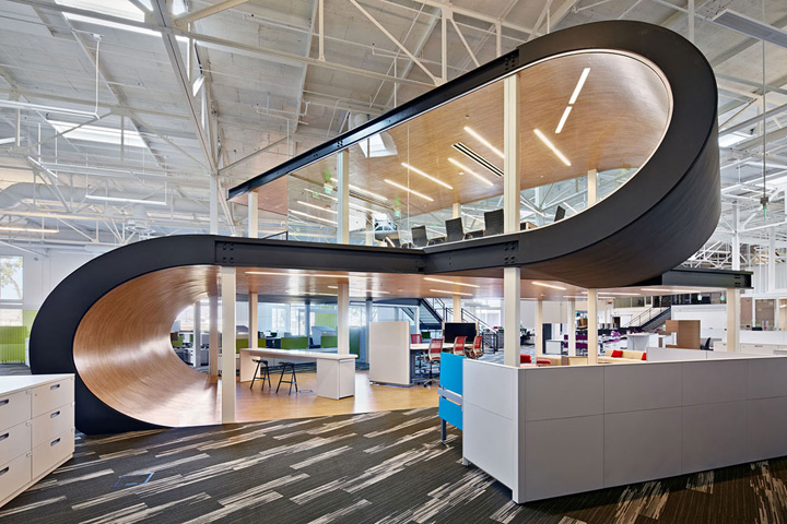
The boomerang further manifested itself in the creation of the two-story stacked ‘boomerang’ in the center of the open office space. The elevated conference room and observation platform allows members of the One Workplace team to quickly survey the floor and show customers how a variety of systems solutions can intermix to create a unified, flexible and layered approach to workplace layout.


Add to collection
