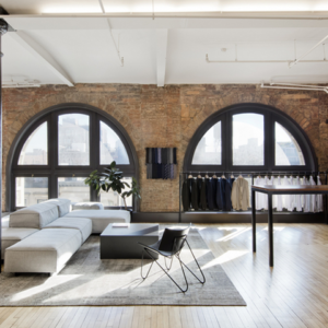
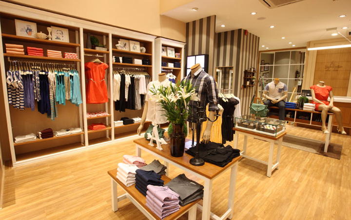

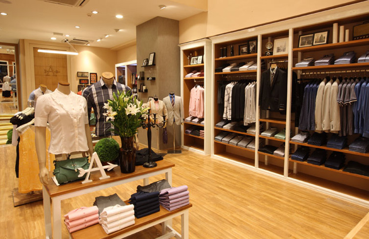
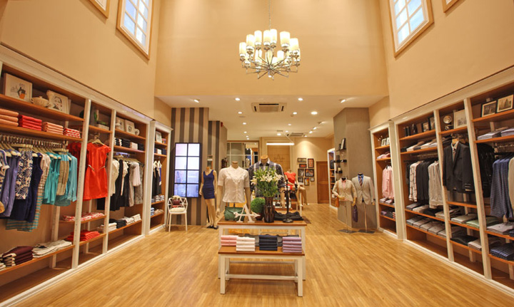
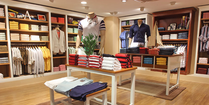
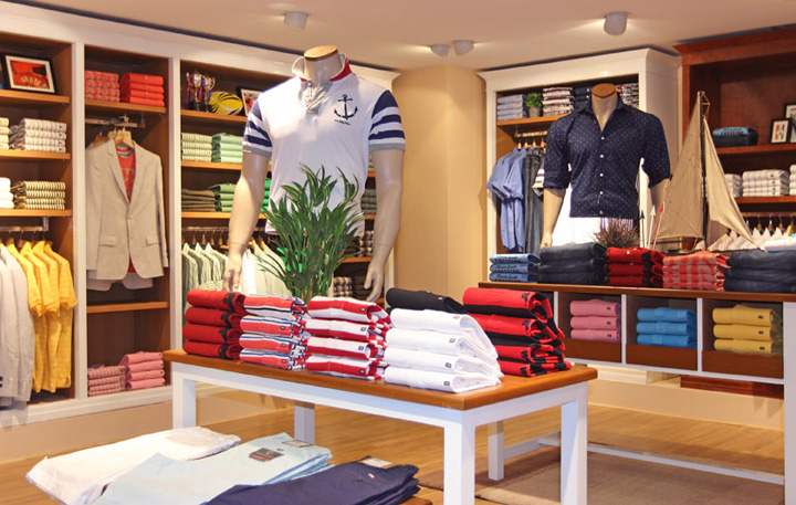
With the powerful integration of visual identity, quality, fashion and merchandising, the exclusive ARROW store has been opened in a very prime location of Linking Road, Mumbai. Occupying two floors of 3000sft in a modern structure, the store interior has the vibe of a plush gentleman’s den and features a subtle blend of contemporary style and mid-century elements. Contemporary furniture, wall panels and framed photographs heighten the sense of a kind of homely hospitality.
The entrance gives a colossal feel with high ceilings and to add to it there are two windows placed on the top with cloud textured walls to give a feeling of space and openness. As one enters the store, both the windows are left open for customers to browse the merchandise. The main façade has been given a very grand open look itself with the door placed a little inwards in the foyer area.
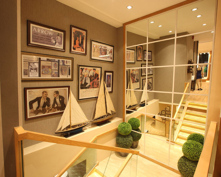
One of the apprehensions while designing this store was to direct the customers to the basement floor, as going by past learning’s from brand patrons we observed that walk-ins reduce for a cellar. This was solved by creating a staircase landing area with mirrors at an inclined angle, so that the basement floor is visible from outside the store and the entrance. Moreover, the stairs are lit guiding customers to the floor downstairs with Arrow’s heritage ads displayed on the walls romanticizing the brand’s past.
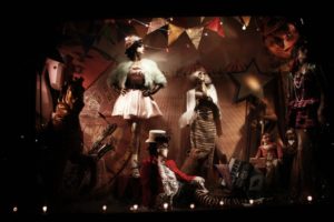
It was also crucial to make the store visible given that it is located on Linking Road – a high traffic zone. To address this, the store front was created with a huge façade which is blazingly lit with the brand symbol ‘A’ prominently displayed on the top panel of the window. With a wooden signage that is LED lit is bound to catch the attention of passer-bys.
The store concept is divided into 2 broad section – appealing to distinct customer profiles. The Arrow Formals & Arrow Sport section in the basement id designed for the sophisticated and matured audience who has a refined taste and seeks perfection and exclusivity. The Arrow New York section has a collection for both men and women – appealing to the young audience, who is fashion conscious, follows international styles, is Experimentative and is a trendsetter.
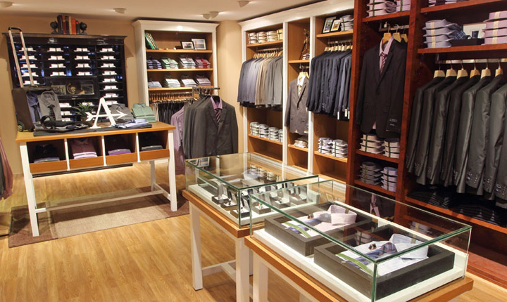
Basis this, the Formal section has a classic and rich design with wooden paneling. American walnut with Burl wood has been to highlight the premium collection to add a warm atmosphere. The ‘White Shirt Bar’ displaying a range of white shirts which Arrow is known for, is made in high gloss and is at a height that is slightly shorter than the rest of the wall panels to demarcate it from the rest of the collections.
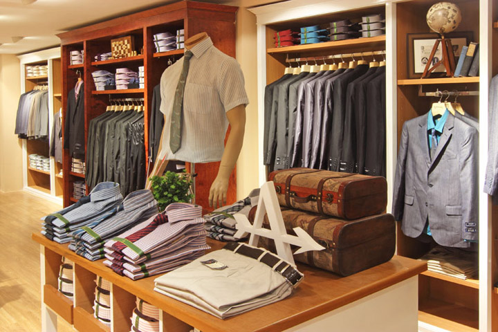
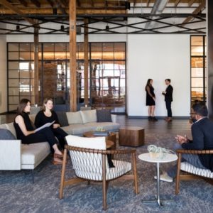
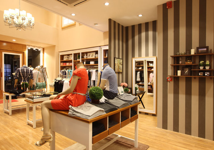
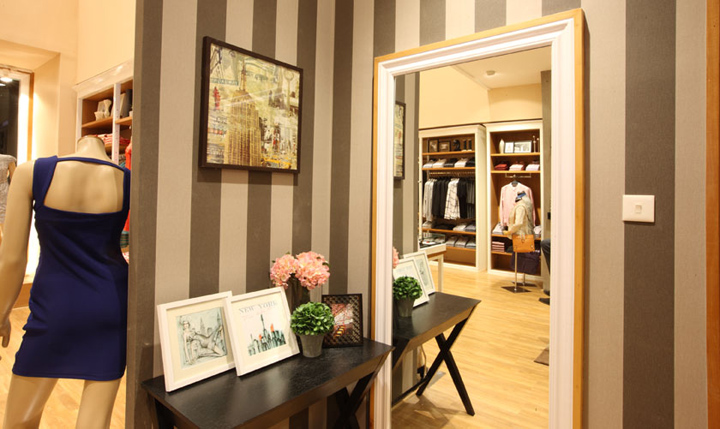
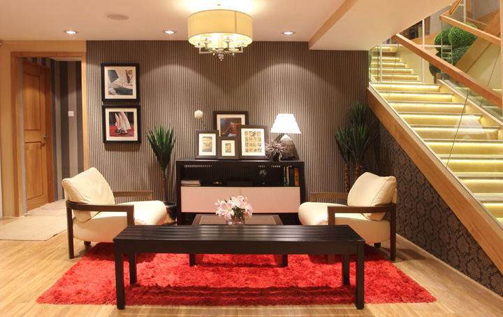
The Arrow New York section has been done in black and white which is modern and edgy, with minimal props giving it a contemporary feel. To give the customer a space to relax and browse through the collection, a Lounge area has been created in the basement, maintaining the sophisticated look of the section. The lighting has been kept subdued here and the seating minimal and comfortable. The store is truly a blend of the brand’s rich heritage and its modern face.
Store Design & Visual Merchandising Head. Arvind Lifestyle Brands Ltd.,: Sandesh S Shet
Project Manager: Deepu Jacob Mathew
Visual Merchandiser: Lekha Gajwani


Add to collection
