
There is more than one way to look at the cloistered architecture of the traditional banking environment. While the design intention may be to establish an atmosphere of hushed security, solidity and permanence, the same highly cellularised interior might sometimes imply something quite different, such as secrecy and opacity.

For Natixis, it was these less than desirable implications that spurred a decisive shift in the design of their new Hong Kong office. Replacing the bank’s original three non-consecutive floors in Hong Kong’s Admiralty district, the project for the new office evolved as a direct contrast to the old: a consolidated, contiguous workspace with few internal barriers to communication or circulation.

The customer experience offered by the new office would be similarly transformative, with a contemporary front-of-house reception/meeting suite designed to welcome visitors into a world of forward-looking confidence, openness and integrity. A further requirement for the project was achieving LEED Platinum-level sustainability.

An emphasis on transparency
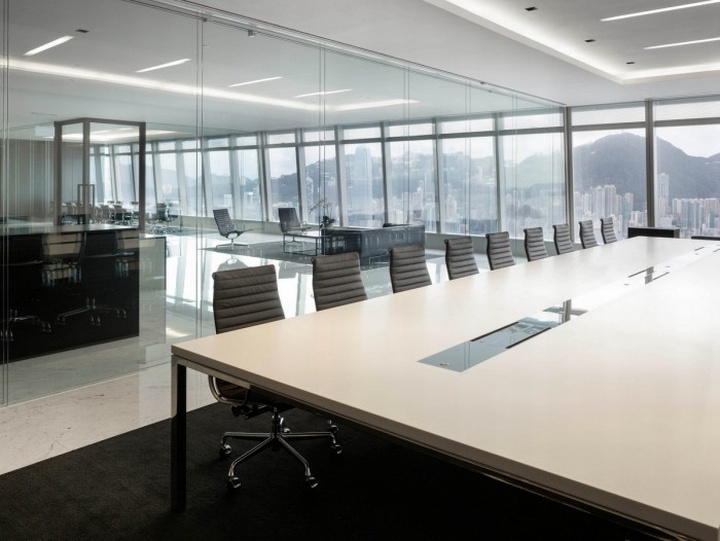
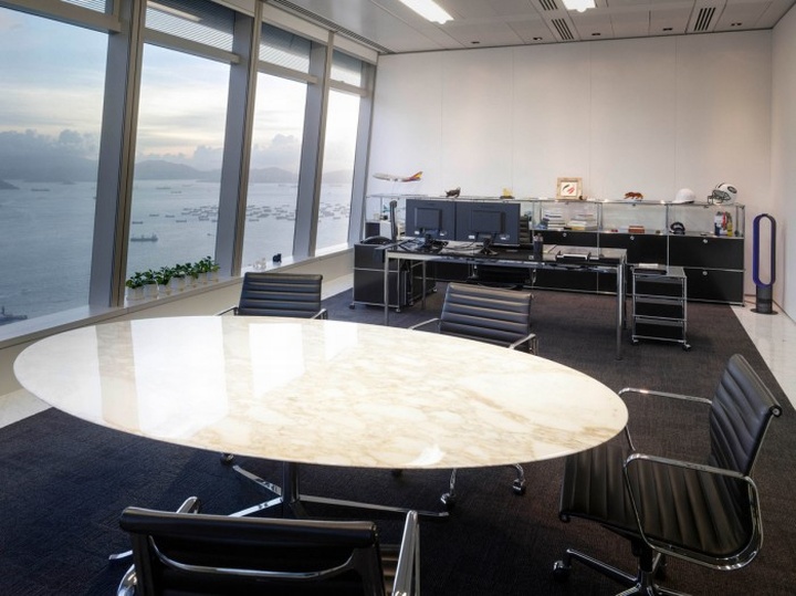
Starting point for the project was a two-level, 41,200 sq-ft space on floors 71 and 72 of the International Commerce Centre. Capitalising on the space’s stunning views across Victoria Harbour and over Kowloon, the M Moser team responded to Natixis’s requirements with a design whose virtual ‘invisibility’ is complemented by outstanding function and attention to detail.

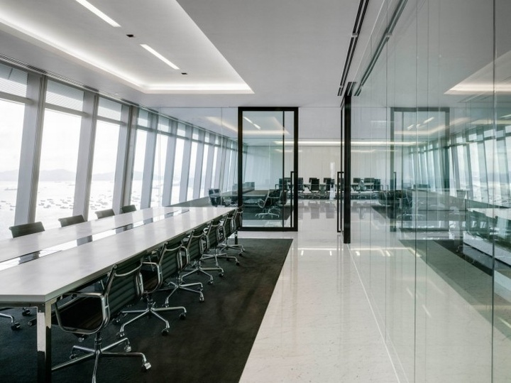
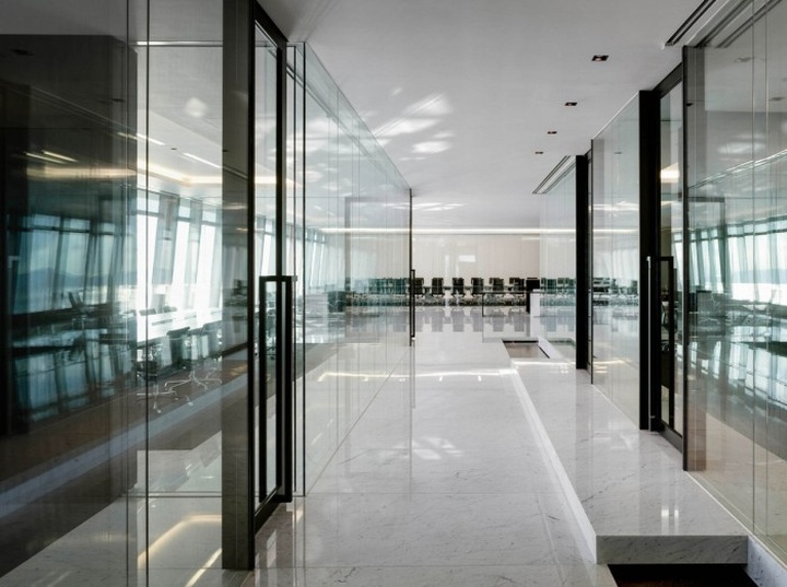
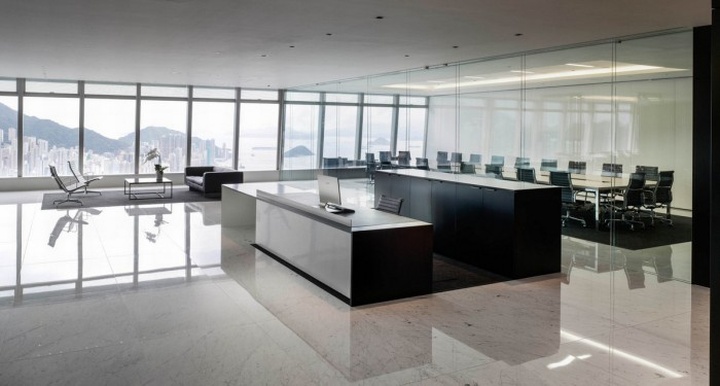
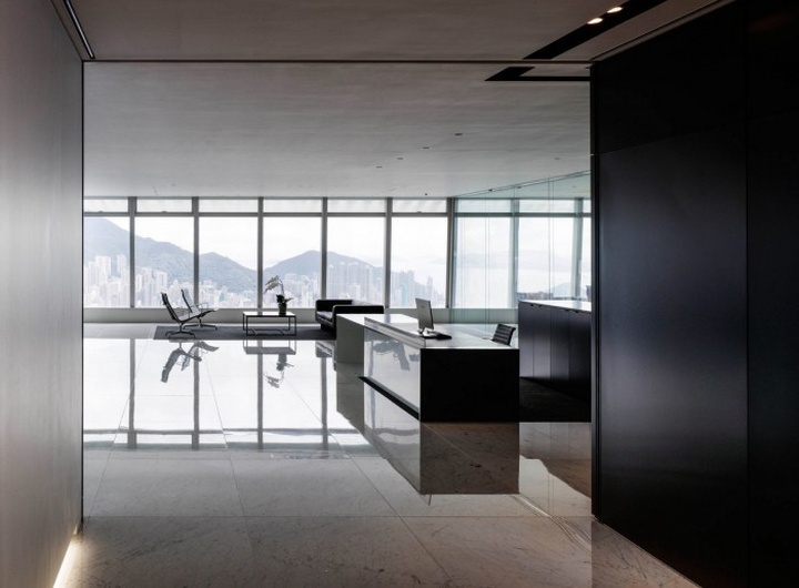
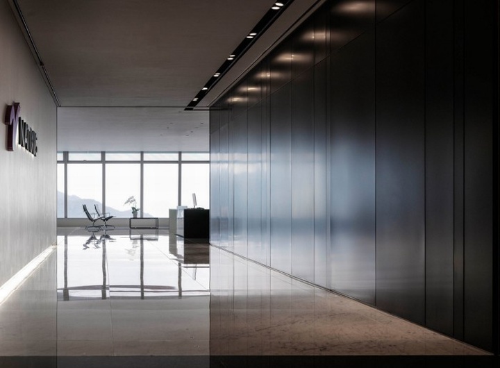
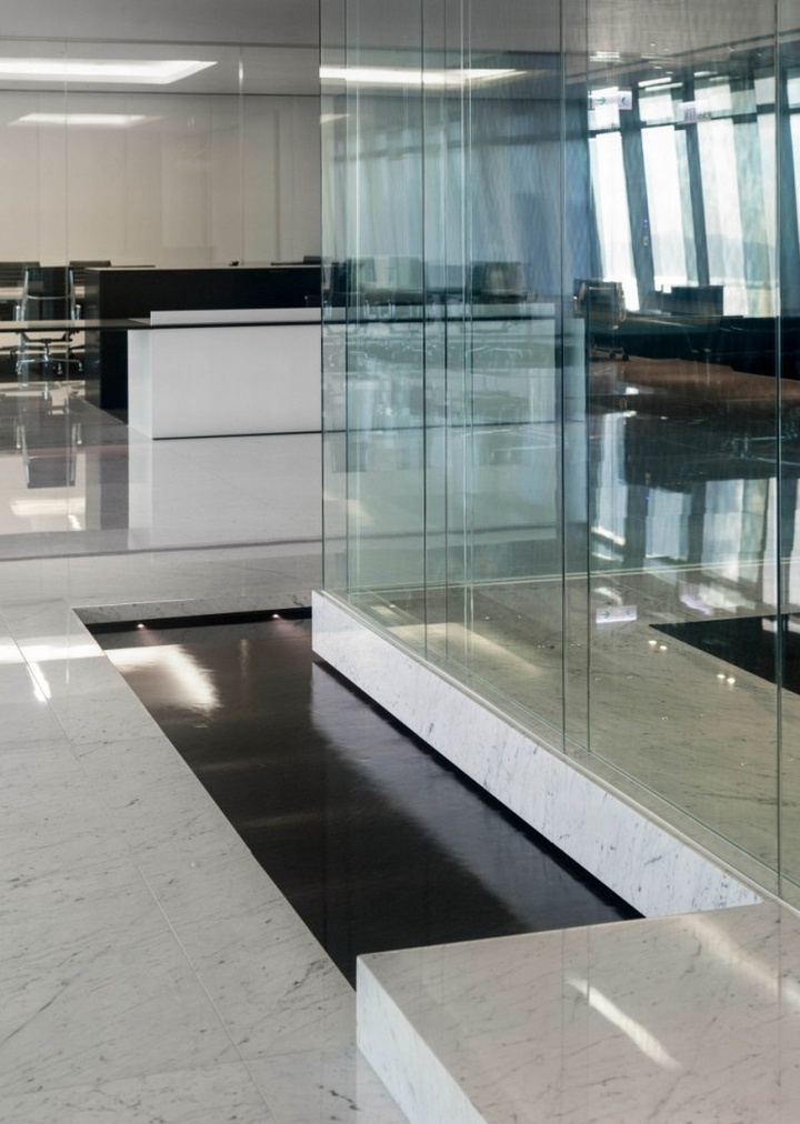
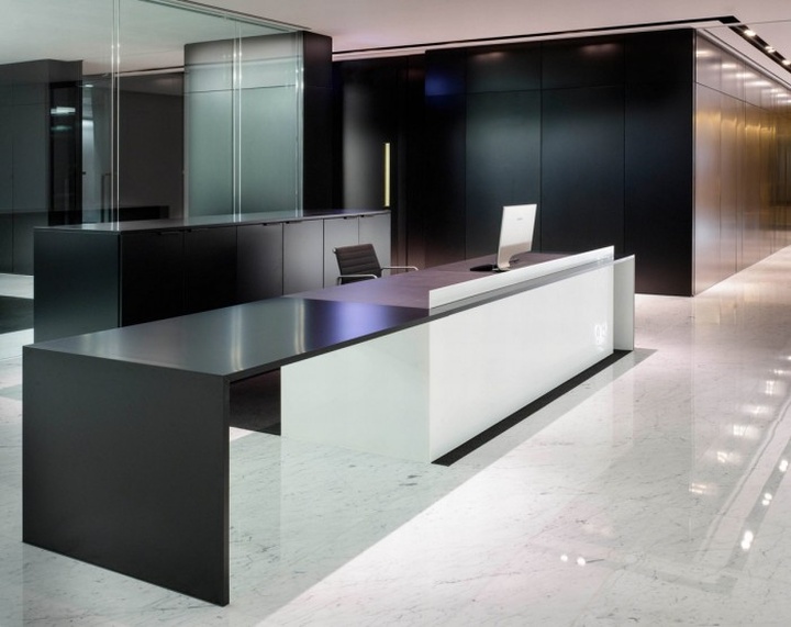
These qualities are epitomised in the office’s entry and meeting suite on level 72. Minimalist in form and material palette, this subtle and precise design draws the eye through – rather than to – its features. From the lifts, visitors proceed into the space via a corridor whose light-coloured stone floor reflects natural daylight streaming in from the reception area ahead. The reception desk itself – a simple horizontal monolith – is pushed to one side of the space in line with the path of entry, allowing for an unobstructed sightline to the view outside.

Other details work to further emphasise the exterior views and subtly create an impression of integrity in the space. The non-standard size of the stone floor slabs, for example, align precisely with the window mullions, leading the eye once again through and out of the space to the view beyond.

Meeting suite & workspaces
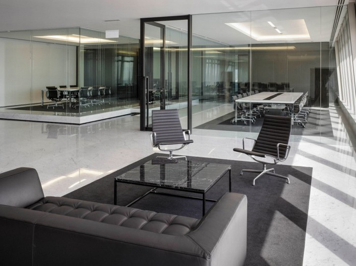
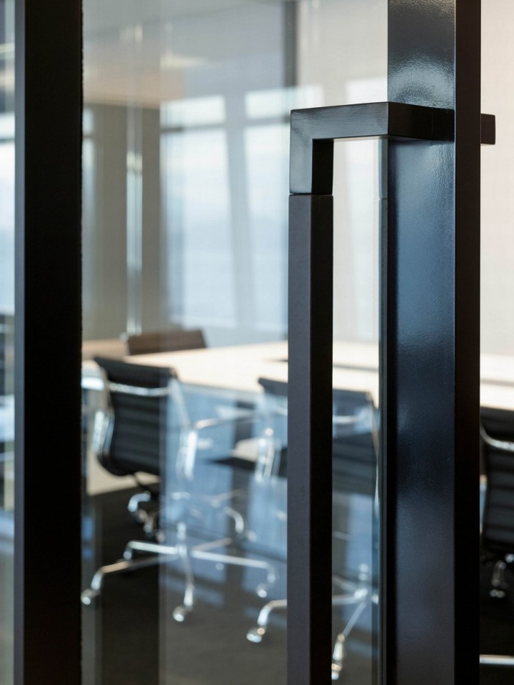
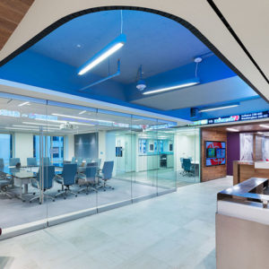
The heart of the space – the meeting suite – presents yet another subtle yet artful composition of shapes and materials that are virtually elemental in character. Partially bordered by a zen-like water feature, the four meeting rooms are encased in floor-to-ceiling frameless glass, contriving to seem virtually invisible whilst offering their users the required degree of acoustic privacy. Notably, the inboard meeting rooms sit atop elevated platforms, allowing their users to gaze over intervening rooms into the adjacent workspace.

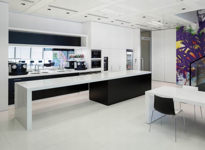
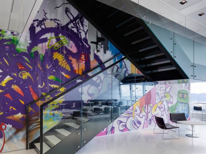
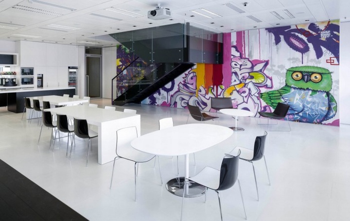
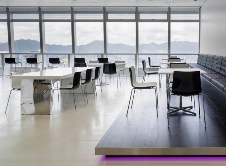
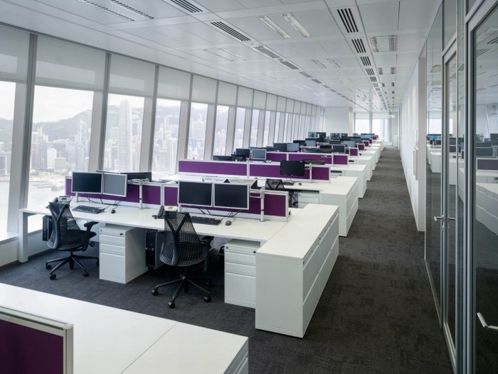
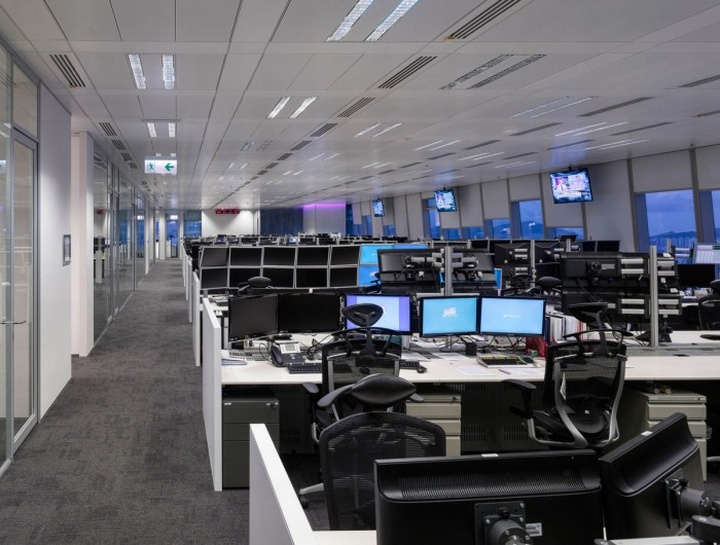
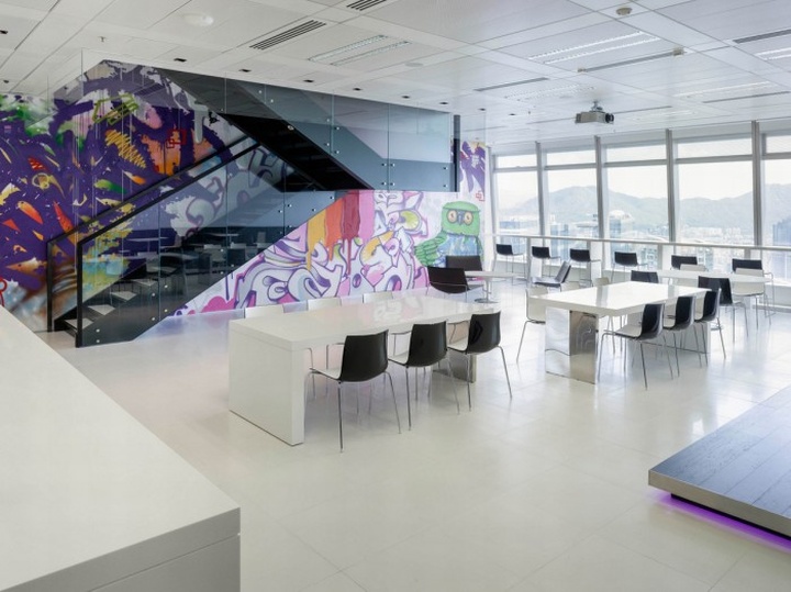
Transparency and flow similarly define the work areas. Staff are seated in open-plan settings with sightlines across and out of the space. When not tucked against the building core, enclosed offices are clustered to form intervening spaces between open-plan areas. On 71/F, workspace flows seamlessly into the office’s spectacular break-out area – and to a graffiti-like wall mural that provides an unexpected twist to an otherwise serene environment.
Design: M Moser Associates
Photography: Virgile Simon Bertrand


http://officesnapshots.com/2013/10/10/natixis-minimal-transparent-hong-kong-offices/
