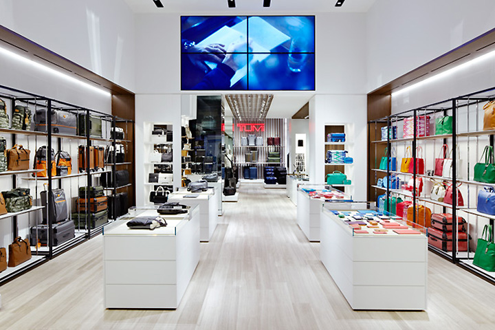

“When we design anything for Tumi we always have the Tumi customer in mind, they know what they want and expect logic and reasoning behind the design.” We wanted to add a sense of hierarchy within the space to provide a seamless experience—moments where the consumer is guided towards what they’re looking for.
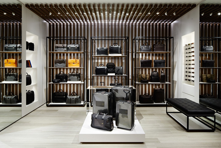
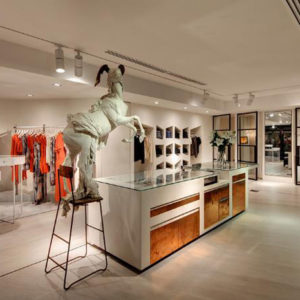
Embodying our studio’s philosophy of transformation and use of angles, neutral-toned materials – striking in their own right – provide a backdrop for TUMI’s products to shine. Day bags hang or sit on shelves, within arms reach and easily slung on for in-store testing.
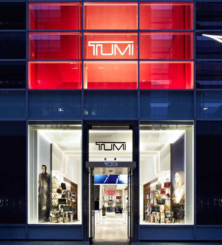
Travel cases rest on clean white platforms reminiscent of a runway, inviting customers to walk up, take hold and roll them along as they test for the right heft and size. Highlighting the center of the space is the first-ever monogramming station for on-the-spot product rationalization, unique to this location.
Designed by Dror


Add to collection
