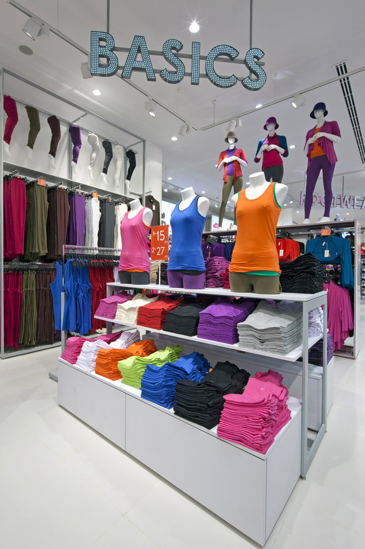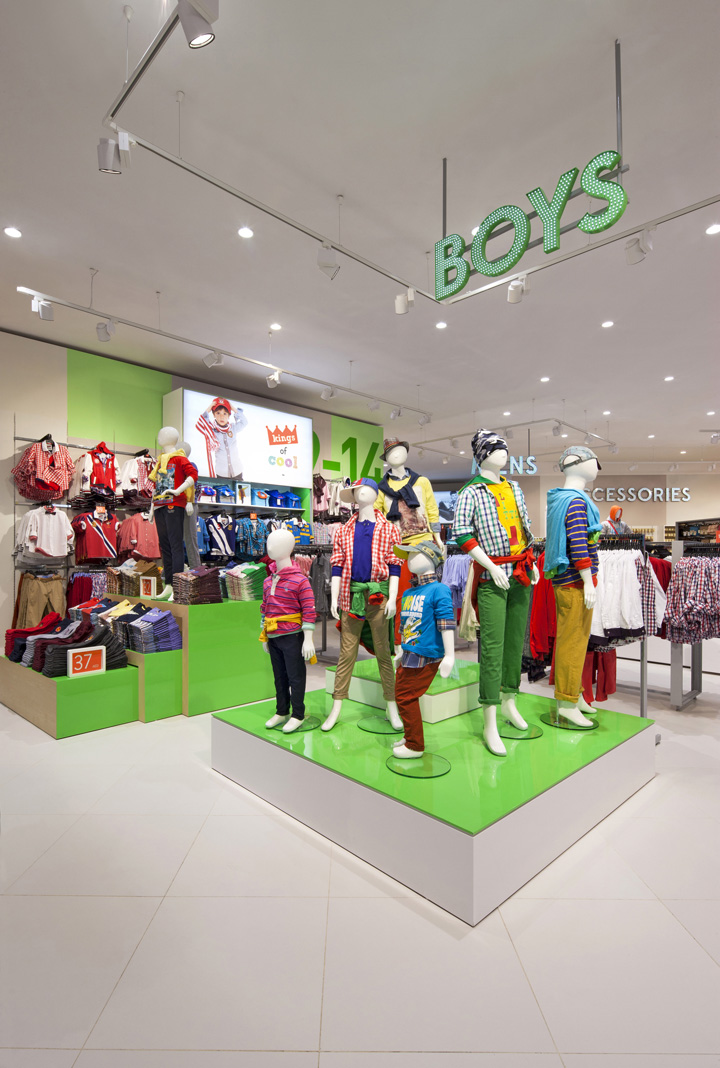

BMA, a Dubai-based retailer operating Red Tag and Geant supermarkets in the Middle East, briefed us in late 2012 to create a new value fashion brand that would challenge their competitors in the market. We were asked to develop all elements from scratch, from brand positioning through to name generation and identity design, to the retail environment and its supporting graphic communications. The brand needed to respond to the new attitude and vibrancy of Dubai, while also being adaptable to cultural demands within the Saudi marketplace. Trading at 30,000 square feet, the new concept is a value fashion business that includes men’s, women’s, kid’s, fashion, shoes, accessories and home departments.

We worked closely with the client team to define and develop a new approach. This included researching the region and identifying where the new brand offer should be positioned, not just within the local market but within a global context. Through our definition stage and a number of workshops we developed the brand positioning, tone of voice and went on to generate the name ‘Twenty-four’. Following this initial phase, we designed the identity and interior along with all in-store graphic communications and ticketing. A light and fresh approach was given to the brand and its environment to allow for brand ownership and clarity through the use of expressive colour.

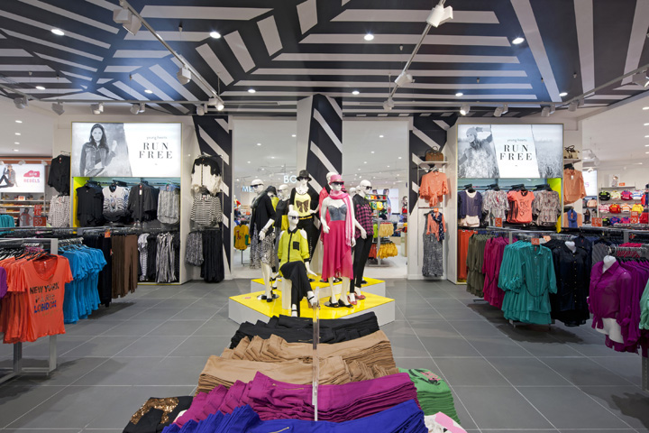
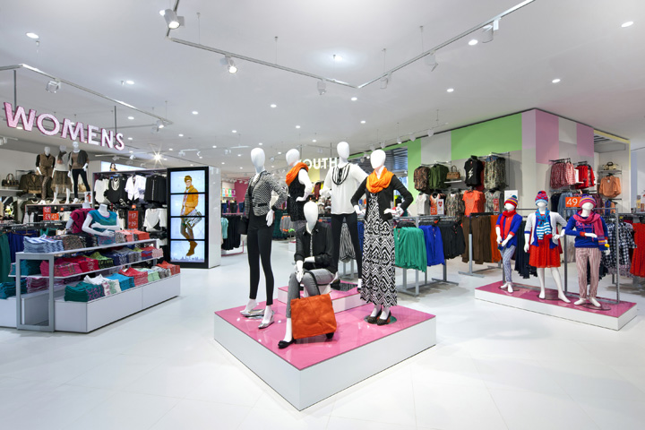
The concept centres on two bold feature boxes, which have landed in the store. The large, freestanding architectural boxes communicate the brand colour on the outside and have a contrasting internal lining, which either responds to trends to create a fashion space, or becomes softer to the rear to form a more discreet lingerie area. The boxes act as dynamic beacons that constantly change and refresh, reacting to new offers during the season. These spaces are angled at 45 degrees to the ‘plan’ and establish the circulation in store as landmarks for customers to gravitate towards, around and through. The apertures within these boxes set up views towards other areas in the store and encourage a sense of intrigue and exploration.

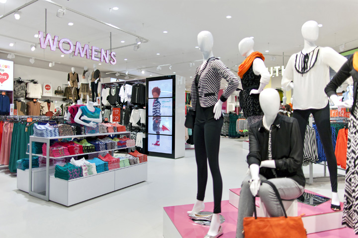
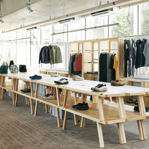
Departments are defined by colour, which is expressed in the linings of the metal-framed wardrobes, feature fixtures and signage and references the colourways of the feature boxes. We designed product wardrobes that could either sit stacked and freestanding to create spaces, or against the perimeter walls as focals. Fully flexible, the perimeter-breaks and focals utilise height to tell product stories with the merchandise, graphics and moving image, and also work to attract and inspire the customer to shop the product range. A new family of fixtures has been designed to meet the density requirements. Hardworking and flexible, these fixtures were designed with an engineered thinness and lightness, which ensures that the product, rather than the system, is the hero. We have designed a number of feature fixtures with more presence and expression to give the department personality.

We created overscaled and illuminated department signs to aid navigation, while large-scale graphics punctuate the landscape. Messages have been also been developed to support wayfinding and highlight departments. A quirky tone of voice, which has been expressed through a mixture of typography and illustration adds a sense of fun and pace to the store. We have kept the packaging simple and refined by using the brand colour in a confident and bold manner to create standout. The ambition was to design and test the new Twenty-four brand across a number of sites in the UAE in October 2013. Following this initial trial, there are plans to launch the brand across the Middle East.
Contact:
David Wright
Group Marketing Director
d.wright@dalziel-pow.com
+44(0)20 7837 7117
www.dalziel-pow.com


