
During his long term collaboration with the middle-eastern leading ceramics manufacturer Royal Ceramica, in his designs Paolo Cesaretti has been always achieving a subtly balanced combination between oriental and western elements. With this same intention the architecture of Royal Ceramica’s new pavilion presented during Cersaie 2013 has its roots on a basic Mediterranean and oriental value, that of the traditional house organized around a public/private courtyard focusing on a central element.

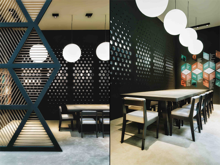
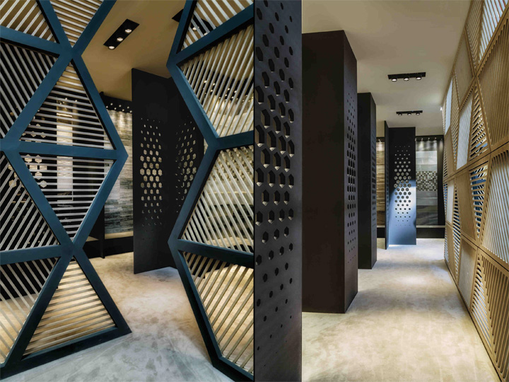
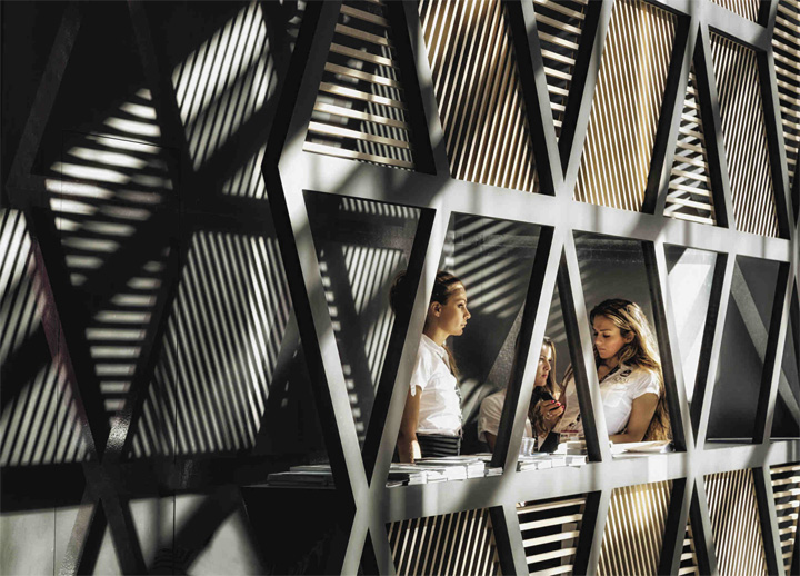
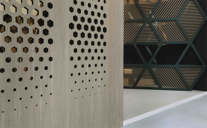
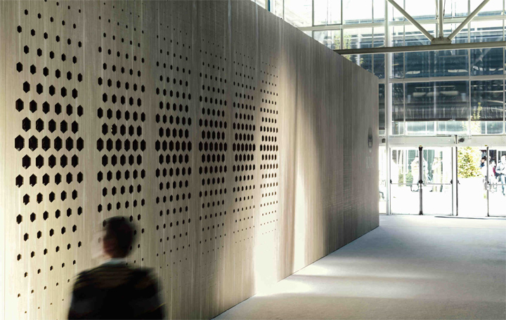
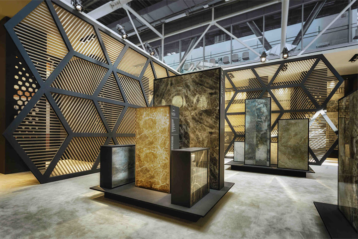
The whole pavilion is framed from the outside by a partly perforated external wall creating a game of shadows and functioning as a surprise and invitation element. The aim of the wall patterning – as well as of the general stand design concept – is to rework traditional oriental geometric motifs through a contemporary design attitude. At the same time the clear and simple design of the exterior is preparing the visitor to the surprising richness of the interior.

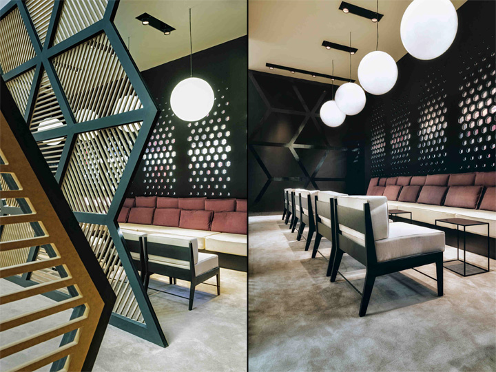
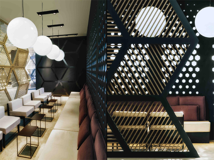
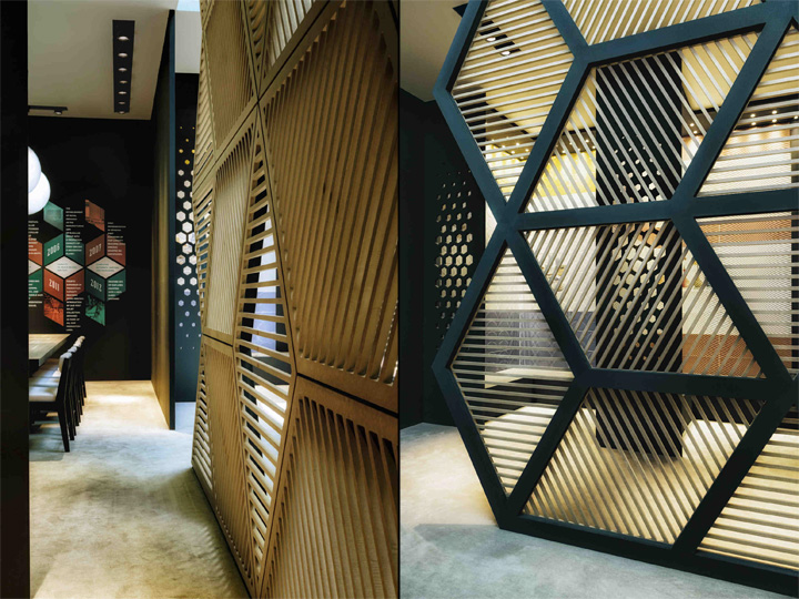
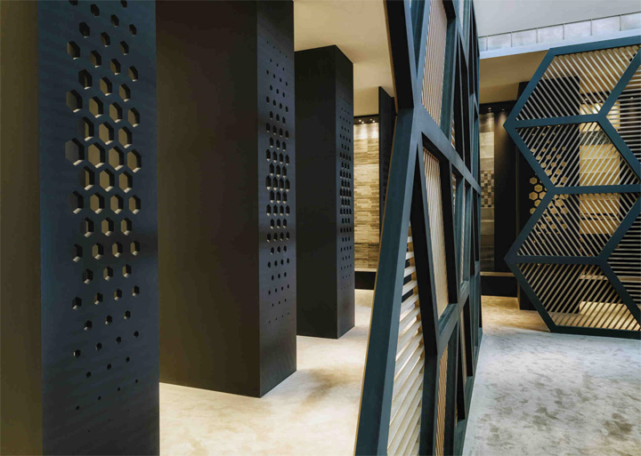
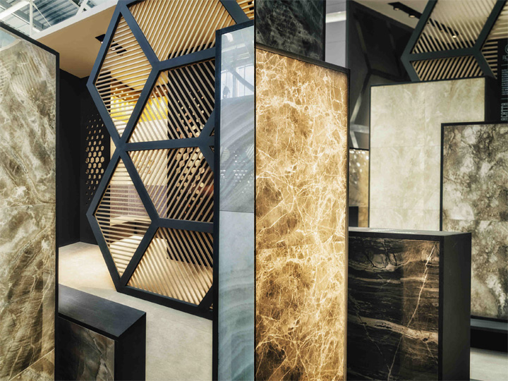
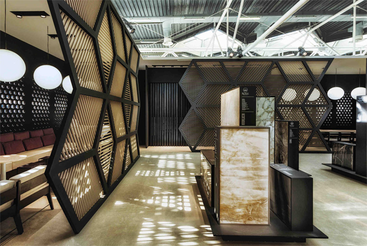
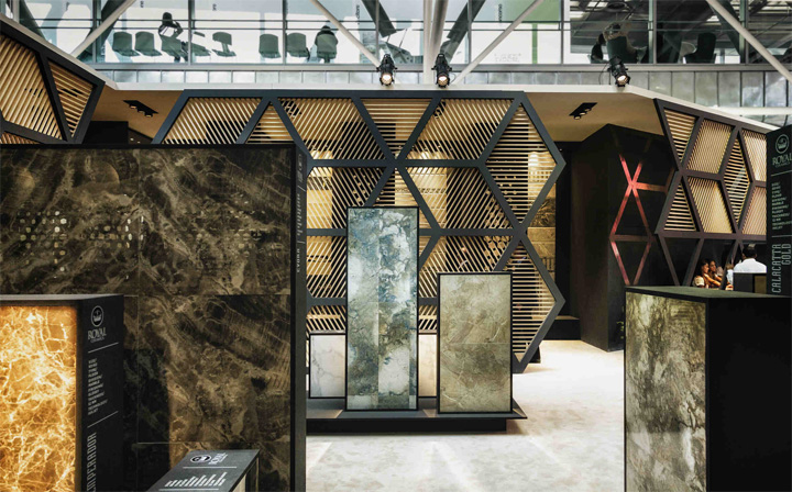
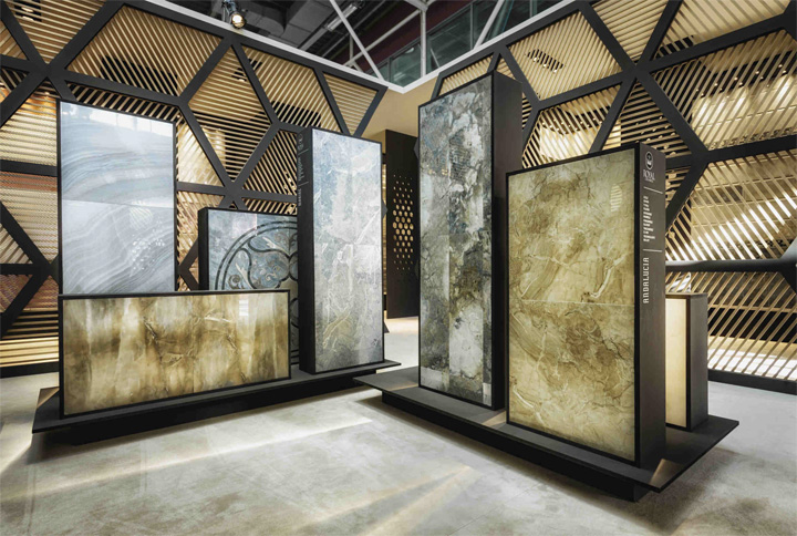
Inside the space of the pavilion is divided and organized through an alternate play of solid walls and hexagonal macro shaped semi transparent vertical partitions to achieve a perfect framing of the main groups of products and in order to optimize the functional use of all the available space without sacrificing its strong decorative appeal.

The exhibit of the nineteen marbellous models is the focus of the central area of the stand. The visitors can browse among look-a-like blocks of marble of different sizes in a landscape of volumes that contradict and complement each other. The blocks are placed on “floating” platforms adding an intriguing element to the whole composition.

The central courtyard is surrounded by the lounge area and the meeting area both complemented with custom made furniture. In a continuous play of overlaying, the hexagonal macro shaped semi transparent walls inside visually overlaps the perforated decoration of the external walls giving to the whole stand a vibrant yet elegant effect.
Designer: Paolo Cesaretti
Assistant designer: Kostantia Manthou with Michela Pinna
Visual design: Claudia Astarita
