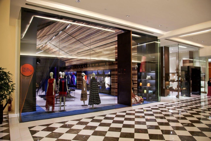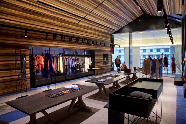

Designed as a first in a series of multi-designer pret stores, where the collections are themed and curated, Neel Sutra – The India Fashion Store is emblematic of Indian Design ethos. Sited at the New Oberoi Hotel in the suburban abode of NCR – Gurgaon, the hotel spawns a high-end luxury international experience. The brief was to create a unique and distinct design ambience that would be conspicuous within the context of other established global hi-design brands at the hotel and elsewhere in the vicinity. The customized and curated store, emblematic of Indian Fashion is conceived within this international collective construct as a step ahead of conventional high street retail to showcase a motley bunch of Indian fashion designers. Contemporary design in India usually expresses the complexity in Indian Design discourse with kitsch. The India Fashion Store is a cognizant attempt to stay away from Indian Kitsch, and instead craft a sacred space.

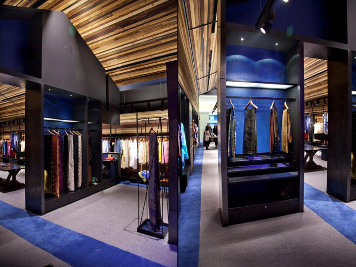
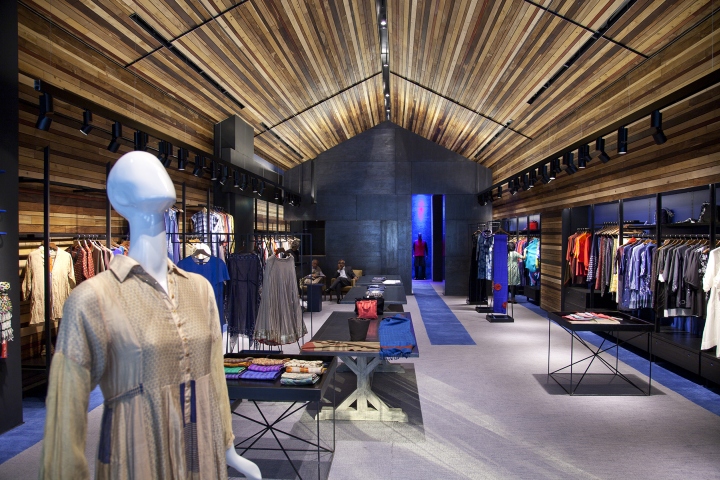
The India Fashion Store is envisioned as an austere House of Indian Fashion employing the hut as a rudimentary notion of shelter, with facets of the Indian design ethos as architectural interventions. A candid reference is made to the Single Line hut diagram; planned in the form of the veritable architectural notion of the plan, section and the walls, a hut-like section with a pitched roof allows for the generation of a strong axis that facilitates the demarcation of the space into the two key components of a retail store- display and movement. The section exaggerates the linearity of the space, the entrance, and finally, its visual termination with a blue niche at the end to emphasize depth and the axis of the store through dissonance. Given the evolutionary nature of the space with its changing collections, a perception of order and Indian tenet is endowed through a play of scale, materiality and technique.

The aperture at the entrance transforms itself into the main door, its solidity becoming characteristic of its physical identity. It also aids in announcing the store to casual observers, rendering its formidable presence, making it larger than life. The niche at the rear converges into an altar-like entity, bestowing the House with a profound solace that only a visitor can encounter. The central space is left vacant for topical display, generating a scale that encourages people to look up towards the pitched roof upon entering, a relic of the hut. This allusion to the pitched roof insinuates the home for Indian Fashion.

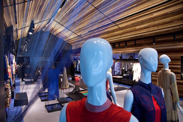
An overall muted color palette is used to offset the curated content at the store. All the incidental, residual elements intended as a backdrop, are hence rendered black with a no-sheen, black paint (called blackboard) that is typically used in public schools to refresh the chalkboards. Another classic technique used to execute the matte black finish, is the use of kajal polish (the Indian Kohl pencil) to exploit the void-ness of black. The timber lattice defines the volume, with distressed zinc, aluminum inserts and blue accents. Originally envisaged as a series of the traditional Indian duhrrie, representational of the Indian weaves, the floor is a hand tufted carpet in ecru and blue with nine different tones of gray and knots. Running through both the horizontal and vertical surfaces, this carpet transforms into a blue rung ladder on one wall intended for display and blue niches on the other.

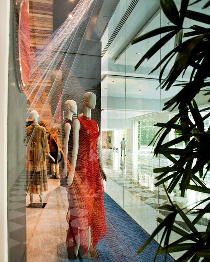
The ladder is also a suggestion of the hut prototype of the simple ladder used in traditional huts to move to the top. The blue carpet terminates into a blue niche at the end of the store, slightly off-centered, emphasizing the axis running right through. A threadwork installation (sutra – a remnant of textile weaves) at the front of the store in shades of blue (neel) and orange also makes a reference to the branding, terminating in the form of a woven wall at the extreme end. The experience of the hut-section, the clarity of the plan together with the presence of altar-like backdrop at the far end of the space renders Neel Sutra as a unique, well-defined, progressive endeavor with a handcrafted approach in retail store design that is befitting to the avant-garde India.
Principal Architect: Architecture Discipline
Design Team: Akshat Bhatt, Aditya Tognatta, Nikhil Auluck
