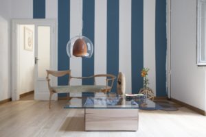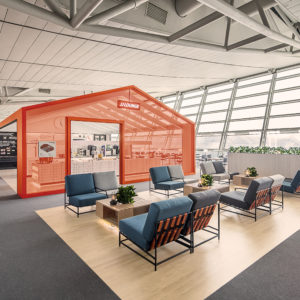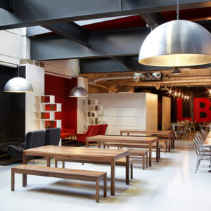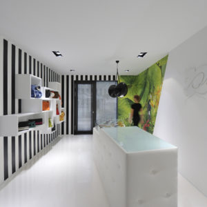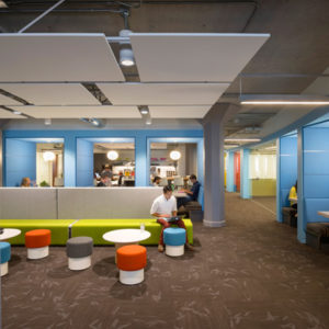

Loisir is a baking studio & boutique cafe owned and operated by patissier Sookyung Kim about afternoon tea and cake. Loisir got inspiration from the ‘time seeking solitude of life’ and will interpret and show desserts in France and Japan after Loisir’s own fashion. The client wanted Loisir’s own sensibility interpreted by the designer could be expressed in a space just like the ‘space achromatic colored, unexposed but fascinating itself’ felt from the dessert cafe Pied, the previous work of Nordic Bros. Design Community, and she wanted to commune with the designer through various themes.

During the process of understanding the client, the designer deduced the direction towards the ‘space changeable each season’ and focused on allowing a margin at important points of the space while concentrating on the layout such as the utilization of interior and exterior spaces separated into two stories and minimization of the traffic line.

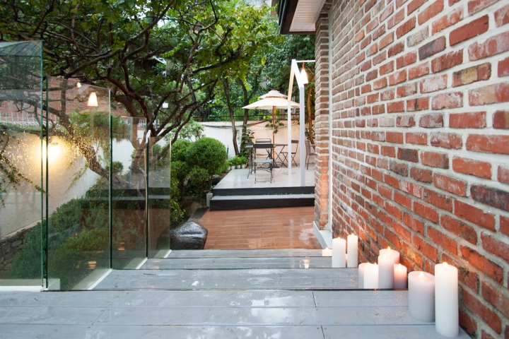
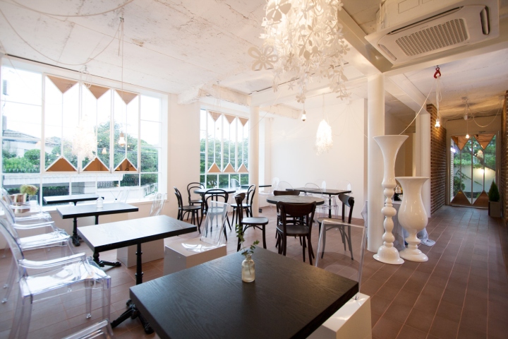
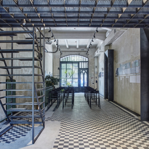
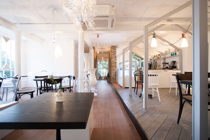
Before selecting materials and colors, the client asked to preserve the appearance(used bricks) as much as we could upon request by the landlord, and the designer put emphasis on the use of unsmooth finish materials such as terracotta and painting of the exposure state to fit in the used bricks.

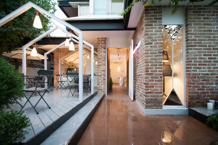
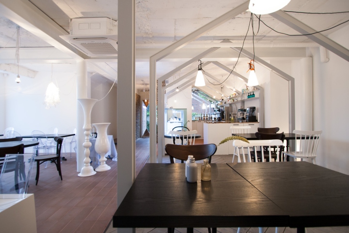
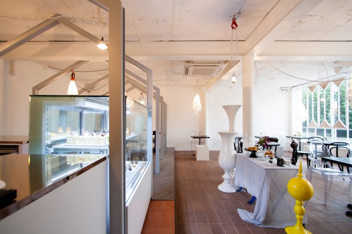
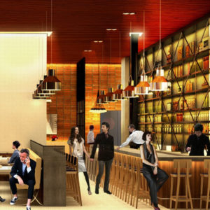
Second floor inspired by an arcade and a corridor. To utilize merits of the previous environment(the house with an open yard and a quiet alley), it blurred the distinction between spaces and emphasized the continuity by arranging the gable roof structure consecutively in a row inside and outside. While providing each table inside and outside with the individual view and leaving a margin for a line for lighting equipment, it used copper as the accent color to express the space image that fell under narcissism.

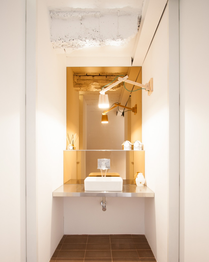
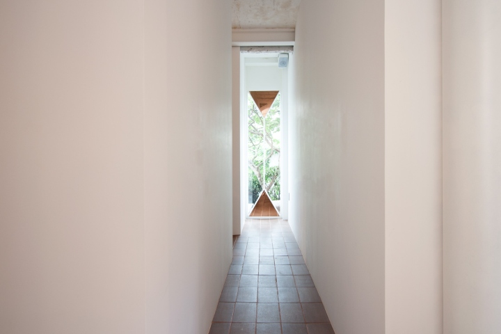
First floor substantial in the utilization of space. After combining two previous studio apartments into one and placing the baking studio and the stairs going to the cafe upstairs in the center, the staff room, storage, main kitchen, toilet, and office enclosed them in the form of ㄷ to minimize the traffic line and fully utilize the space.
Photography by Nordic Bros. Design Community
