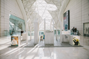


Shopping Centre Sustains Growth in The Hague. Voted the best Dutch city centre of 2013–2015, The Hague beat Amsterdam by actively working toward livability, a mix of functions, and a varied retail environment with well-integrated modern interventions in a historical setting. The New Passage / Nieuwe Haagse Passage by Bernard Tschumi – which opened to much fanfare in September – is seen by the municipality as continuing a positive trend in the development of the city’s core. Although the passage is not a common typology in Dutch cities, it does have a historical precedent in The Hague. Dating from 1885, the covered street formed an important shortcut between prestigious department stores. Due to the changing retail landscape of the city, the large department stores were reoriented one block to the south, and the passage, exceptional as it was, lost some of its urban function.

The city and the developer both agreed on the necessity of extending the historical shortcut in order to create a stronger urban connection and improve the flow of people in the centre. Bernard Tschumi was chosen by the developer due to his ‘continued interest in urban spaces and his ability to create iconic architecture’. At the opening, the architect himself declared his aim was to ‘connect to the best traditions of the past in a contemporary manner and make a positive contribution to the urban fabric’. The connection and integration within the city’s street plan is seamless, and the architect has even retained one of the original façades that faces small-scale retail on the passage’s north side. The south side, which sits among large department stores on the Grote Marktstraat, makes a stronger statement. Its boldly fragmented volumes with amoeba-like cutouts might not be to everyone’s liking, but they act as an effective urban marker.

The finer details of the architecture are, however, a little less spectacular. The building is clad in faint blue tiles – a reference to the ceramics of the neighbouring city of Delft. On the whole, though, its detailing only reaches the standard of contemporary shopping malls, a shortcoming all the more noticeable given that one can easily walk over to its more elaborate older sibling.
Photography: Ontwikkelingsmaatschappij Spuimarkt
Design by Bernard Tschumi


http://www.frameweb.com/news/the-new-passage-by-bernard-tschumi


