

To bring the modern day customer into the next generation of the Michael-Angelo’s food experience, this family-owned, Toronto-based specialty food retailer looked back at its forty-plus year history. In other words, they moved forward by looking back. By remembering what the business is all about. In the case of Michael-Angelo’s, the family realized that, in the end, it’s really just about food – “For the love of food” and “Sharing our love for food.”

Like watching Nonna perform culinary magic in the kitchen, the preparation of food for each individual customer makes ‘food theatre’ one of the tools that allow Michael-Angelo’s to educate and inspire. The new 10,000 sq. ft. space (curated down from its more typical 55,000 sq. ft. traditional grocer) has in-house chefs making fresh creations for customers while digital screens capture the event to entice and inspire the passersby.

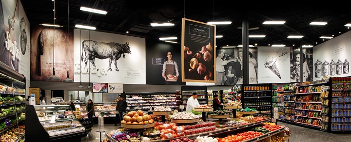
The overall design aesthetic supports a food experience steeped in specialty foods, with a commitment to authenticity, old-world tradition and craftsmanship. With its inspirational and architectural imagery, the design tells a story that celebrates culture and food. The uniformly coloured department signs, with their unique fonts, are a play on the signage that make up individual storefronts within a culturally unique and urban food market streetscape, where each shop is highlighted by their specialty (the butcher, the baker, etc.) In each department, an overscaled photograph of the food specialist brings a feeling of sincerity, honesty and authority. Graphics are used to highlight an aspect of the food’s preparation, quality or provenance that helps strengthen the customer’s trust while visually guiding them from area to area – or from ‘shop to shop’ – within the store.

Perimeter walls highlighted in ‘painted’ antique brick enhanced by ‘woodblock carved graphics’ add a textural quality and introduce a clean black and white motif. The care needed to hand carve each ‘wood stamp’ echoes the handcrafted quality brought to the store’s prepared foods. Simple wooden architectural features encompassing the Bakery, Caffè/Gelateria and Deli add a warm quality to the space while textural elements iconic to each department – rolling pins, cutting boards, plates and cups – bring a traditional feel in an orderly fashion. A sense of honesty is conveyed through the selection of materials; neutral woods, natural terrazzo flooring and vintage painted brick reinforce the design’s ‘genuine’ appeal while also highlighting the overall commitment to authenticity through an old-world tradition for the modern sensibilities of today’s customer. In short, the new Michael-Angelo’s proves that looking back can help you move forward.
Photography: Neil Hill / Watt International
Design: Watt International




Add to collection
