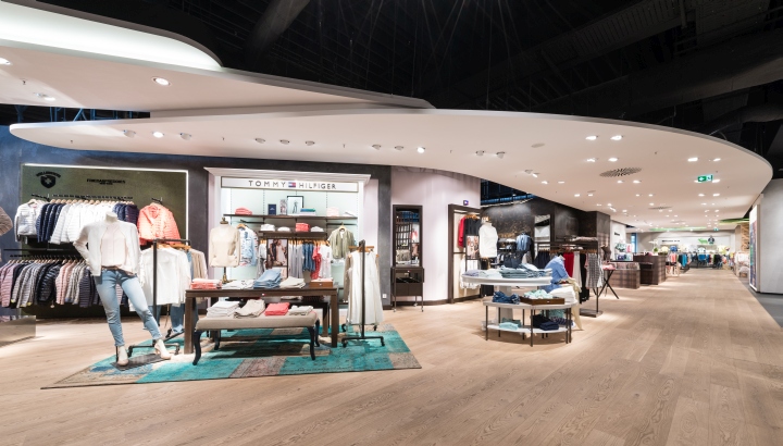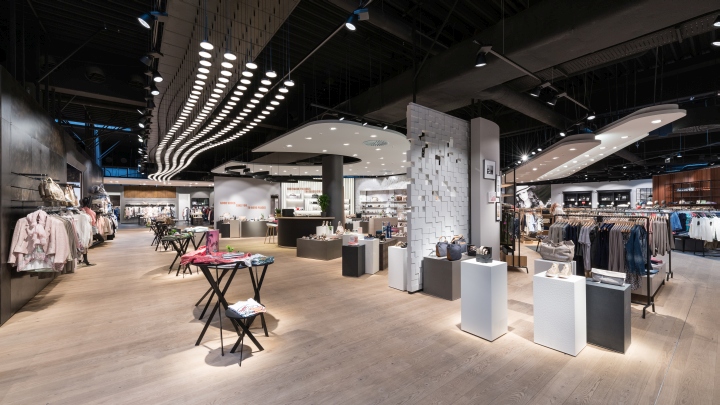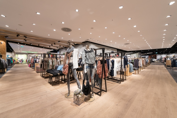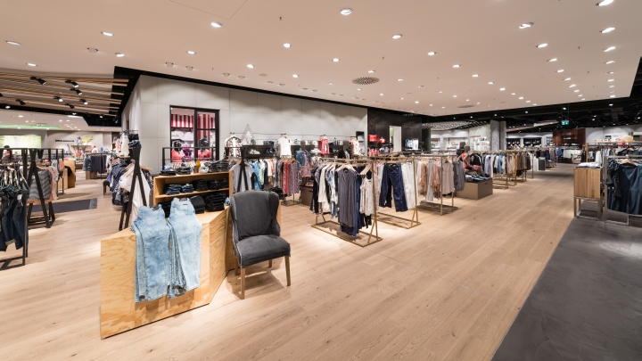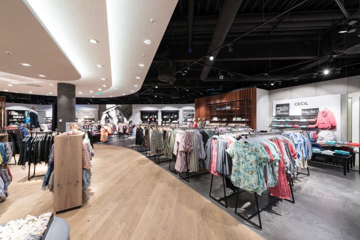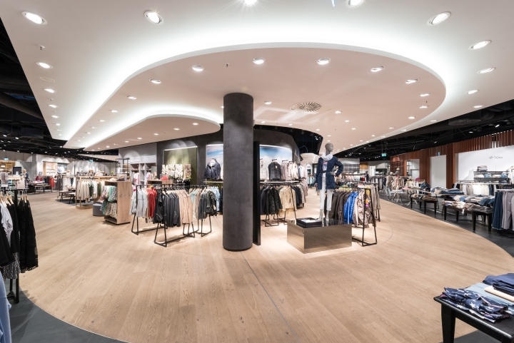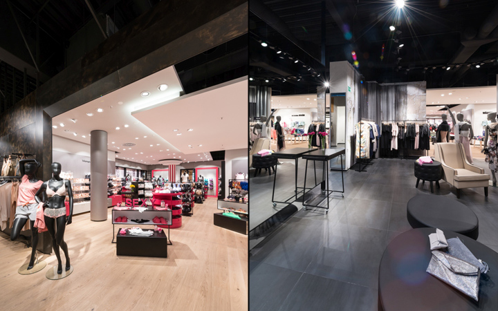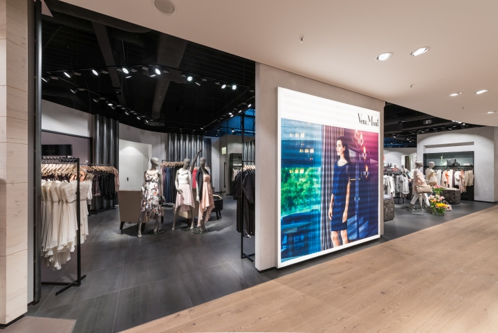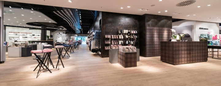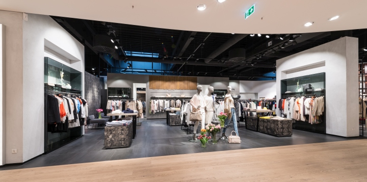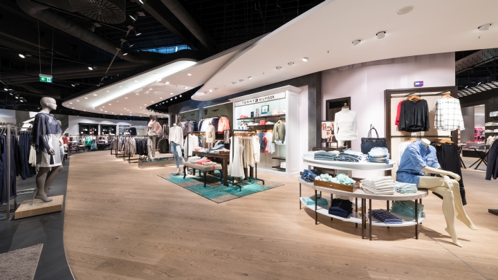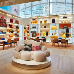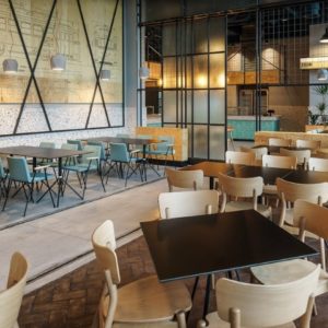
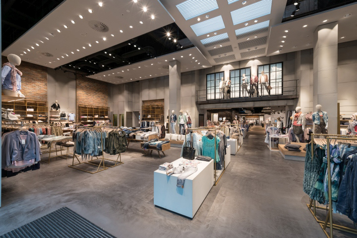

The new store area is a section of the former “Praktiker”- construction market. The highlight of the shop is the about 400 square meters large entrance area with a room height of more than 7 meters. The following main area with a retail space of about 2.200 square meters has a clear height of about 4,5 meters. A special requirement at the beginning of the planning process for the salesroom design was the arranging and structuring of a total retail space of approximately 2.600 square meters (all on one level, on the ground floor) so that a well organized and clearly recognizable and comprehensible store was created for the costumers on the one hand, but individual and partially self-contained sections were formed, matching the product range as well as the target group, on the other hand.

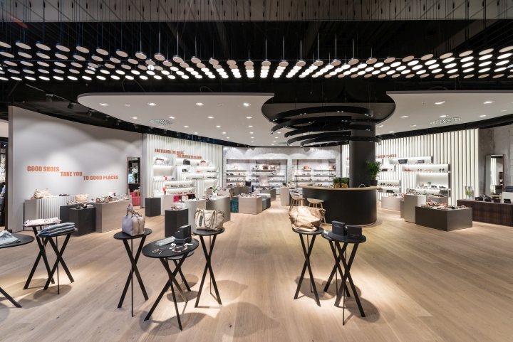
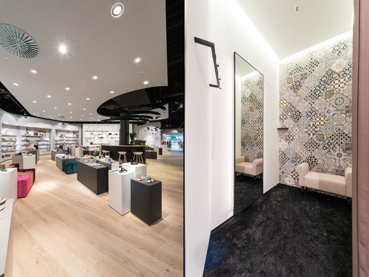
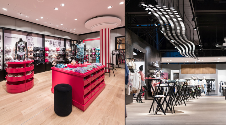
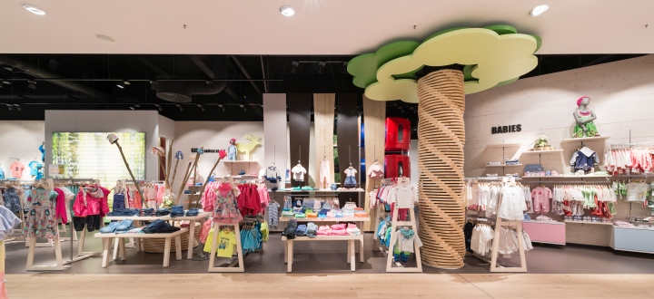
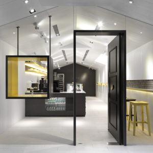
So the lingerie department is located at the centre of the shop floor in a separate “house” with two entrances and two additional (openable) windows establishing a visual connection from in- to the outside and vice versa. Also separately located, but in a more open way (compared to the lingerie department), is the shoe department with its small coffee bar. The same principle was used for several other sections such as the one for the evening wear.The store provides its customers a complete range of womenswear including lingerie, from entry-level price range up to the premium segment, from Young Fashion to Modern Classic. Furthermore there is also a Boys-and-Girls- children’s department.

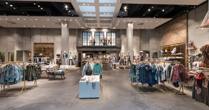
The very high entrance area was designed loft-like: jointless decorative screed, back walls made of exposed concrete combined with ceiling-high brick walls placed in front of them, tables and racks consisting of brightened oak wood and metal profiles with a brass finish. Individual gypsum board – ceiling panels create a dynamic space. A 3-meter high metal stage stretches along the entire length of the 6-meter high façade between the storefront and the ceiling-high back walls of the shop serving as a decoration area.

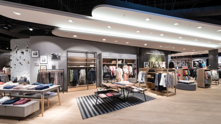
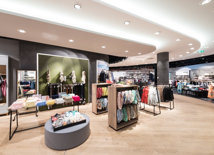
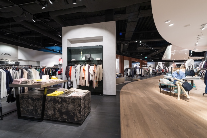
A great part of the salesroom has an openly designed ceiling. Various, partially rounded and in different heights overlapping ceiling panels define the basic structure of the customer’s route through the shop. A special highlight is the central light staging: the 450 wavel-like arranged special LED lightunits are individually controllable and have dynamically adjustable brightness levels. This makes a variety of light scenarios possible, from discreet waves up to a lightstorm.

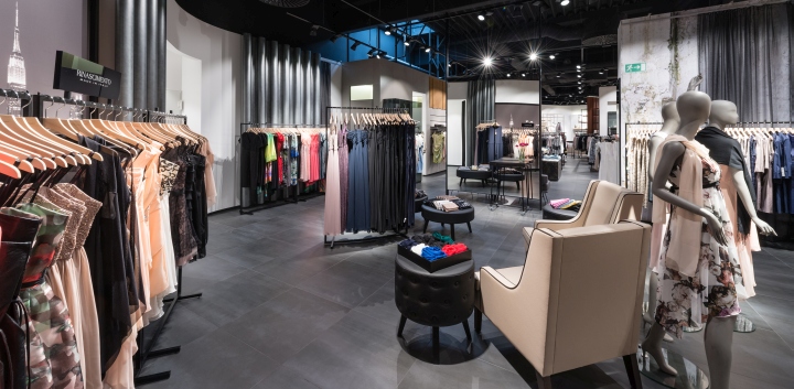
Various floor coverings were laid matching the different assortment sections throughout the store: subtle grey-oiled cottage oak planks, a largely dimensioned anthracite-coloured tile floor, the decorative screed in the entrance area as well as linoleum for the children’s department.

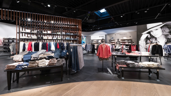
Then again the back walls were also designed to match the different assortment sections: Patinated metal surfaces in combination with exposed concrete at the “Modern Woman” premium section, simple back walls combined with black built-in cupboards papered in parts at “Modern Classic”, special high-quality glass surfaces at “Classic Premium”, vast photo wallpapers with metal “curtains” at the evening-dresses department, cabinets in combination with wooden boarded walls at the lingerie department, plywood walls at “Young Fashion” and glazed spruce walls at the children’s department. The shoe department features back walls with a backlit lamellar structure with engaged boxes for the goods presentation and also a few with protruding pixelated surfaces. At the beginning of this department one of the walls optically dissolves: several wall elements were removed, so that exciting perspectives appear.

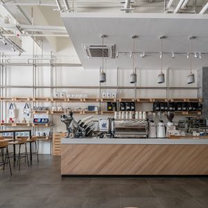
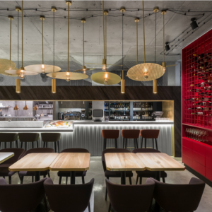
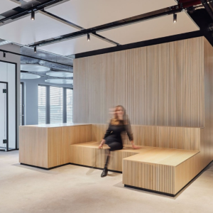
The illumination above the coffee bar brings additional dynamics into the place. The “Modern Classic” and the section with the pants and knitwear have lamellar back walls centered in the middle, with lamellas that are set in a way, so they allow you to see through them from some viewing points, while forming a single unit, letting the goods displayed in front of them be clearly recognizable, from other. The dressing rooms are generously dimensioned and elaborately designed. The seating in there is anything but ordinary and together with the special wallpapers and surfaces a pleasant atmosphere is created.

Overall a quite metropolitan appearance, but – according to the client’s specifications and preferences – incomparable, not cool and distant but inviting, comfortable and such as the owner family: with passion!
Design: MAI | Messerschmid Architekten und Innenarchitekten / Jochen M. Messerschmid
Photography: Adrian Beck
