
This project is an office on the top floor with an area of 820 square meters and a storey height of 6 meters. Our mission is to create a multi-functional, young and fashion working environment for a multi-department company. What attracts us most in this project is the 6 meters high ceiling, and we start the design by retaining the exposed ceiling of the original building.
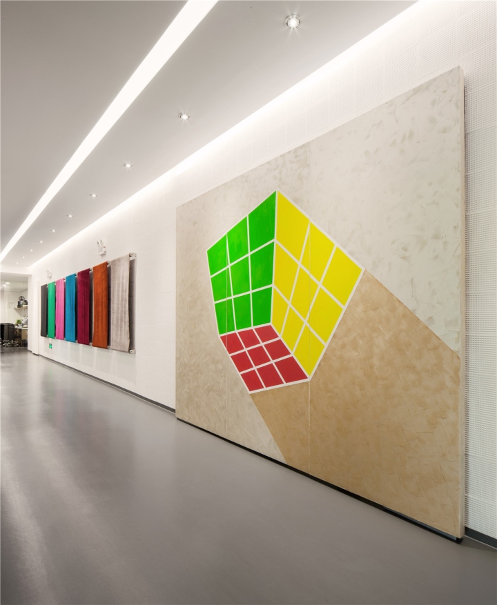
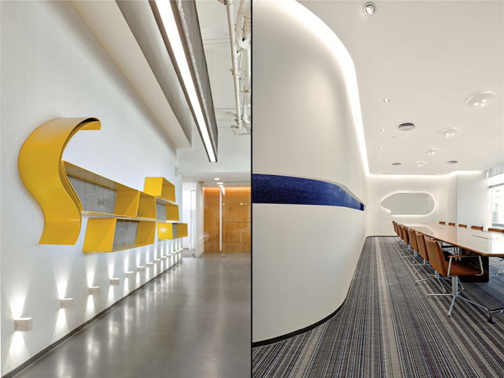
Due to the unique features of the building structure, we designed an ambulatory centered by the building tower through which visitors can travel around the office in the shortest distance. The simple fluid lines created by the ambulatory maximize the space utilization, and facilitate the cooperation among different departments. The ambulatory is the main thoroughfare of this office, and parts of the walls display leather materials that Satchi uses. The scroll type display technique not only facilitates the changing of leathers but also makes it easier to read. When walking in the corridor with the seemingly casual-distributed pictures and large custom-made exhibition shelves, visitors would feel like being in an exhibition gallery. Guiding the visitors to walk around the space circle by circle is also one of our design purposes. In this way, visitors could stop to appreciate the beauty of the materials while they are experiencing Satchi’s culture.
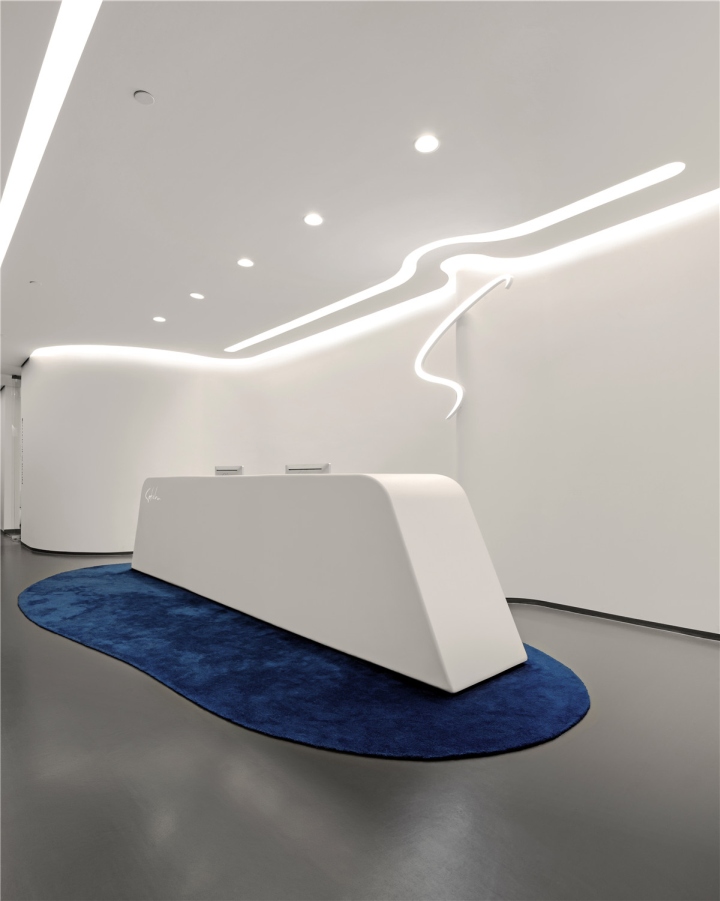
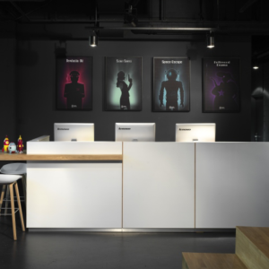
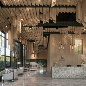
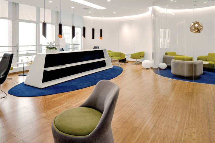
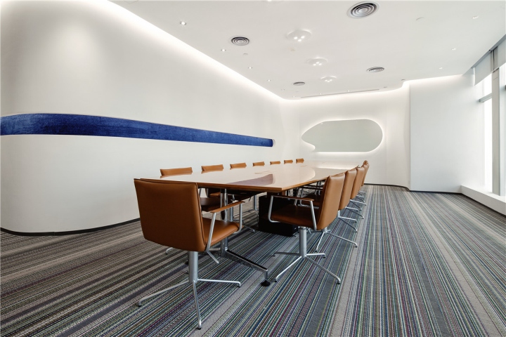
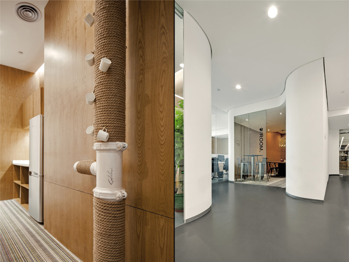
Walking into the concave fluid lobby, the curved lines of the ceiling, wall, floor and the front table guide the visitors. The lobby is also the place where the curved feature walls begins, and extended to every functional space. The fundamental color of the whole space is white, and four different textures are presented, including smooth, tree bark texture, checkers and inclined spliced tiling texture. The comparison of white and wood enrich the layers of the space, while the embellishment of yellow and blue is a presentation of vitality. Walking into the reading area, the visitors are greeted with an ample space filled with light.
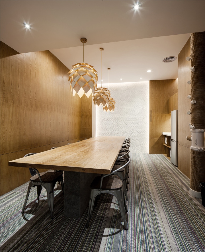
Sitting on the comfortable sofa, reading a book under the sunshine penetrates from windows would be the best thing at this moment. The reading area shares a curved glass wall with the interview room; this makes both spaces larger visually and insulates the voice at the same time. Except that some special departments need unique spaces, other departments are all putting in the open office area; the vertical letters beside the office table are the signs for each department. In this space, the designers break the original depressing working environment and recreate a bright, open and pleasant working space through combining super high storey height, exposed white ceiling and industrial hanging lamps.
Design: feeling Design / Evan Wu
Photography: He Yuansheng
About feeling Design
feeling Design believes that each space has its exclusive soul!
We cannot describe the actual concept of space, just as people cannot identify soul. As spatial designers, We transfer “intangible space” into “functional space” with more acute sense and through one or more design approaches. feeling Design devotes to giving each space an exclusive soul, offering people a totally new sensory experience and creating collision and resonance between people and the space.
Feeling Design focuses on the design of commercial space, exhibition space and brand environment–inspired by feeling, follow heart.







Add to collection

