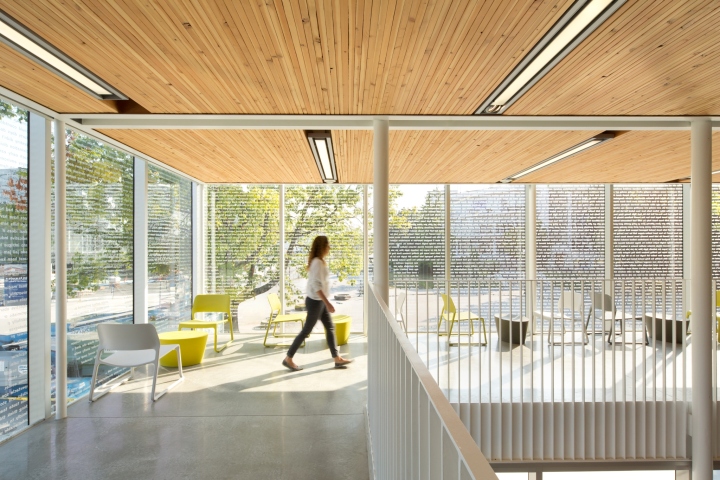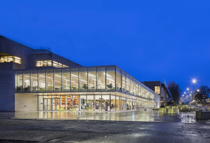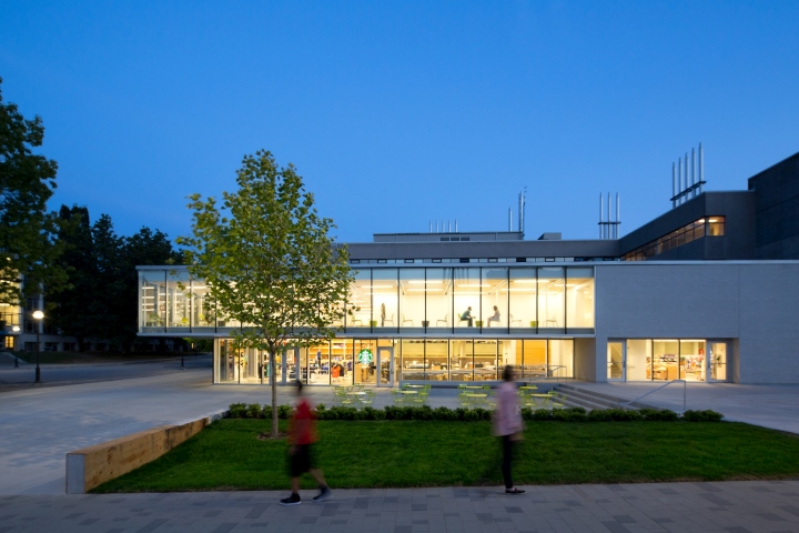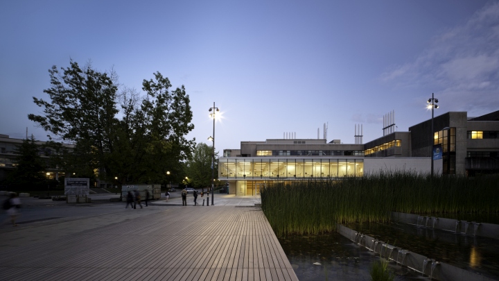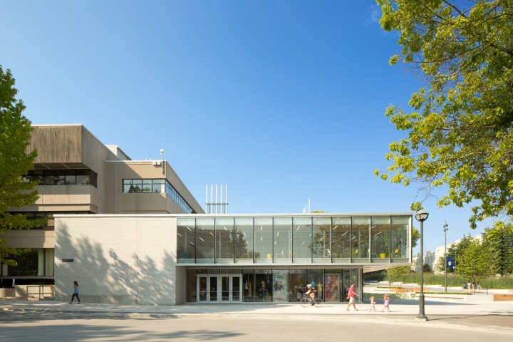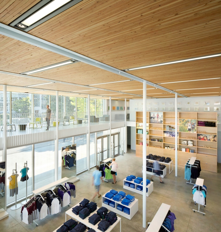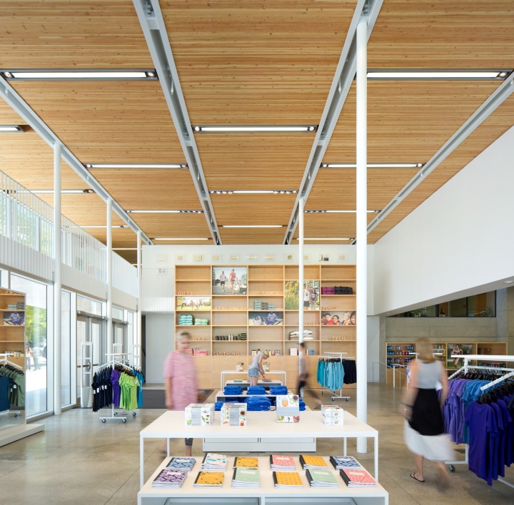


The newly renovated and expanded bookstore on the University of British Columbia’s (UBC) main campus is proof that simple design interventions can have grand effects. What began as an initiative to improve the store’s visibility and services went beyond these measures to transform the bookstore into a vibrant meeting place that invigorates the store and its broader surroundings and supports UBC students’ general well-being.

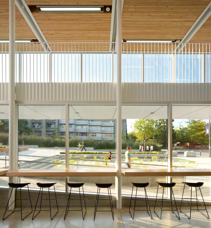
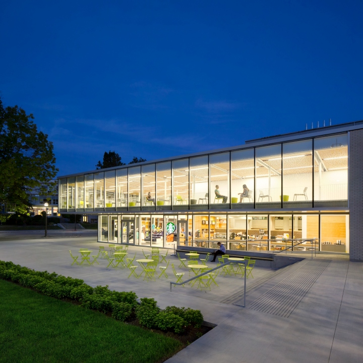
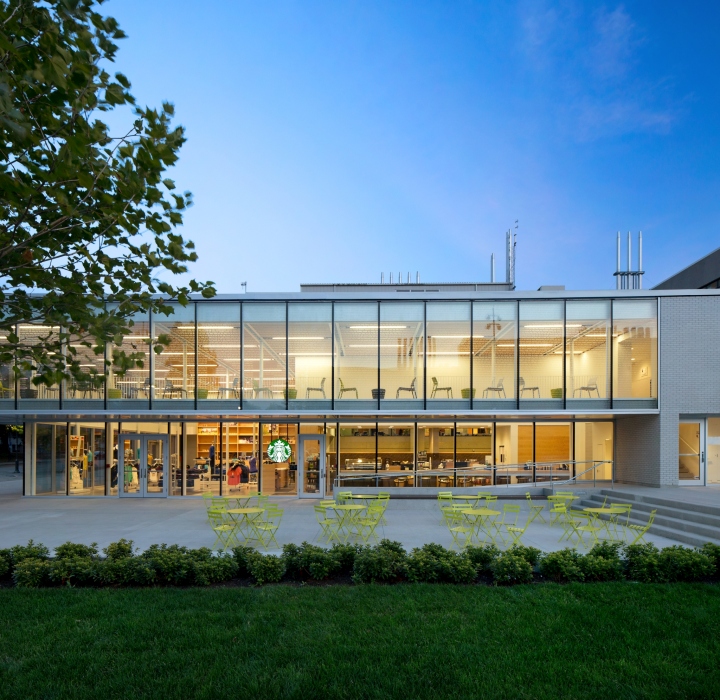
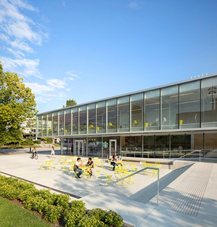
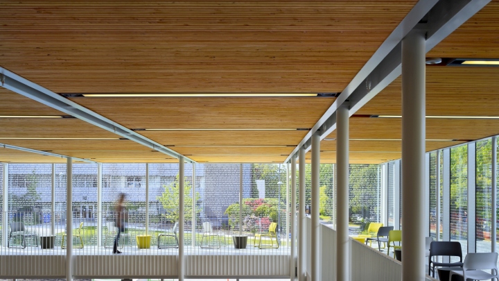
The design team began by pushing the store’s perimeter outwards and wrapping the eroded concrete face with a high performance glass skin, that converted the bookstore’s fortress-like edifice into a luminous glass box that both uplifts the retail experience and improves campus safety by creating visual connections with the adjacent courtyard and streets.

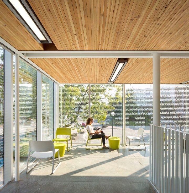
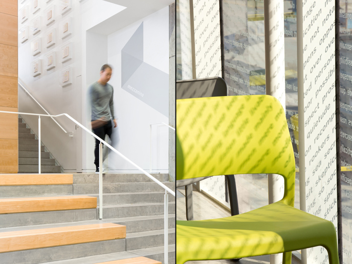
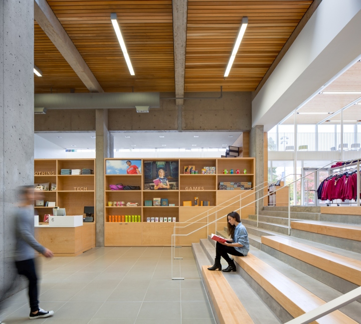
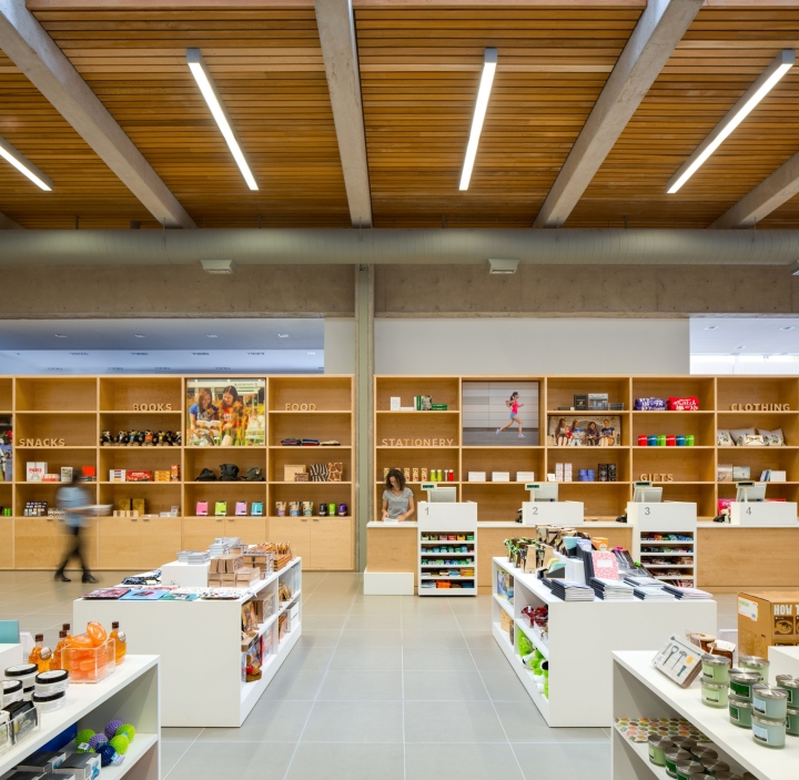
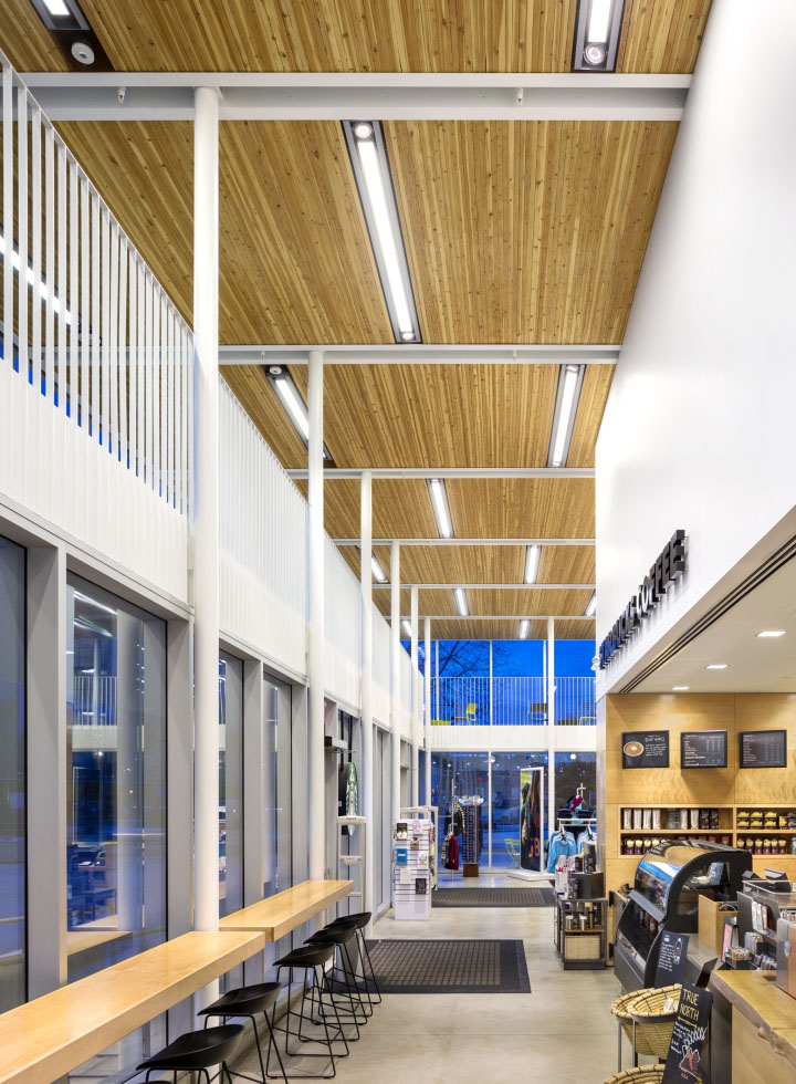
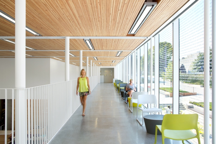
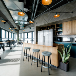
With this box, the architects were able to open the introspective interiors, and clarify the previously convoluted plan. The addition houses prime retail space for UBC merchandise, a new convenience store, a coffee shop, and a variety of flexible spaces that encourage gathering and informal exchange. The coffee shop and convenience store spill out onto a newly landscaped courtyard, further activating the campus edges. A glazed mezzanine over the coffee shop and new retail zone offers students a place to relax, hold impromptu discussions, study independently, or organize small get-togethers. Its elevated position creates optimal people-watching opportunities and adds more eyes on the street. Wanting to draw natural light from the glass box into the lower retail level, the design team cut a wide set of stairs to the basement.The poured concrete steps, with integrated wood seating, warmly invite students to explore the retail areas beyond while also offering both a casual respite spot, and convenient seating for talks and concerts.

Revamping the store on all levels of detail, the design team developed new branding derived from the store’s essence: the book. They created a new logo comprised of colourful, geometric shapes that abstractly depict open books, assembled in the form of a lowercase “b”. By assigning each shape a colour that represents one of the departments in the store, the design team created a unified graphic language for the signage and wayfinding system, visibility strips, and shopping bags.

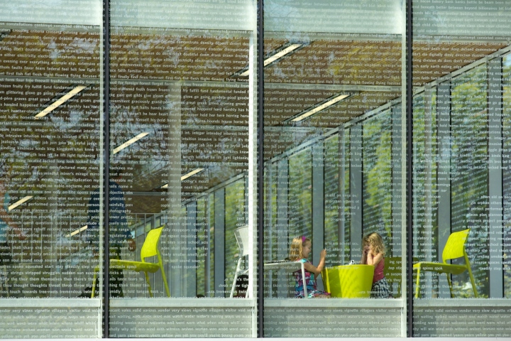
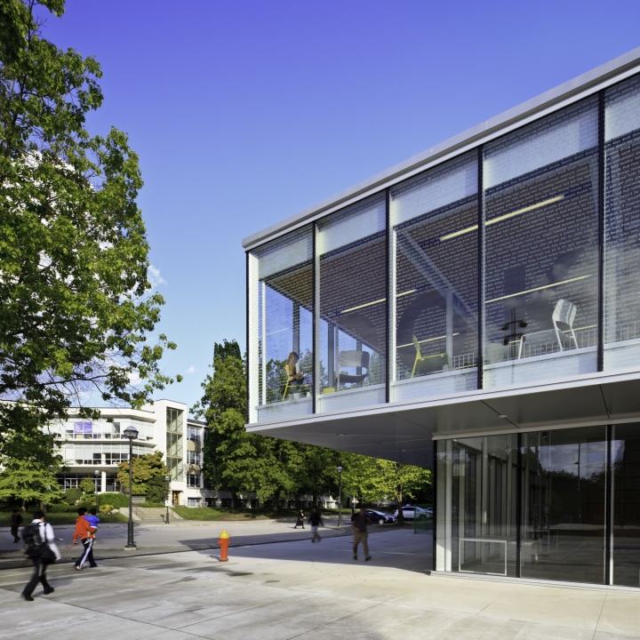
To engage the community in the bookstore’s redevelopment and its 95th anniversary, the architects invited UBC’s professors, students, administrators and tourists to name their favourite books. Then, they created a window frit comprised of the first sentence of page 95 from each entry. As sunlight filters through this sea of abstract literary language, the words wash over the interiors in a play of light and shadow while also providing shading and privacy.
Design: office of mcfarlane biggar (omb)
Photography: Ema Peter / Latreille-Delage / Ed White
