

Add to collection
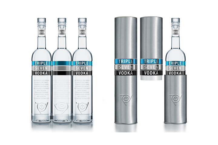

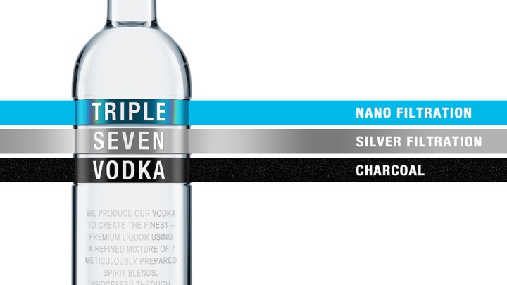
One of the leaders in the Belarusian spirits market, Zavod Bulbash, offered our studio to develop design for ultra-premium Triple Seven Vodka, using black, grey, and blue colors. Triple Seven Vodka is a blend of seven spirits filtered through coal, silver, and nano-filters. Taking into consideration the customer’s regard to the color palette, the agency interpreted the product story as three multi-colored stripes, which correspond to the sequential filtration stages. On this background, the simple, bold and contrast trademark looks remarkable.
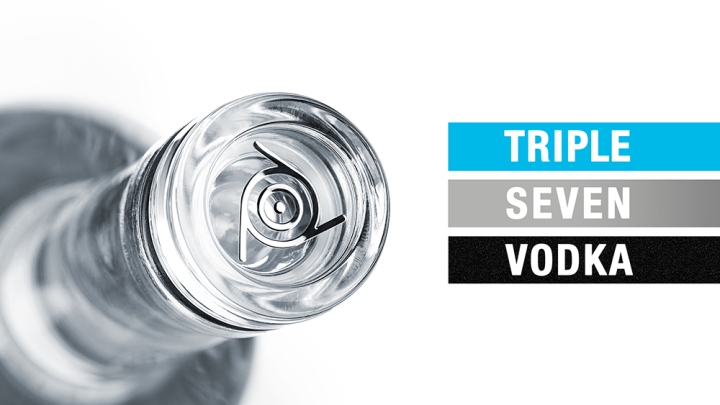
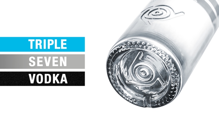
The symbol, three figures “7” turned in a circle, reminds of a rings in the water. Among several suggested variants of bottles the customer had chosen the one of a classic shape, and the agency designed a bottle with a hollow for the decoration area, a heavy bottom, and the symbol debossed in the lower part and on the bottom. Light bottle glass toning and decorated Vinolok glass stopper relate the Triple Seven Vodka with premium-class products. It’s the brand for accomplished young people who value high quality in everything they do.
Designed by ARMBRAND


Add to collection