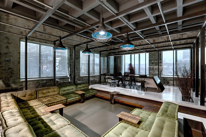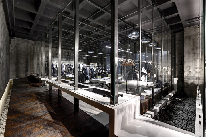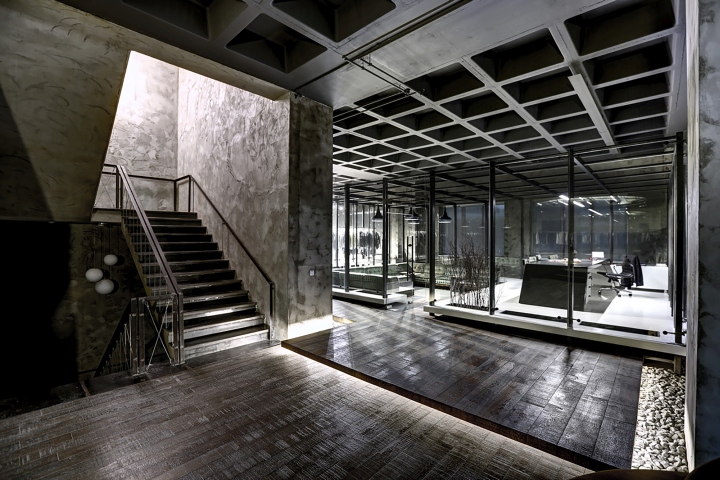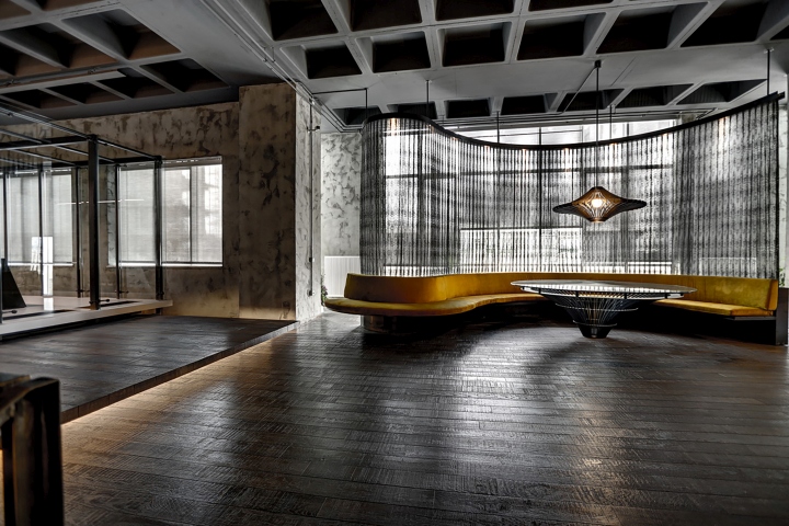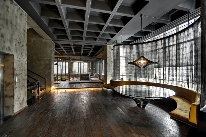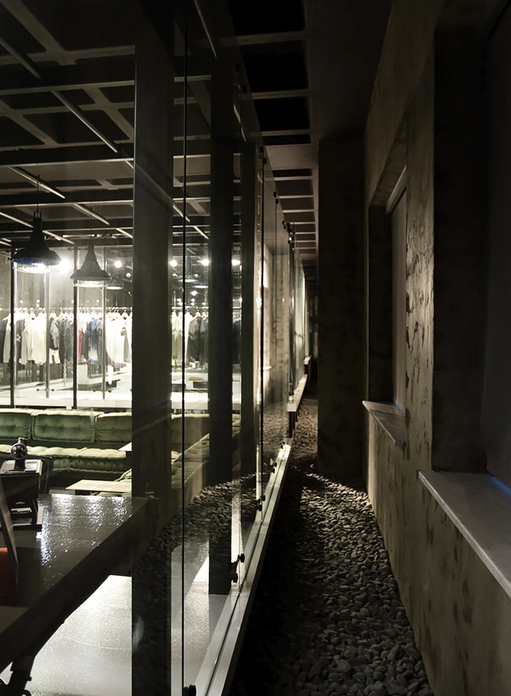

The project consist of a space designed for utilisation of the export division and a lounge area which serves that space, within the headquarter of a textile company.

The export division is composed of three main group; manager’s office, showroom and operational office which are seperated from each other plainly and these parts should have been visually related, also protect their aural privacy.

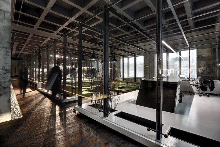
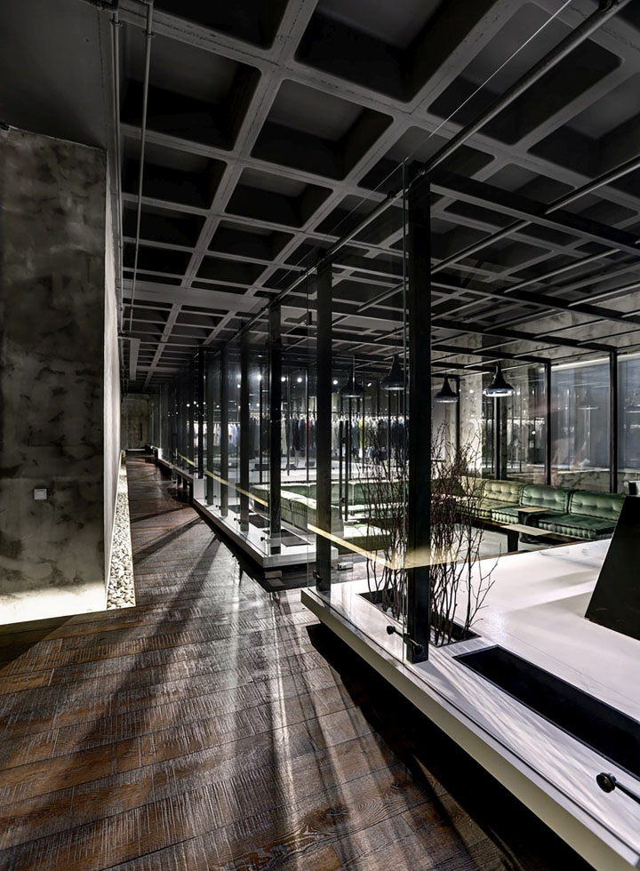
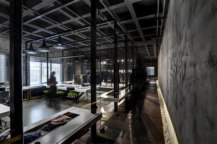
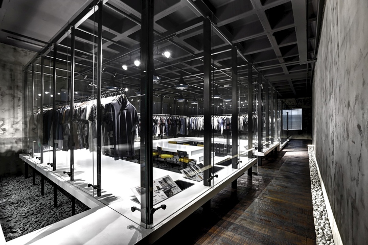
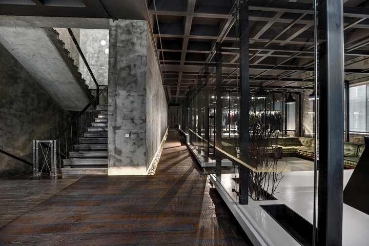
The concept is fictionalised upon three transparent main boxes positioned side-by-side to the space which have 3 main functions and a main axis without touching existing walls and floor. This axis provides the circulation within the whole building to proceed also inside of the export division uninterruptedly, and the boxes belong to the export division are integrated to this axis.

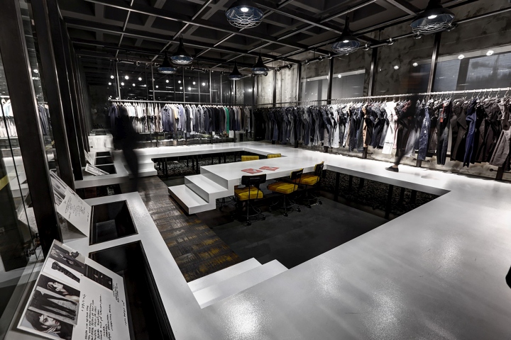
Functionally seperated subparts of the main boxes formed different levels of platforms. With getting contact with themselves and other boxes in order to provide continuity of circulation and meet the visual privacy and visibility demands of these levels, in meaning of floor level, occured an escalatory arrangement beginning from entrance. In this way, the connector axis became an element which reinforces the integrated situation by ramping and penetrating inside of the boxes.

Main boxes consist of iron construction and glass. Separating situation of the platforms and the ramp, reflected to the materials as walnut laminate parquet on the ramp and white coloured polyurethane finish on platforms.

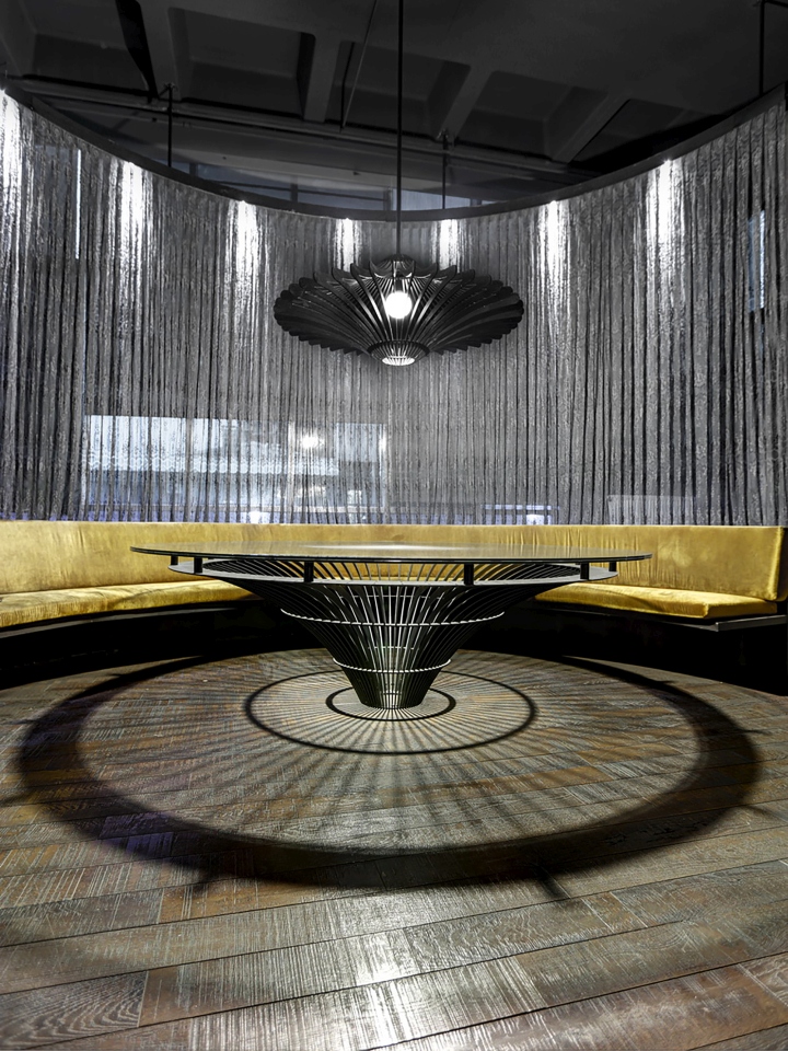
In lounge area, designed a seating unit for short-time meetings and events used by company employees and guests as well. In this context, with curvilinear form and feminine effect of seating unit, aspired an interaction area define contrasts with building overall.
Design: Zemberek Design / Başak Emrence / Şafak Emrence / Ece Ilgın Avcı / Cansu Sezer
Photography: Şafak Emrence


via Archdaily
