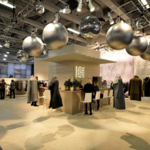

The new exhibition design designed by Demirden Design for Pasabahce met with its visitors on the 657 square meters of space at Frankfurt Ambiente Fair between February 12-16th, 2016. Demirden’s design teams’ new exhibition display carries the exhibition features to an innovative and extraordinarily pure ground with the special installations that they have designed for the display. Quality design approach and artistic touch are revealed at Pasabahce’s new display aiming to let the audience discover the space with deep and effective emotions in relation to Pasabahce products.

The exhibition space welcomes us with 2 different resturant galleries: A warm and comfortable welcome, displaying the ‘bistro’ products, continued with the interpretation of a gracious restaurant with ‘fine dining’ content.
The inviting general structure creates a dynamic mood through many open spaces, letting the visitors circulate inside the entire exhibition area in a tempting and yet relaxed mood. A total of ten different sections are involved in the project and defined under the names of patisserie, pub, cocktail, mixology, party place, cooking is an art, kitchen, garden and two different restaurants. All of these defined galleries concretize the living spaces in which Pasabahce products touch our lives in.
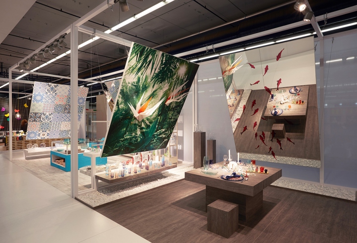
Mirrors in gigantic dimensions hanging from above along with visual installation panels create an impressive and simple interpretation in display design, as well as permitting the visitors to communicate with the products in a speculative dimension.
Usage of these angled mirrors adds a new dimension of depth and conceives an offbeat perception of the exhibition with a recommendation of new discovery through reflections.

Garden
Tropical flowers arouse by gaining their dimensions out of the greens’ rich shades from the huge plant leaves printed on the visual panels. Gigantic mirror turns into the surface of a lake where red fish swim inside. This abstract realism influenced section invites the visitors to another habitat.
Mediterranean Kitchen
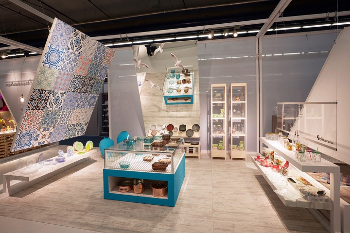
Mediterranean lifestyle and culture, reflected through the space design of this gallery help the audience observe long missed emotions: Vivid, natural, warm. This kitchen is where we can feel the warmth of a family, with huge and crowded tables set and delicious oven baked food is cooked in Pasabahce’s Borcam products. Central cooking unit is integrated into the space, one can look through the mirror recognizing the seagulls, the dominance of the sky and feel a warm and calming story of serenity being told.
Cooking is an Art
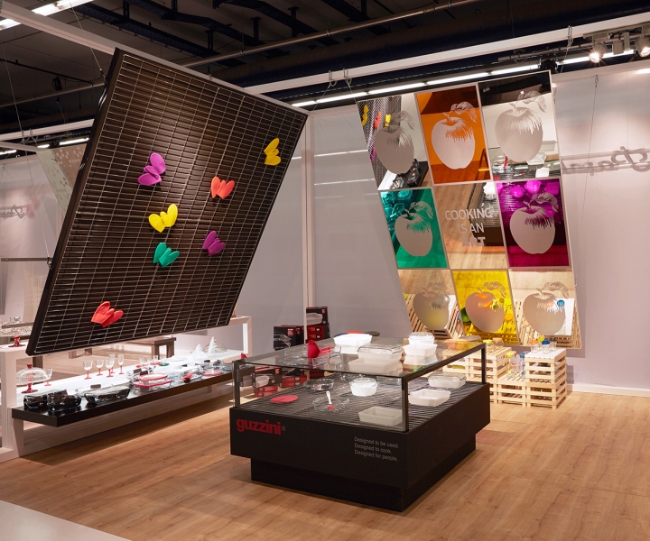
Seperated for Guzzini and Zest products, highlighting the art of cooking through pop-art, this gallery is a modern and colourful kitchen capturing the visitors. Silicone oven gloves offer a composition of butterflies on the hanging panel and the huge mirror processed with pop-art visuals take visitors into a journey. In this gallery where Guzzini and Zest products are displayed side by side, Zest part is entirely dedicated to the upcycling theme, just like its product line. Lighting details refer to the reusage of Pasabahce’s glass water gallons. Wooden fruit crates are converted into display units, synchronizing with the Zest philosophy. This joyful design, harmonically expresses the vivid world of exhibition design.
Winter
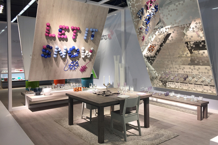
The white simplicity embracing the visitors at the winter section calls the visitors for a cosy atmosphere, a winter house. Colourful wool clews join together to state the motto of this section, ‘‘Let it Snow’’, raising a smile on the faces. Sparkling snowflake graphics on the mirror are teleporting the audience directly to the very last month of the year.
Emphasis of emotions through the whiteness and purity, the space design is remarkable with its softness and simplicity.

Party Place
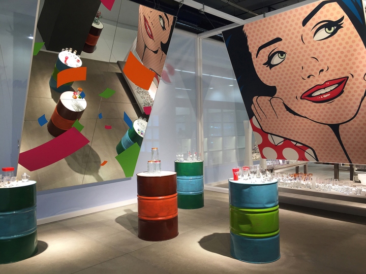
Coloured barrels and flirty looks out of a comic book illustration poster… Get ready to embrace the party atmosphere. This corner, throwing confettis through the mirror on you, creates a colourful hotspot while the colourful barrels transformed into exhibiting units generates a highly energetic place for the visitors. An actual celebration place for the products as well as a corner to have fun in…
Cocktail
The cocktail gallery will make you say ‘‘Oldies but goldies!’’, standing for a representation of an elegant cocktail atmosphere. Indubitably, at this reception you are hosting your VIP guests with the most sparkling booze. This gallery meets with the audience with a visual installation from the 30s, reflecting the vintage inspiration through nobby exhibition units made of brass combined with the royal black background.
Mixology
Mixology section expresses itself as an extraordinary area where you can set your eyes on the huge variety of Pasabahce glasses and their chic attitude. It also happens to be the gathering point to taste compatible drinks and classy mixes. The bar atmosphere embodies stylised XXL cocktail ornaments.
Pub
The beer sommeliers will never want to leave this place. Inspired by an old malthouse, this gallery holds the motto of ‘‘Cheers with Pasabahce’’. The display base created with the abstraction of the copper beer tanks and an unexpected commentary on the beer tap, will not let connoisseurs miss Pasabahce’s special beer glasses. We sense that you feel like brewing your own craft beer…
Patisserie
The irreplaceable element of a classic patisserie would be its awning. Created by the multi-exhibiting of awnings, the three dimensional graphic allows the visitors feel the Parisian spirit.
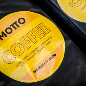
Vintage atmosphere is supported by the pick of an antique mirror and completed with a vintage looking espresso machine, making you feel like you want to order a cup of coffee. Imagine grabbing a bite of your freshly baked croissant and the smell of the fresh coffee, picture colourful macarons; the patisserie section makes us live a daydream of Paris.
Romantic patisserie is a place where you can find peace, and meet with Pasabahce’s like-minded products for cafes and pastry shops.

Demirden Design Restaurant
In this gallery we are welcomed in two different restaurants. Contemporary restaurant section contains a modern touch with elevated seatings and bistro trends, whilst the second restaurant theme is embraced with a contemporary interpretation of classicism. The sincere atmosphere of the contemporary restaurant is present as a space of human interaction and a place that you would want to have a warm chat with your friends, corresponding with the products it is exhibiting. Elegant restaurant reflects the ‘‘fine dining’’ theme, the same concept of Pasabahce products, as we notice the beveled mirror and the white table cloth.
Photography: Christof Herdt, Demirden Design


Add to collection
