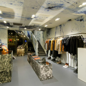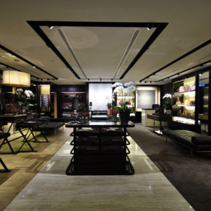


De Pratti is the most important Department Store in Ecuador, nevertheless, its appearance was not as strong as its importance and De Pratti was in the need of whole new image concept in order to lift the awareness of the brand in people´s mind as one of the best Department Stores in Latin America regardless its wide market share. A new market strategy needed to be planned and launched involving a new branding and visual merchandising rethinking as well as a new interior concept design.
The main interior design challenges were the following:
1. To turn the image concept store in order to become De Pratti into an aspirational store.
2. To generate new in store deparment concepts in order to display a new shopping experience.
3. To propose a new and dynamic layout to meet the new store planning requirements.

The new store planning involves different atmospheres.
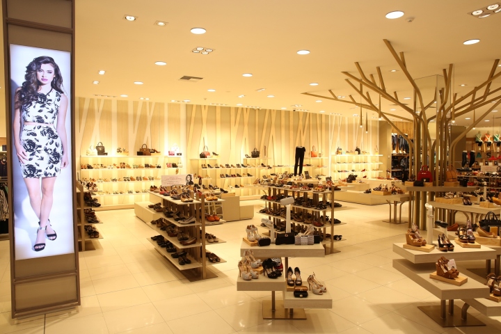
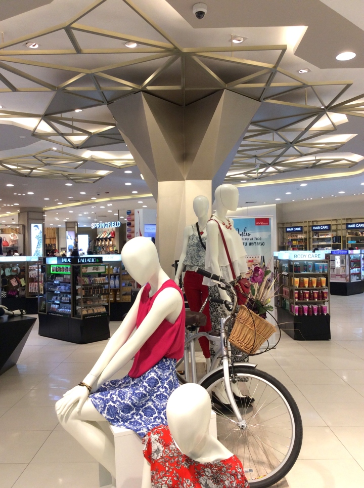
The driving idea for the new concept emerges from “a walk” in the countryside, the forest or the city. As a matter of fact, “a walk for fashion and life” where things have to involve the customer in an specific atmosphere surrounded by different elements, like trees, bicycles, leaves etc.

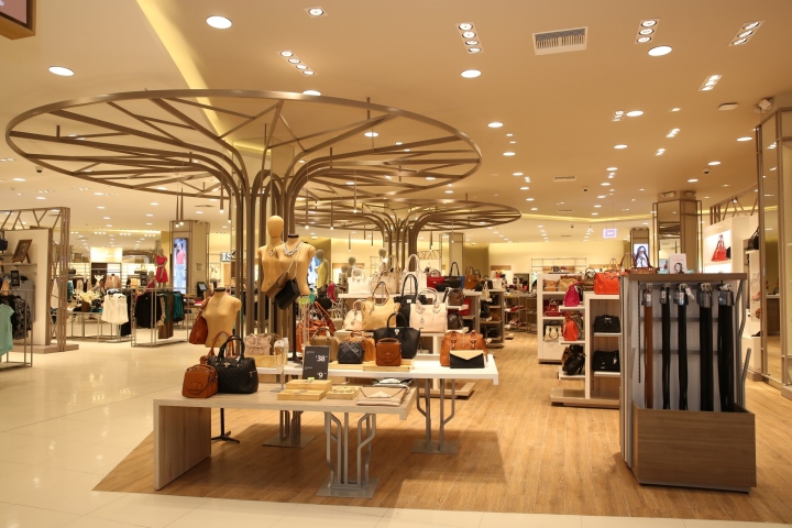
Under this driving idea of “a walk” different scenarios appear as the customer surfs the store. In each department, the existing structural columns are covered shaping them as trees in which a fashion concept of an specific department is displayed using new and dynamic shapes. Bicycles are used to emphasize the “lifestyle” concept of each area.

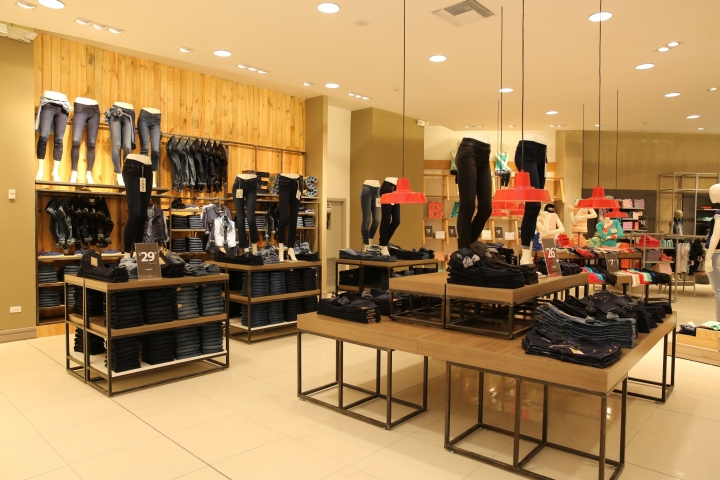
The materials and colour concept easily came along the “a walk of fashion and life” concept. The ladies apparel and beauty department was conceptualized in light wood finishes and earthly tones bringing up the lightness of the countryside colors and scents. Men department materials and colors are oriented to a shady atmosphere emulating the shadowing of the forest, bringing up a chiaroscuro atmosphere.

The rest of the department atmosphere are also referred to colors and materials according to a specific department concept, as previously described. The plain and homogeneous design of ceilings and floor coverings links the whole departments by using the same dynamic pattern through all the store. The simpleness of ceilings and floors emphasize the wall perimeters and focal points as well as all the store fixtures. These fixtures are strategically located to take the customer through a path that takes him/her to slowly discover the store in a different way.
Designed by Ares Arquitectos



Add to collection
