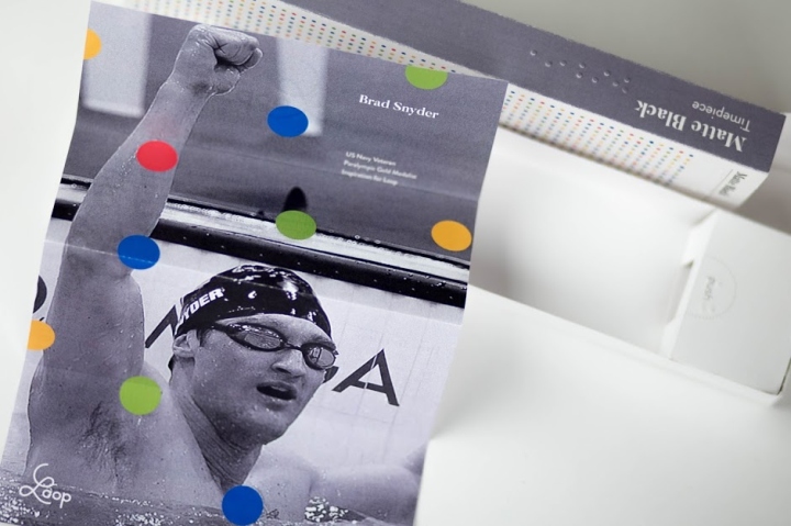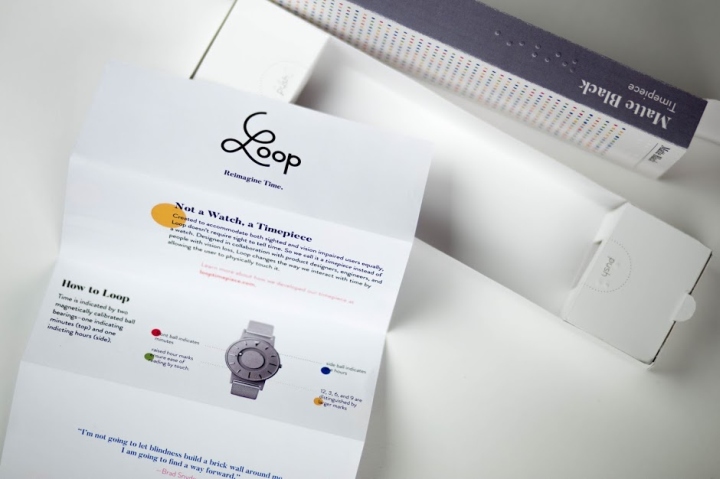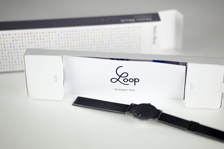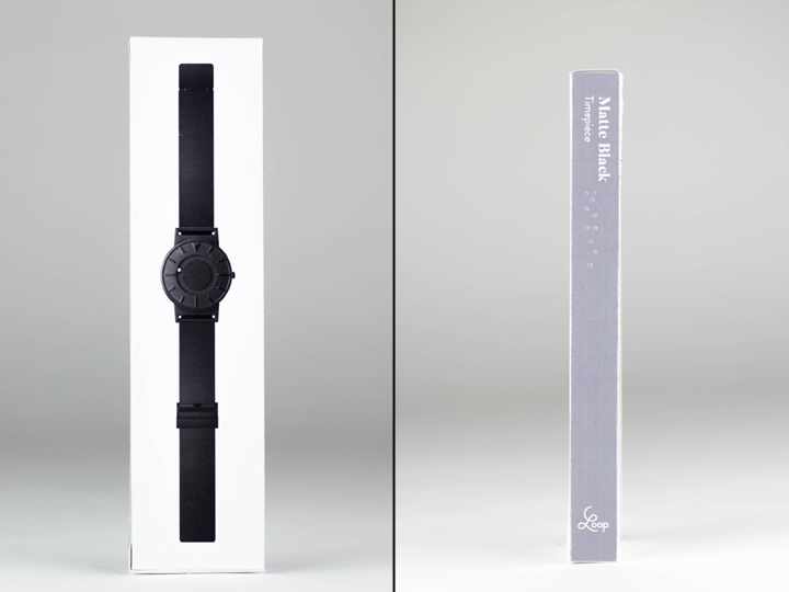

Loop is a fictional rebrand and reposition of the tactical watch, eone-time. Loop is a revolutionary timepiece that changes the way to tell time. Loop was inspired and designed for the blind, but is meant to be worn by everyone. The front bead indicates the minuets, while the side bead indicates hours. Loop breaks the fourth wall by being able to feel and interact with time.

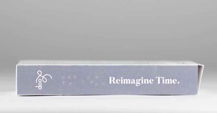
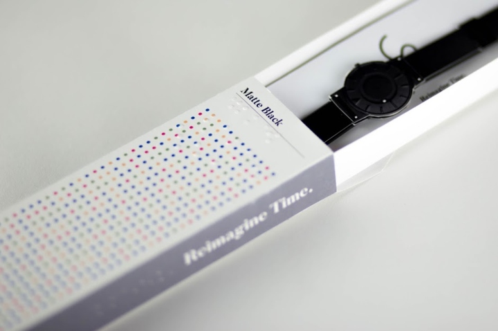
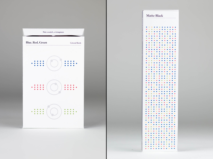
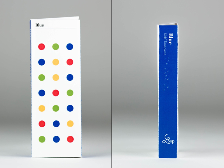
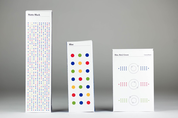
The packaging is sophisticated, yet humanistic. A major repositioning goal for the company was to expand their target audience to a broader audience. Therefore, the bright colors represent the vast range of people who wear the product. Braille was incorporated into the packaging, for functional purposes for the vision impaired who wear the product, while also creating a visual identity of dots to represent braille.

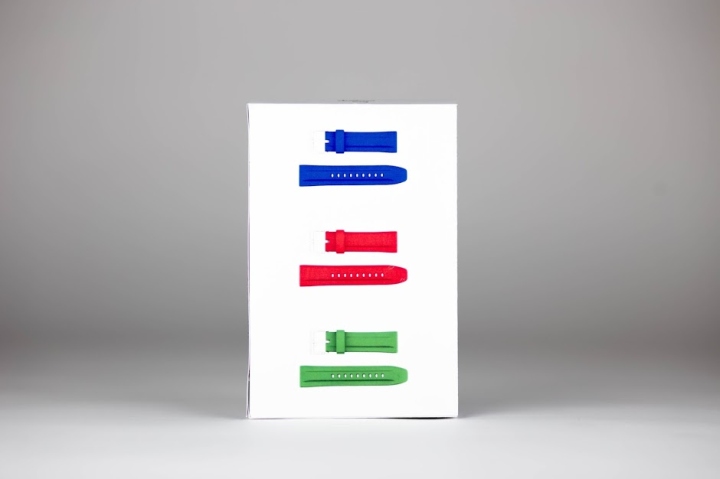
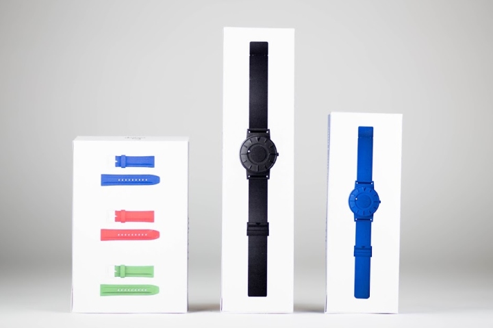
The adult packaging was the largest and most sophisticated. The kids’ timepiece featured larger dots to becoming more playful, but maintain the established visual identity. The color bands feature the dots in a more practical sense to showcase the colors of the interchange bands inside the box. All three packagings house the product on a removable tray. Below the timepiece is a brief instruction manual for the product.
Note*— Loop is a student rebrand and reposition of the tactile timepiece company, eone-time.
Designed by Sam Bumbalo


http://www.packagingoftheworld.com/2016/05/loop-packaging-identity-student-project.html
