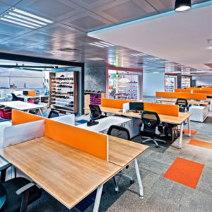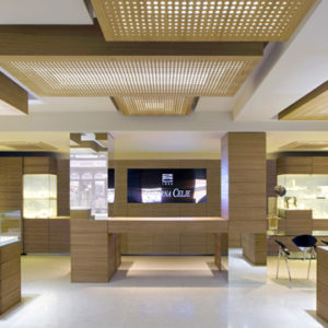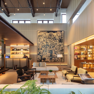
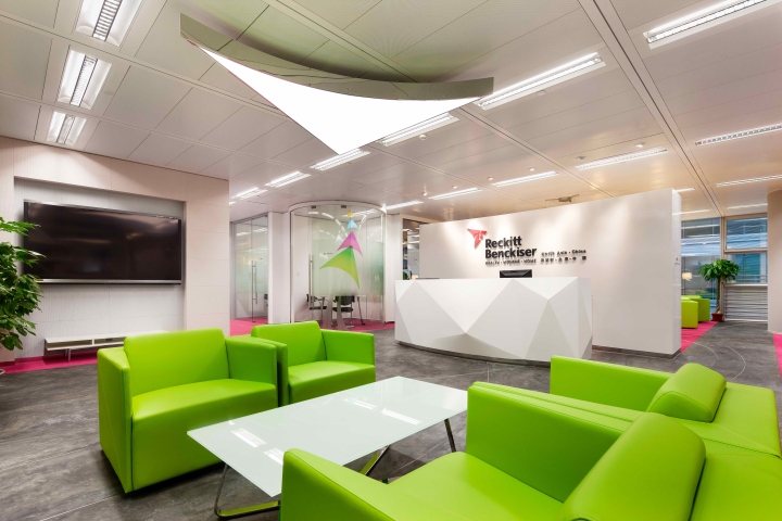

According to Reckitt Benckiser’s corporate brand identity guidelines: ‘Our new corporate brand identity takes its inspiration from an uplifting and highly visible metaphor. It harnesses the wind’s energy to provide its drive and agility. Sharp and angular, it is competitive, spirited, full of vivacity, energetic, colorful and dynamic – all attributes of our business.’ There for, by using the metaphor of the sport kite, an exciting visual language has been created around two key elements in this Hi-End with LEED Platinum office at Park View Building:
1. Corporate brand logo shape
2. Series of eye-catching Kite graphics

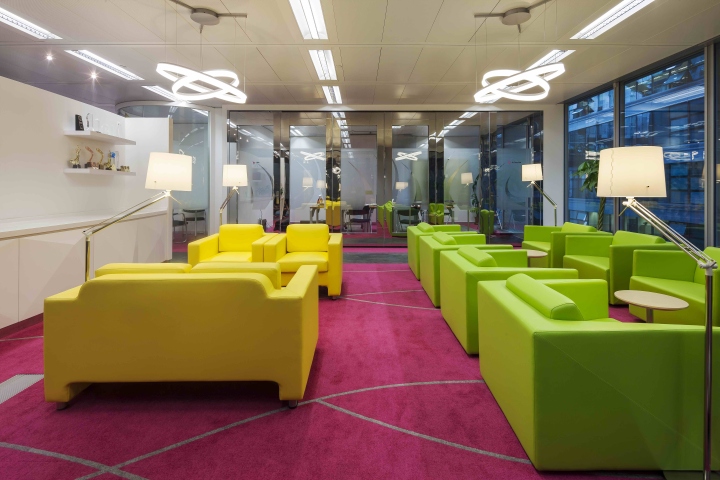
David Ho presents a highly inspired approach to a consistent tone and style with office space, and helps reinforce his client’s corporate brand identity. Colors used for the office come from the corporate brand color palette in Pink, Yellow, Cyan, Lime, Purple, Orange, Blue and Green. David also used the kite-shaped logo for the reception’s main pendant light. The speed lines reproduce as a consistent tone of grey and are integral to the Kite formations. They show direction and convey agility, power and speed atmosphere for their Asia and China HQ office in Beijing.
Designed by David Ho Design Studio
Photography by Lou Hong Yi



Add to collection
