
Dr. Danielle Brassard has long dreamt of opening her own public dermatology clinic in Montréal. To meet the needs of clients who deal with eczema, psoriasis, hives and other skin conditions linked to stress, the future clinic must welcome patients in a comforting atmosphere. Her vision for the space is unlike the model of traditional medical clinics, which are often gloomy places where the comfort and well-being of the patients and professionals are relegated to the sidelines in favor of technical requirements. To turn her vision into reality, she contacted Laurent McComber in September 2014 from the architectural firm L. McComber.

Gloomy to glowing
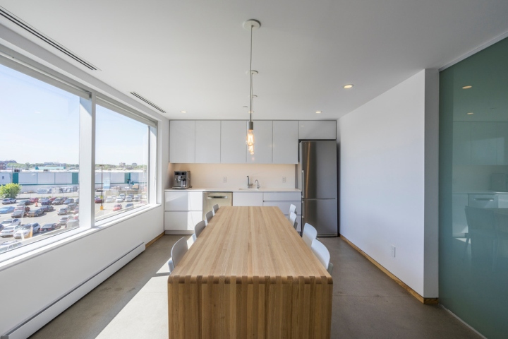
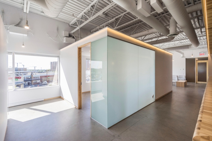
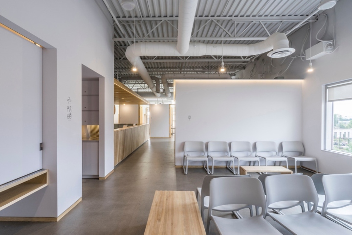
Light, a critical ingredient of many dermatological treatments, is the starting point from which the project evolves. Despite its large windows facing east onto Avenir Boulevard and south onto the Montmorency metro station parking lot, the former paediatric clinic that occupied this space was dark and uninspiring. The position of the waiting room in the centre, with windowless examination rooms surrounding it, shut clients off from the outside world and its views and natural light. To make the most of the large openings, the entire office was transformed into an open-plan space with translucent elements serving different functions within the clinic, letting the abundant natural light filter in all around. The ceiling, covered wall to wall in acoustic tiles, was exposed to make the area feel more spacious.

Translucent surroundings
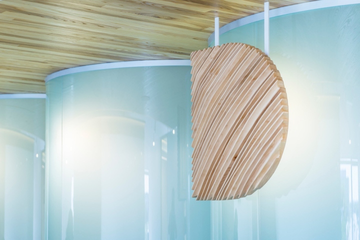
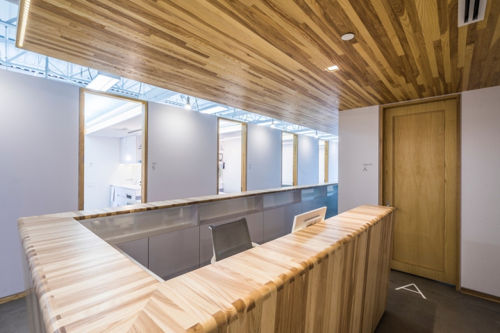
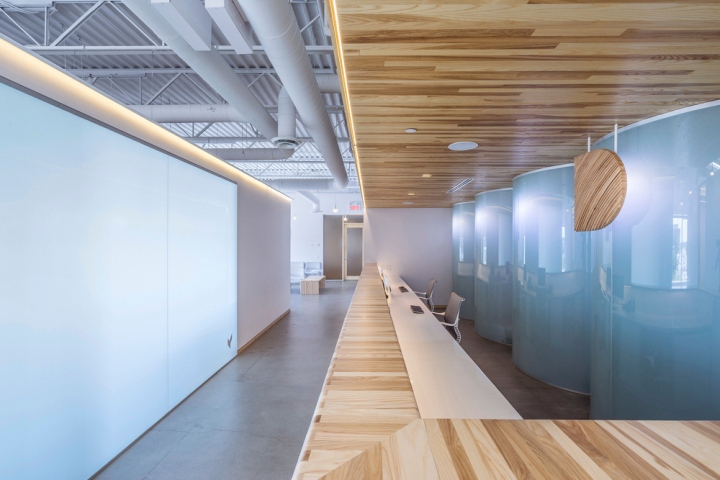
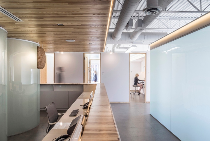
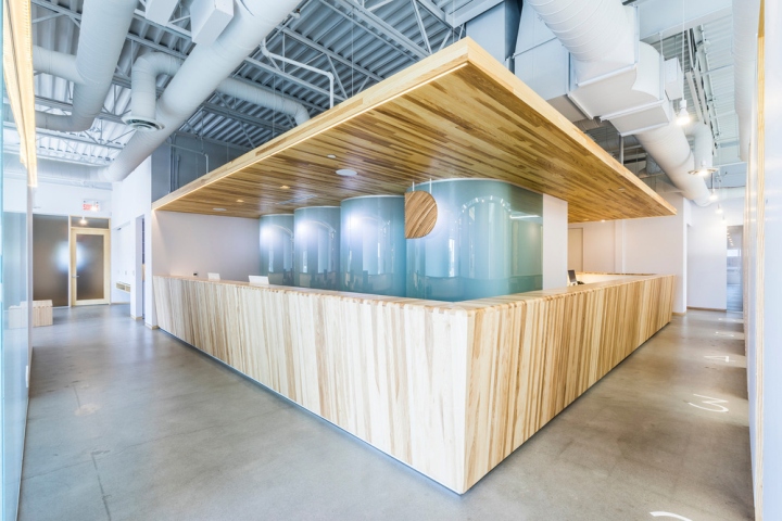
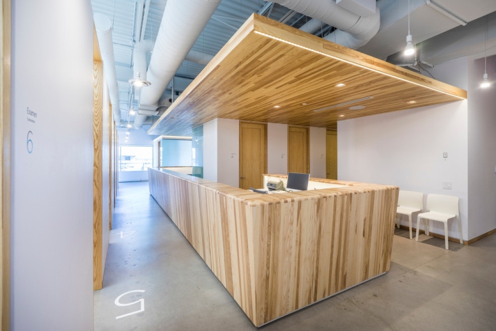
The six examination rooms, featuring frosted glass ceilings, form a long white wall punctuated by six high wooden doors. With its imposing opalescent glass wall and lowered ceiling, the relaxation room for the clinic’s professionals looks like a glowing cube. Light therapy machines sit imposingly in the centre, behind reception. The curved translucent glass walls that encapsulate them give away their function, as they emit an entrancing purple light when in operation. A long, solid ash reception desk wraps around this central core, with an entrance on either end: dermatology (main entrance) and light therapy (secondary entrance).

The client as the focal point
Dr. Brassard wants her patients to relax as soon as they enter the clinic. They should feel an uplifting sense of peace and calm during their visit rather than being weighed down by stress and discomfort. At Clinique D, the waiting room offers the most breathtaking view of the entire space: the whole stretch of Avenir Boulevard. People are more patient, more understanding when they are comfortable and well looked after. At the foot of the waiting room chairs, custom-built solid ash coffee tables mirror the look and feel of the reception desk. At the bottom of the hall closet is a wooden shoe rack, inviting patients to take their boots off as soon as they walk in. Further in, an alcove where washrooms are located also has a hot/cold water dispenser for anyone to pour themselves a cup of tea while they wait for their appointment or treatment.

Caring for the care staff
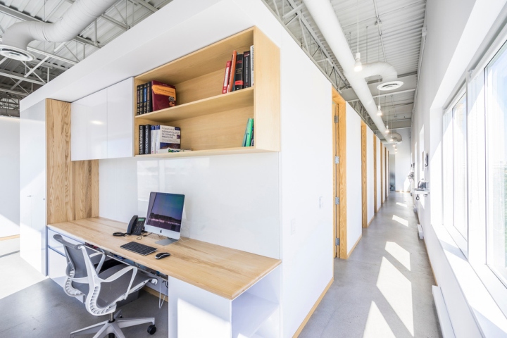
In addition to being a welcoming and comforting place for patients, the clinic must meet the needs of its staff, who spend long hours working inside its walls. It must be efficient in the way it is organized and pleasant in the way it is laid out. To achieve this, the clinic’s professionals must be able to move between the common areas, offices and examination rooms out of sight of the public. By moving the consultation rooms away from the exterior wall, a long service corridor was freed up for staff to move around in. This spatial arrangement, the true backbone of this space, created a bright and lively corridor through which nurses, technicians and physicians can move freely from one room to another, consulting their patients’ computer records, exchanging opinions and information, or even going to their offices and the relaxation room. Computer workstations are mounted on walls for medical staff to consult records before or after seeing their patients, without blocking this strategic passageway. The staff can also enjoy the transparent block within which the relaxation room is enclosed, shielded from the curious glances of the patients.

Customized lighting
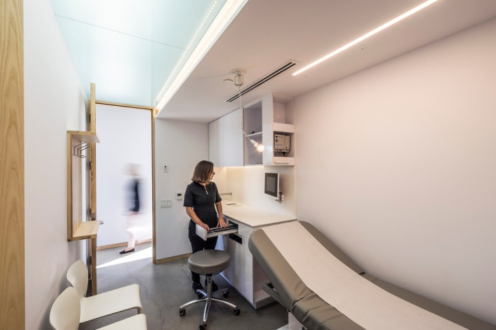
To supplement the natural light, hanging Wi-Fi LED bulbs can be programmed to the desired intensity and colour for each zone. Installed 8’-0” high, they offer users maximum energy-efficient brightness, without being too blinding. Strips of recessed LED lights highlight the large wood overhang above the desk and the whole of the waiting room. The same type of recessed lighting lines the reception desk to light up the work surfaces for staff. Lastly, each examination room has light flooding from a variety of LED sources, producing a very expansive but highly efficient spectrum: in panels behind the glass ceiling, in inset linear strips along the same ceiling, and in the form of a built-in light fixture above the exam table and a directional Wi-Fi bulb on an adjustable arm beside the patient. The glass ceiling and doors to the service corridor complete the layout with diffused natural light. The intense brightness of the space lends itself well to greater precision in the visual examination of patients.

Atelier Chinotto’s signature
All of the signage was designed in collaboration with graphic designer Atelier Chinotto. Stylized but universal at the same time, it consists of a mix of custom-designed logos (phone, washrooms, charging stations) and more specific descriptors for each room (1, 2, 3, A, B, C, Dr. Danielle Brassard, lunchroom, etc.). The lettering consists of cut-outs from light grey vinyl against the white background of the walls. For the concrete floor, however, the lettering is painted white right on the grey surface. The font is understated and sleek. The 3D geometry is the pinnacle of the design. It is a 3D parametric extrusion of the 2D logo designed by Atelier Chinotto, where the depth of the grooves varies depending on their width, offering a stunning play of light and shadow.

Clinique D under the spotlight
The Clinique D diaphane project is proof that, with a client’s trust, a dynamic young firm can deliver a complex, specialized architectural project without necessarily having acquired previous expertise in similar ventures. Clinique D is confident that a welcoming and well‑designed care space promotes the well-being of its users and professionals, and indirectly leads to positive care and working conditions. Its exceptional architecture and sustainable construction details will improve the well‑being of many, a real investment for society over the longer term. A care space does not necessarily have to be dominated by technological equipment. It can be inspired by the human warmth of the people that inhabit it and the place that it calls home.
Architects: L. McComber
Design Team: David Grenier, Laurent McComber
Photographs: Raphaël Thibodeau


http://www.archdaily.com/788559/clinique-d-diaphane-l-mccomber
