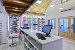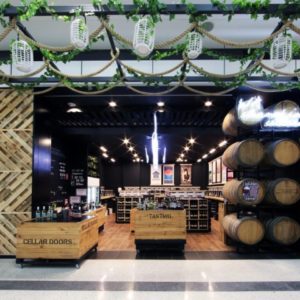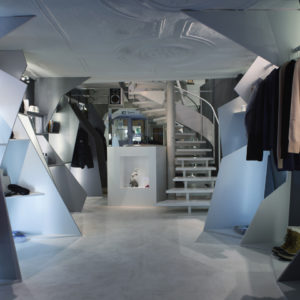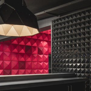

Disha Agencies is a store dealing in electrical equipments located in the heart of the electronics and electrical market in the city of Chandigarh. Sitting in the middle of the chaotic scenario of the urban setup the area provides, the store needed a renovation and a makeover. The idea was to attract a different variety of clientele without losing the existing customer base.
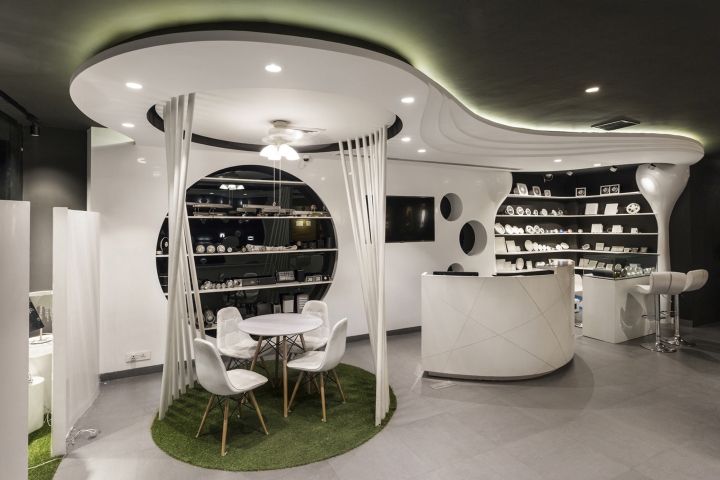
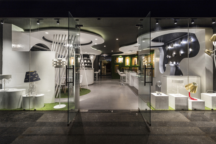
The design brief was not only to reinterpret the store as an up-market electrical showroom, but also to expand it to encompass decorative and outdoor lighting fixtures. Ideologically, the challenge was re-imagine the whole space with additions without changing the context. The solution was to divide the space into two zones. The front zone deals with electrical equipments and the rear zone is designed as a space to display decorative and outdoor lighting fixtures in a studio-like space. These two are connected via a passage that acts as a buffer, separating, yet binding the two zones together.
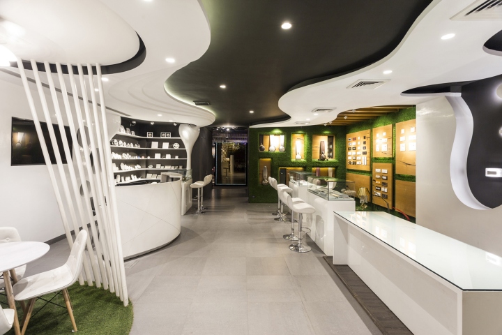
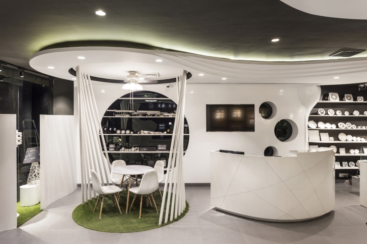
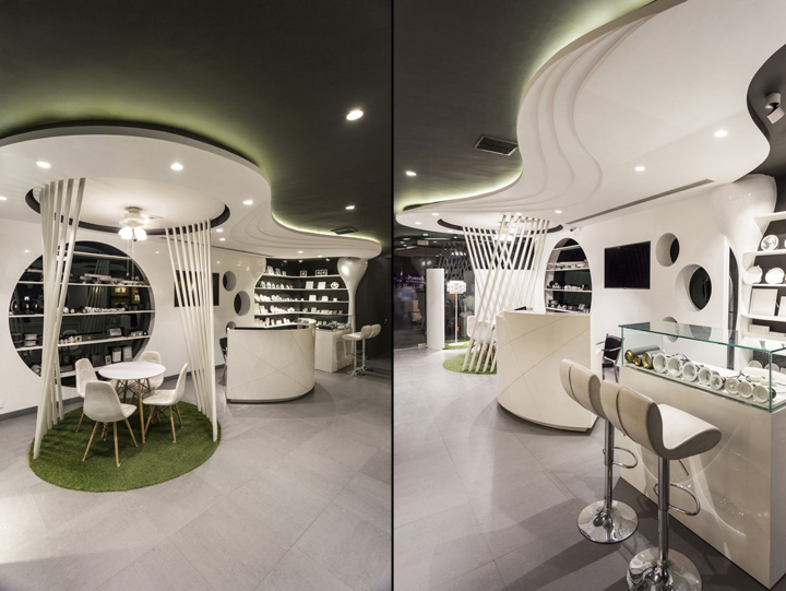
Both of these spaces are conceived as independent and individual entities with a common underlying design sensibility. The first zone is a study in contrasts with its grey background tone superimposed with fluid white forms that begin as the ceiling but drop down to become part of the walls- movement caught and frozen in space. A semi-covered discussion area uses hollow white pipes extending from the floor to the ceiling to distinguish it from the rest of the space as one enters. Unique circular displays modules, in addition to undefined pockets of storage and display units, preclude the possibility of conventionality without breaking the boundaries of practicality.
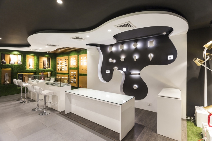
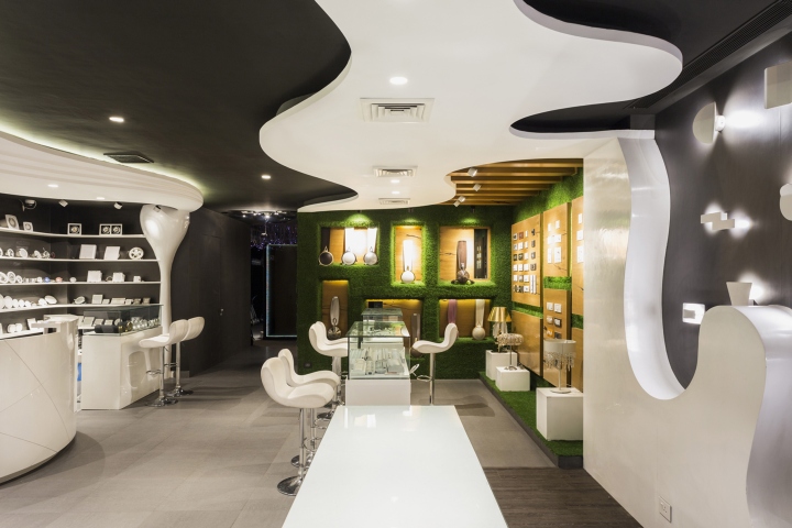
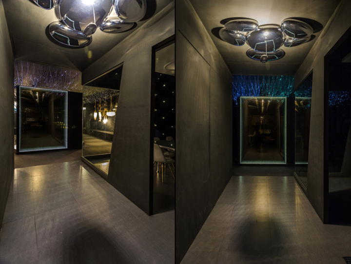
Further on, green is added in juxtaposition with wooden paneled display units, for electrical equipment to enlivening the interiors. The passage connecting the two zones uses infinity mirror to pique the curiosity of the visitor. The somber, dark theme of the passage contrasts perfectly with the highlighted interiors of the front zone.
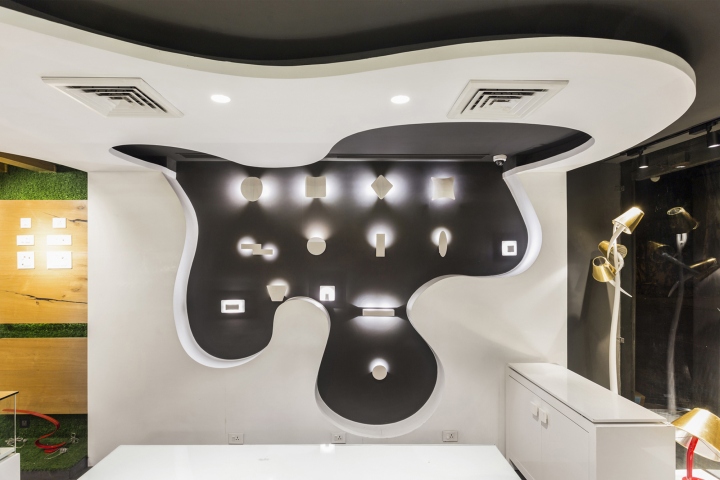
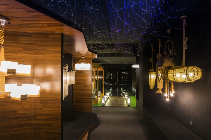
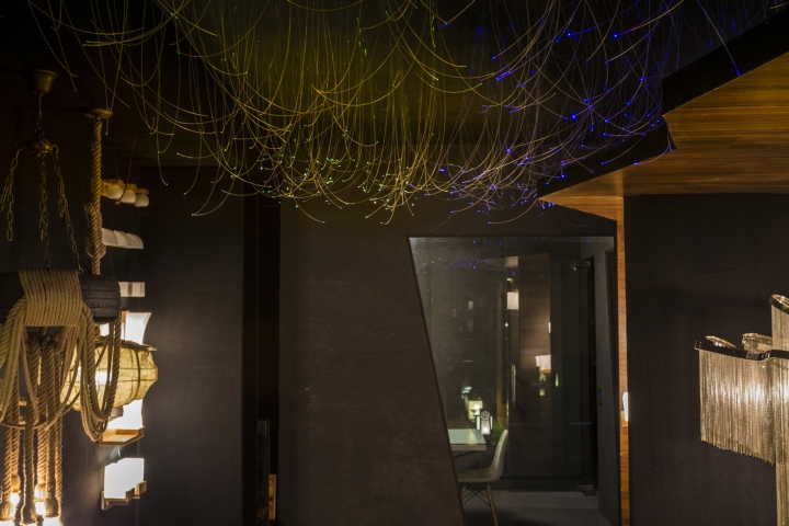
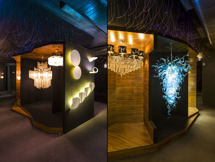
Housing unique light fixtures, the rear zone is carpeted, floor to ceiling, in black. An irregular, zigzag volume designed as a display for the fixtures, sits in the center of the space. Each fixture is given a place of importance, treated as a piece of art in an exhibition and appreciated as such. Hanging fibre optic cables with dynamic lighting extend over the entire ceiling exuding sophistication.
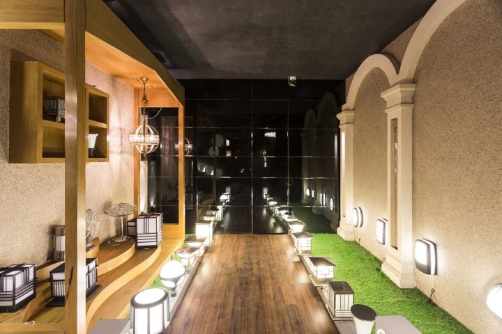
An outdoor setup, complete with arched patio and a porch opposite is used for the display of outdoor light fixtures with a wood floored passage leading up to a black mirror.
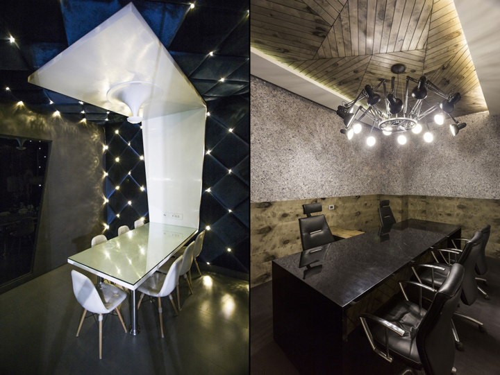
The MD’s cabin adjacent to the outdoor display area is designed in shades of light grey and brown. The ceiling uses wooden panels arranged in random, geometrical patterns with a single light fixture used as the main element. The furniture is kept dark to match the flooring of the space.

A meeting room is also included in the showroom, featuring fabric panels with backlit crystal lighting. A white section of the ceiling moves down and converts into a conference table in an offbeat design solution. The overall design in a study in successful manipulation of volumes and materials used to create a powerful language.
Designed by Studio Ardete
Photography by Purnesh Dev Nikhanj



Add to collection

