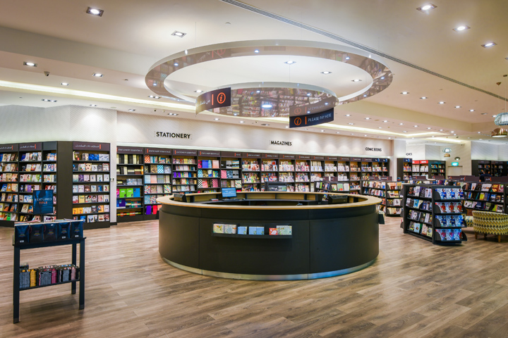

Leading Kuwait publishers and bookstore That Al Salasil appointed design4retail to create an engaging environment which would reignite consumer’s passion for reading and elevate That Al Salasil as the bookstore destination in Kuwait. Selling books in both Arabic and English, the 740m2 store features a large kids’ zone – a bespoke area which we created to excite and encourage younger readers to pick up a book. We closed up the expansive entrance of the existing store to create a large promotional window, with bespoke fixtures showcasing best sellers and forthcoming book signings.

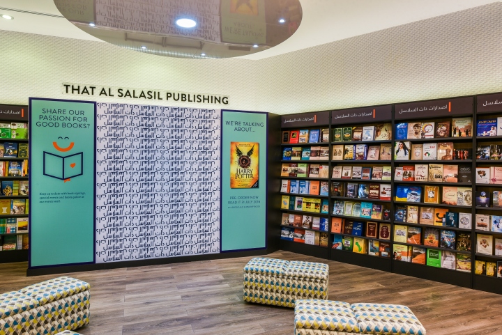
On entering the store, the space feels welcoming and open, as low level displays provide clear vistas across the store to navigational signage, which guides customers around the store with ease. Central to the store is the cash desk which also doubles as an information point for any customers with specific enquiries. With over twenty stores throughout Kuwait, That Al Salasil’s identity is highly recognisable across the region, so alongside the logo, it was important to retain the brand colours and use these as the foundation for the new graphics palette. Adding a secondary set of complementary colours, we created a broader spectrum that could be used across all in-store communication and incorporated into the design of the retail environment.

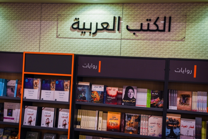
We introduced a consistent tone of voice across the store, which is warm and welcoming, yet with an informed and authoritative tone, commensurate with a brand of their standing in the market place. Selling books in both Arabic and English, meant that it was essential to keep iconography simple, with an immediacy that transcends the nuances of language and culture. As part of this we also incorporated subtle elements from That Al Salasil’s logo creating a strong and fresh visual identity for the brand. In-store messaging and navigation uses a hierarchy of colours from the brand palette; from the single colour high-level wayfinding, to secondary navigation which uses That Al Salasil’s brand orange, with white lettering, set against a contrasting slate grey backdrop.

Using the full colour range, along with a more conversational tone of voice and characterful graphic language, posters and point of sale invite customers into the store and draw instant attention to the latest launches, offers and events. Whilst orange provides a call out around the perimeter, highlighting bays showcasing the ‘book of the week’ and on-shelf messaging for recommended reads. Along with the new graphics, which provide interest points around the store, the layout encourages customers to meander between departments, while ambient lighting signposts break out spaces with comfy seating, inviting customers to browse the store’s books at their leisure.

Creating a sense of occasion, the store also features a book signing area, with seating for That Al Salasil customers and stage for visiting authors, that can be easily packed away when not in use. Alongside, customers find the kids’ zone where the theatre continues, announced by a bold new colour palette and graphic language which welcomes children in. We also used a more youthful tone of voice with subtle changes as the children progress from toddlers to teenagers.

The space features the ‘tree of knowledge’ at its centre, with fun characters and messaging hanging from its branches, to encourage even the youngest children to explore the world of books. Surrounding the tree, we designed curvaceous furniture with low level, easily accessible shelving and seating areas where kids and adults alike can share the joy of reading. The new store creates a destination for the whole family, with a relaxed ‘café culture’ atmosphere, where customers can pause and enjoy the extensive range of books That Al Salasil has to offer.
Photography by Mustafa EK


