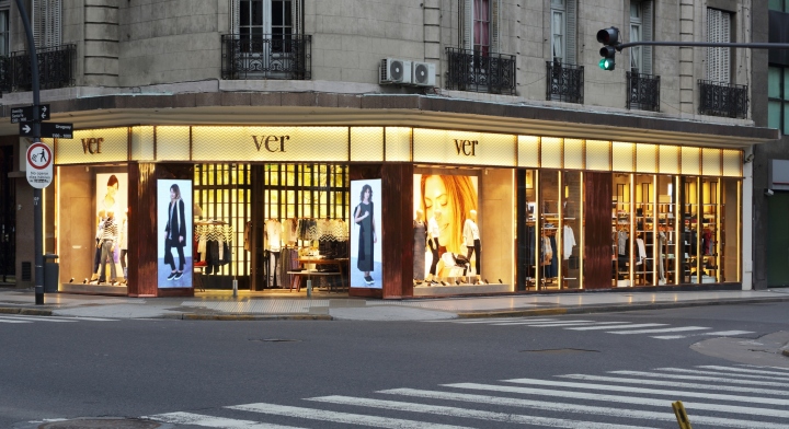


This Project marked a turning point on the new image for VER, a brand based in Argentina dedicated to women’s clothing and accessories. The site, an important commercial corner in Buenos Aires; the building, a 100 years old historic gem.

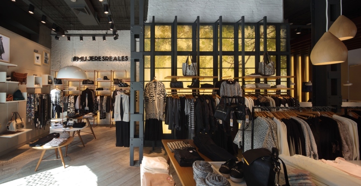
To create an ambience that would attract a wider target audience the direction was to provide a warm, modern and inviting space where women in their 20’s to their 60’s could enjoy the shopping experience with a SPA, or RESORT like flavor (i.e. green patio effect, the Nordic aesthetics and light wood as part of the décor). The new image needed to appeal to local and international markets as the brand aims to open locations abroad.

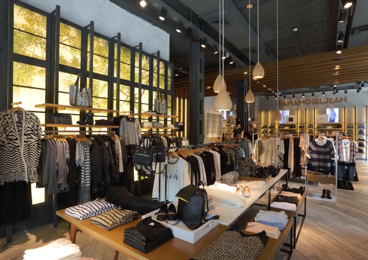
In order to create the sensation of a larger space we design a long extended unified façade; the choice of copper to frame the front line brought sophistication and warmth. The façade was also used as a tool to bring the inside experience to the outside (i.e. what is a store window is the actual a clothing display unit on the inside); this also allows customers to still have the feeling and sensations of being a bit outdoors. Bringing natural lighting adds to the experience. On the interior we created different ambiences to generate multiple spaces that evolved around what looks like a central green house.

As a general project line this store had to accommodate and accentuate the idea that the brand carries and offers different product lines in a harmonic interior. The experience had to appeal to a wide range of the market. The choice of noble materials, soft pastel colors and a warm overall lighting were among the resources to recreate the resort like experience; a relaxed and enjoyable layout circulation. Fun details like written messages on mirrors and fitting room walls were bits and pieces that were added in order to speak to younger generations (one of the main objectives of this renovated brand image).

All furniture-equipment were tailor made using copper, wood and marble to enhance and add value to the products displayed. All combined created a relaxed and yet sophisticated environment. Using the latest LED technology, the lighting system was carefully designed to create an ambience of warmth as well as to improve the visualization of the goods, enhance their colors and make them irresistible. All shelves carried LED lighting to insure that no product would be left out of the spot light.
Firm: Botner – Pecina Arquitectos; principals: Daniel Botner and Eduardo Pecina
Project Team: Daniel Botner; Eduardo Pecina; Roxana Lotersztain, Federico Stremmler, Filippo Calegari, Valeria Munilla, Alejandro Fuchs, Carina Garcia.
Photographs: Gustavo Sosa Pinilla


