
International retail and brand design agency Sheridan&Co reveals its latest work in rejuvenating the brand strategy, identity and packaging design for Tails, the premium premixed cocktail brand.
Tails is renowned for its delicious no-fuss batched cocktails, underpinned by the values of innovation, quality ingredients and craftsmanship. Traditionally it has appealed to busy, hedonistic consumers who enjoy expertly mixed tipples anytime and on the go, to the more discerning cocktail lover who relishes the occasional convenience of supping on faithful classics like Cosmopolitan to more unusual combinations like Elderflower Collins and Espresso Martinis.
Despite its prestige and fanbase, Tails believed that more could be done to effectively communicate its creativity, provenance and expertise through its pack design, and tasked Sheridan&Co with conceiving a revived identity that would modernise the look and feel of the brand and bring its distinguishing characteristics and values to life. Tails also wanted a solution that would strengthen the brand’s on trade growth internationally, as well as support growth across major retail channels.
Freddie Sheridan, Sheridan&Co, comments: “Although founded in 2008, Tails’ collaborations with global cocktail influencers including Bols of Amsterdam, the oldest distilled brand in the world, est. 1575, sees its products created with unparalleled artisan craftsmanship. Therefore the challenge was to create a premium, heritage-centric identity that would translate across its various product lines (200ml, 500ml bottles and 1 litre glass bottle packaging) and, importantly, entice the Millennial market to trial its wares without alienating existing consumers. There was a clear opportunity here to modernise the existing brand design to create a visual system relevant to today’s busy and discerning consumer, celebrated the brand’s provenance and elicited a curiosity for flavour experimentation.”

While the quality of ingredients played a core part in the inspiration for the overall design, tailored to make mouths water, Tails’ worldly brand story of Inventors, Craftsmen and Showmen spanning two continents (Europe and North America) formed the framework for communicating the brand’s mastership of mixing, batching and imbibing cocktails.
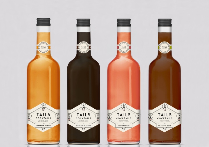
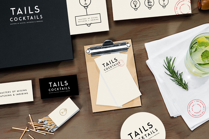
Sheridan&Co designed a label that captured this narrative, using classic fine pen illustrations to forge three icons that represented Tails’ roots – London (abbreviated as LDN) is identified by a light bulb, denoting where the ideas and innovation for the brand come from; Amsterdam (AMS) is signified by an antiquated filtering apparatus, indicating heritage and craftsmanship; finally, New York (NYC) is represented by a cocktail glass, denoting the location for the influence of cocktail theatre and showmanship. The ornate arrows that link the London, Amsterdam and New York icons together highlight the brand journey and DNA of every Tails.
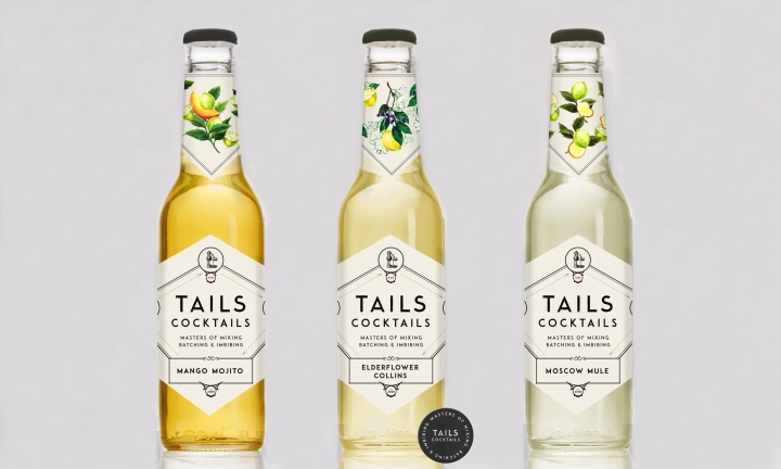
Replacing Tails’ original old fashioned looking logo is a new bold black font with a mottled, uneven texture, as if the brand mark has been hand stamped. Sheridan&Co worked with Tails to devise the strapline ‘Masters Of Mixing, Batching & Imbibing’ which rests beneath the ‘Tails Cocktails’ logo, qualifying the heritage and craftsmanship values communicated in the overall look and feel of the label. A further brand marque signified by a classic red circular stamp articulating the three locations and primary influence of Inventors, Craftsmen, Showmen (which sits to the right of the label on the 1 litre bottle and on the back label for the 200ml offering) again echoes provenance, heritage and craftsmanship. To the left of the label lies a short narrative of Tails’ history that Sheridan&Co helped formulate, setting the brand tone of voice and underscoring the brand’s values further.

For the more simplistic serve cocktails that comprise Tails’ smaller 200ml offering, colour plays an important part of the identity, with a further bottle neck label design embellished with fine hand drawn Darwinesque illustrations of fruity ingredients painted in watercolour. The delicate hues serve to complement the colour of the concoction within and visually dramatises the flavours so that the consumer can almost taste it, just through sight alone.
Nick Wall, Managing Director, Tails, comments: “For us it was really important to premiumise and make our packaging design more relevant to the guys behind the bar as well as the modern consumer, while still communicating the provenance and heritage that has made the Tails’ name a leader within the premixed and batched cocktail category. We also knew that more could be done with the design to make Tails visually impactful on shelf. Sheridan&Co have created a design that appeals to both taste traditionalists and flavour experimenters, artistically capturing our brand narrative and values. Rustic, old school visual cues underscore our heritage and craftsmanship while beautifully detailed drawings resonate the quality of the ingredients we use in our flavoursome blends – it’s a perfect balance of the contemporary and the classic.”
Tails is distributed by some of the UK’s major on trade venues including 600 Greene King Sites, 240 Prezzo restaurants and all Hotel du Vin and Malmaison Hotels. Retailers include Harvey Nichols.
