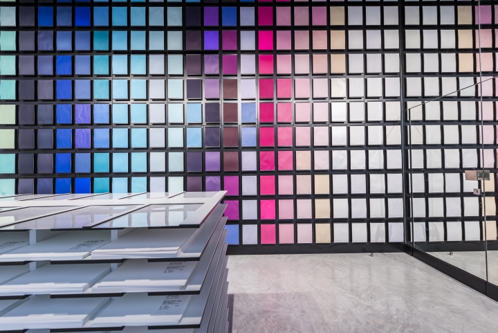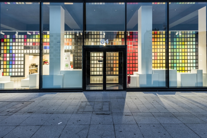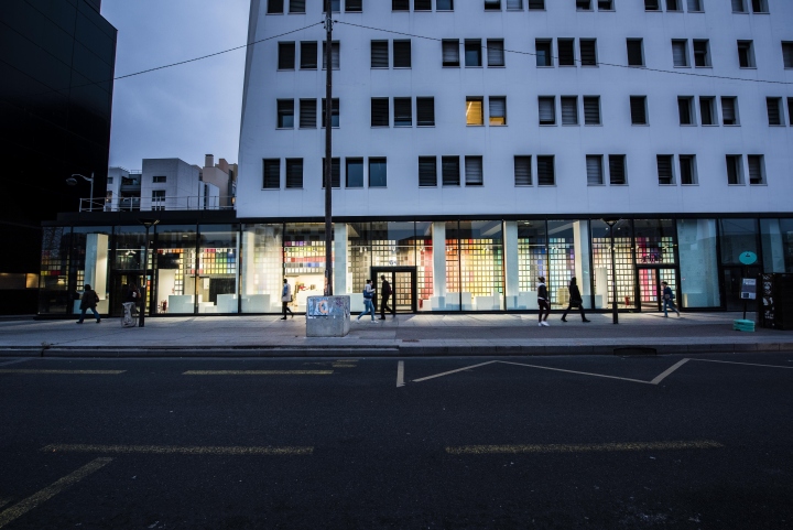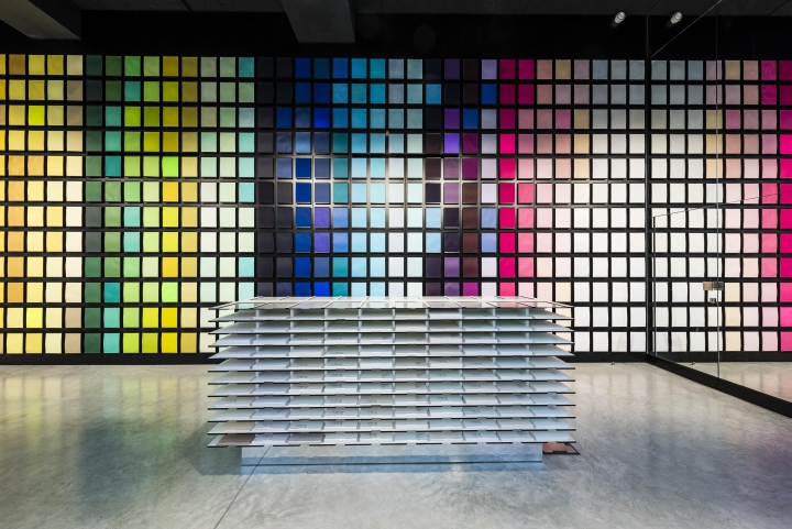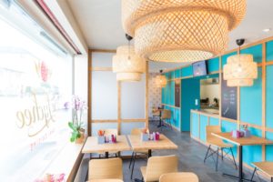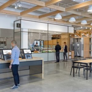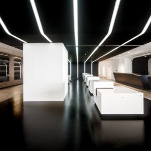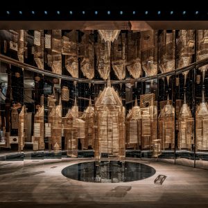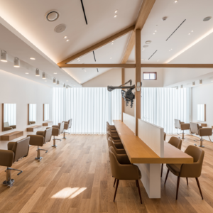
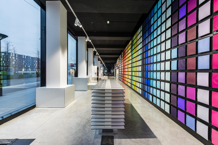

IN&EDIT architecture was asked at the end of 2015 by Antalis to create their new parisian flagship. Our challenge was to develop a new identity easy to recreate somewhere else – if needed. The atypical space’s first feature was its main linear glass facades that are 33 meters long. We had the strong desire to make it a breathing place with windows everywhere so it would give depth to the store. We wanted to make the store appealing from the outside so that they get more visibility. Having a new store also helped Antalis reinforce their brand identity.

Antalis is well-known in the creative industry as they sell a wide range of papers. Our goal was to create a skyline in the middle of an area that’s evolving for the better. It’s not common in downtown Paris to see highly modern buildings as we tend to keep the historical parts alive. The 13th arrondissement where Antalis is located, is a changing area. It’s becoming the new business center. As a result, we really wanted them to embody this change.
Photography by Olivier Rolfe
