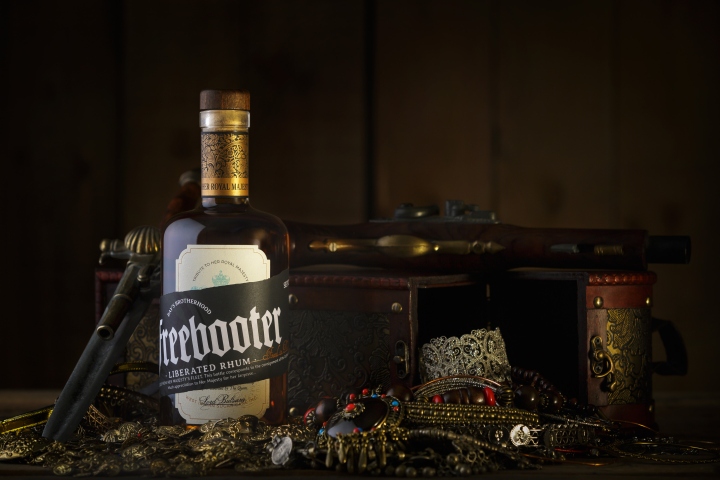

Freebooter is a clear commitment to a story that might have happened once. From its inception on a blank canvas, without preset limitations, we create an attractive and suggestive concept to take us back to a remote era and place.

Strategy: we select exclusive materials and complex technical details to highlight the premium character of the product. We deepen Rhum imaginary, pirate drink par excellence, in order to develop an attractive, suggestive and striking design. A distinctive storytelling has been created to enhance our graphic proposal. We stimulate the consumers’ curiosity and complicity in order to promote their interaction with the product, fostering an emotional bond with brand.

Storytelling: on the commemoration of The Queen’s reign, the West Indian Sugar Cane Captain, Lord Bulsara, wanted to present to Her Royal Majesty with the finest rhums from his family distillery. It is unknown where in The Caribbean Sea the Bay’s Brotherhood intercepted the precious cargo, but it is certain that the so called Bay’s Brotherhood members were one and all despicable riffraff, buccaneers who dishonored The Queen’s delicate Rhum.

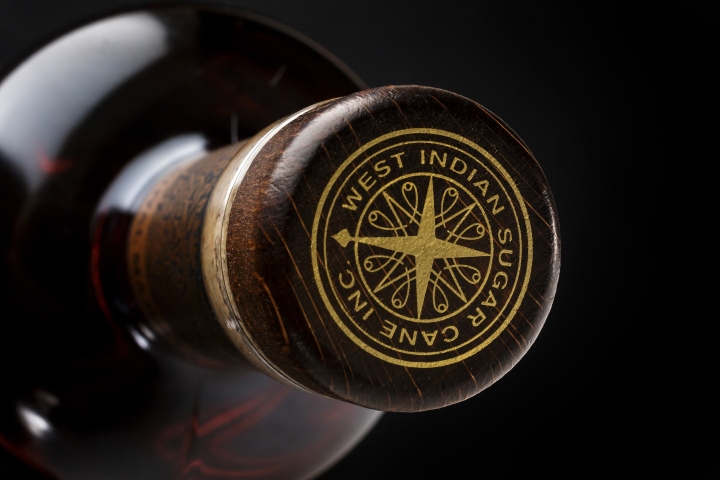
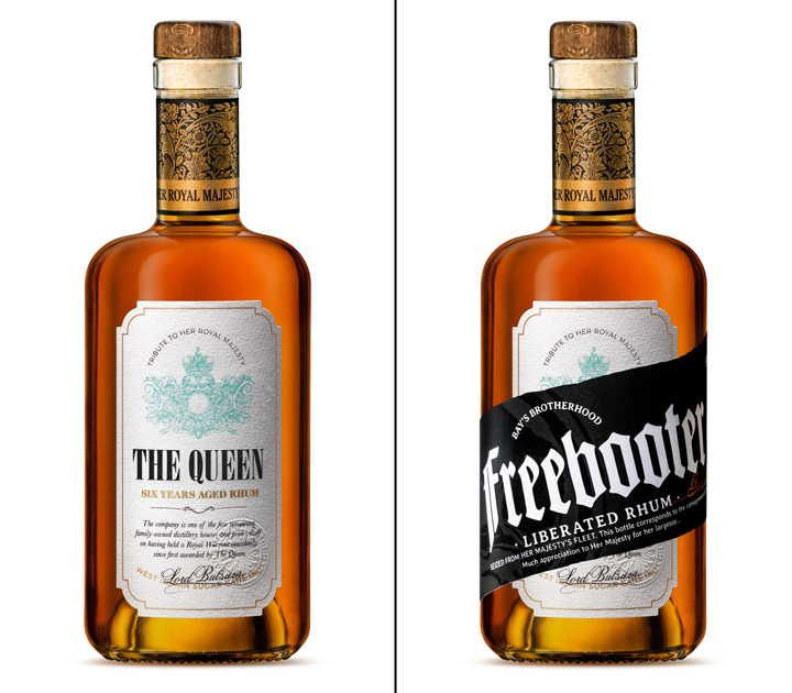
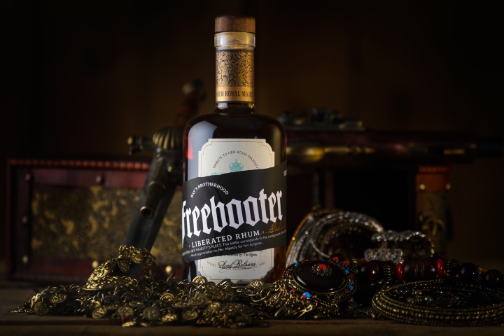
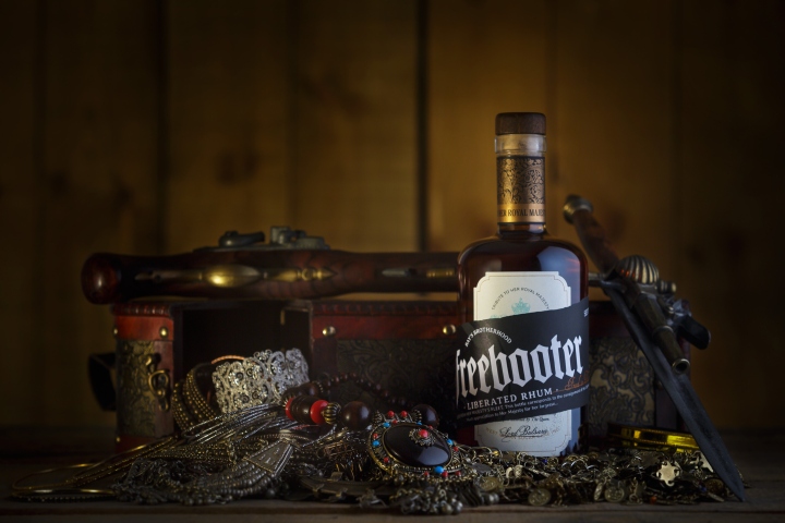
The Freebooters eagerly tagged the bottles to peddle them. They set them with a skull, the badge of the Bay’s Brotherhood, renamed as “Freebooter” the Rhum of The Queen and rejoiced in their misdeed with the following inscription: Bay’s Brotherhood Freebooter Liberated Rhum. Seized from her Majesty’s Fleet. This bottle corresponds to the consignment of the Captain’s Booty. Much appreciation to Her Majesty for her largesse… The bottles disappeared swiftly, once their origin was revealed word spread. From wealthy figures to bandits, everyone followed the “Freed Rhum of The Queen”. The legend of Freebooter sails the seas, and its fame can only be overcome by its authentic taste. Will there be any hidden bottle left intact to be discovered …?

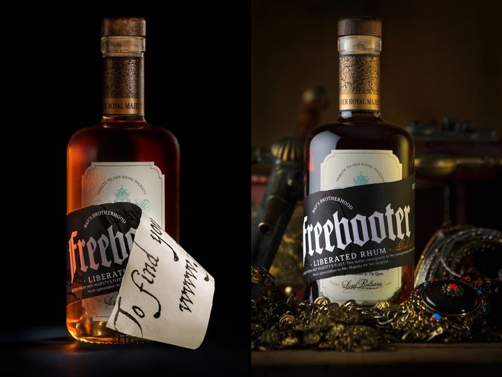
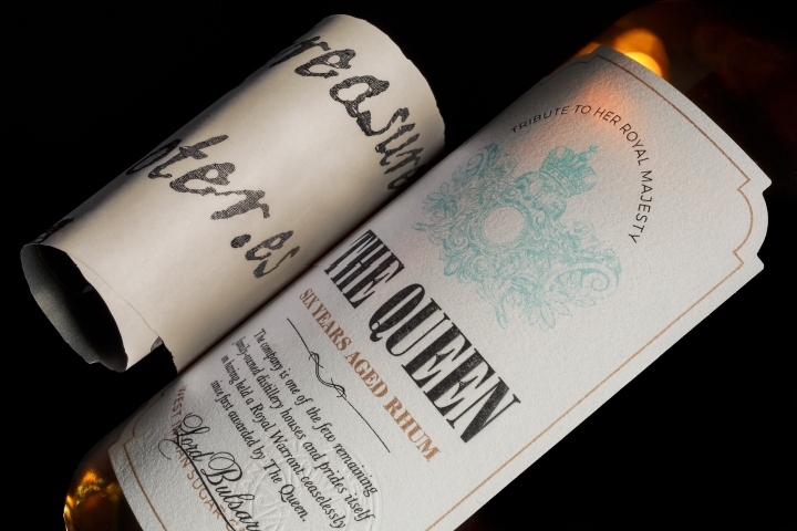
Graphic Solution: our graphic proposal plays with two opposites aesthetics: the sophistication of the nobility on The Queen’s label, against the rough and improvised corsair’ relabeling. A white cotton paper presents the label of The Queen, white with shades of turquoise and gold typical through classicism. Different stamping and embossing processes with metallic inks give a quality twist to this label common in that period.

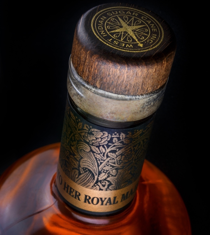
We cover the neck of the bottle with an elaborate classically inspired serigraph print using metallic inks, which present the bottle as “Tribute to her Royal Majesty The Queen”. This detail enriches the storytelling as it achieves a striking packaging, clearly Premium. We create the freebooter’s balance superimposing a light ripped paper, irregular and of reused appearance, with two colors of black shaping a skull. The serigraphy highlights the new origin of the rhum: “Freed in The Caribbean Sea”. On the reverse of this removable label, we entice the consumer to deepen the story of the product on its website, with a typography in the pirate style with black ink. We are experts in creating names, concepts, in the brand management and transformation.

We work as craftsmen; polishing, defining and unravelling the concept. From consultancy, via creativity and research to cultural acceptance of the brand on an international level, TSMGO offers complete and comprehensive name creation, packaging and branding services. Using an effective, solid, proven methodology, we help to build and create brands, to improve corporate identity or the identity of products and services.

At TSMGO we create and implement effective branding solutions; integrated, comprehensive and innovative, contributing to the development of our clients’ business. Our team of professionals is specialized in brand consultancy, naming, multi-disciplinary design, internal branding and brand management. We have extensive experience in integrated corporate brand projects, brand architecture, naming, corporate identity and strategic brand management.
Design: TSMGO (The Show Must Go On)
Photography: Dclick!
