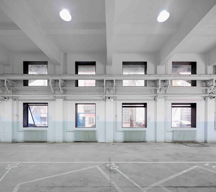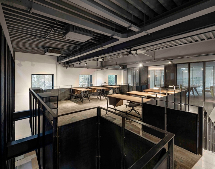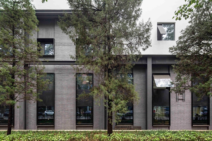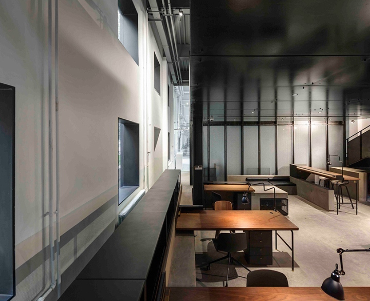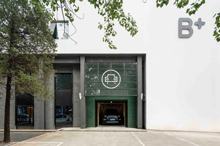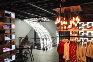

“The Garage” is chinese studio Neri & Hu’s latest architectural renovation project. The scheme addresses Beijing’s notorious traffic which has been interwoven into the local’s daily lives and attempts to bring back the allure of driving in this automobile center. The result sees a mixed-use program featuring a café, offices and an automobile workshop – all set within a former missile manufacturing factory.

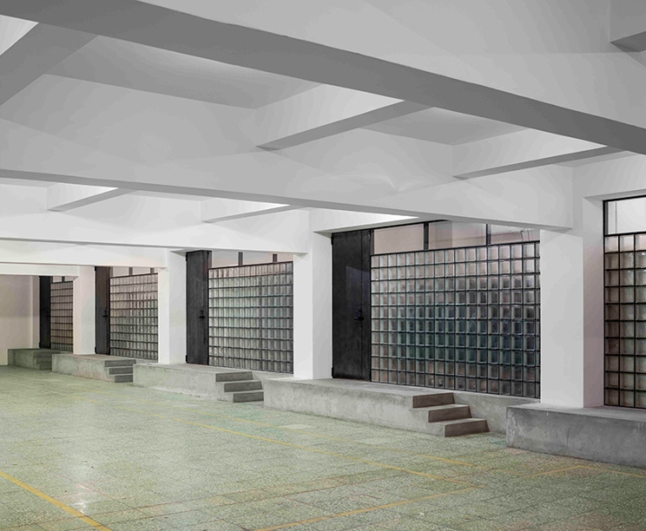
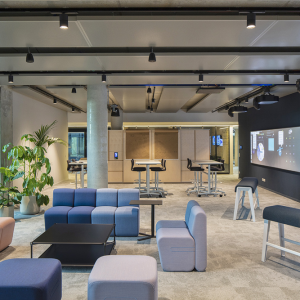
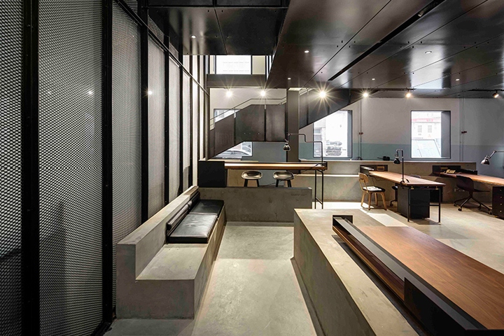
The industrial character of the factory is retained with four main brick walls remain untouched. The introduction and combination of materials chosen by Neri & Hu makes for an inviting interior which takes advantage of the mechanical and industrial theme. The addition of a new steel frame structure and a third level makes use of the vast height of the space and the black metal frames redefines the rhythmic window openings.

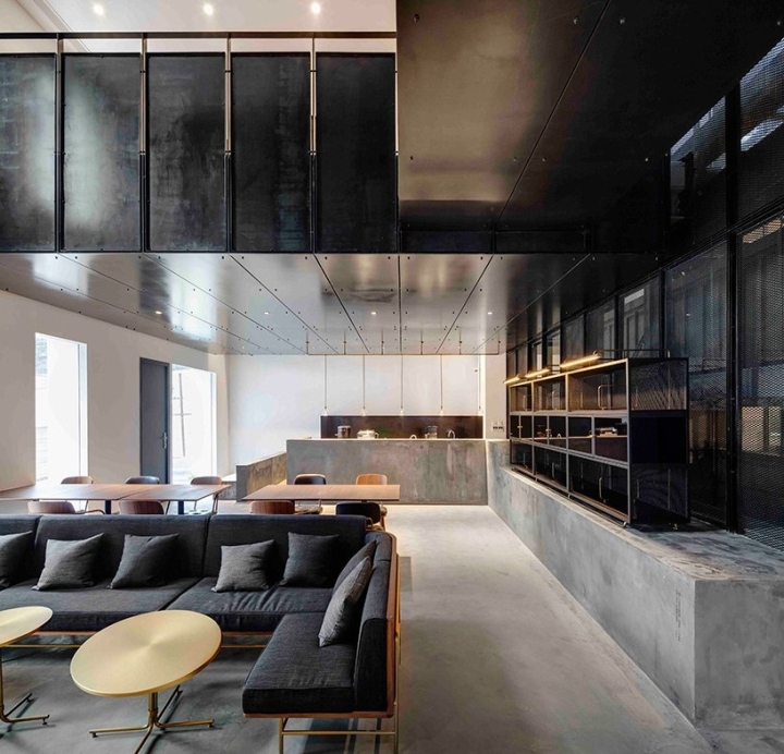
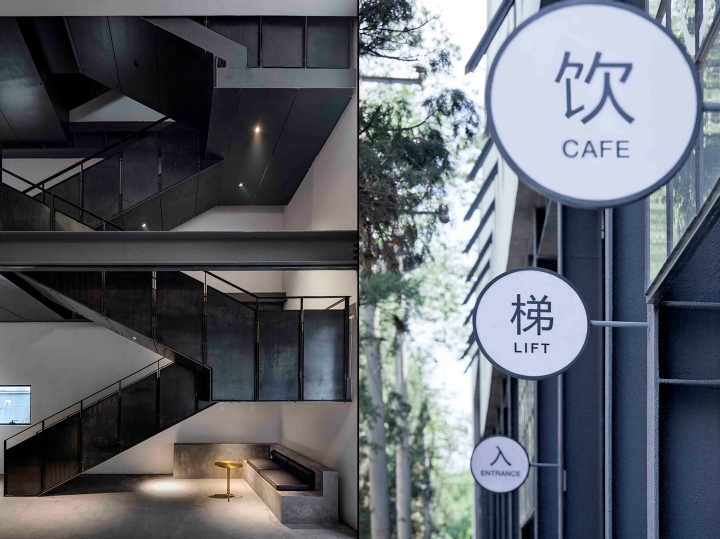
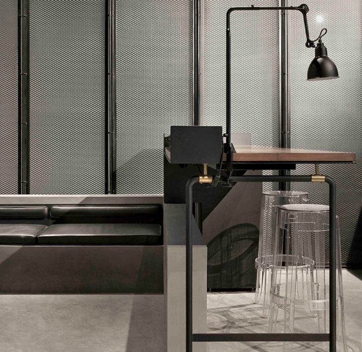
Mirrored surfaces provides textural intrigue to the mostly monochromatic base and the raw steel edged glass garage doors at each of the vehicular entries are all marked with custom graphics and signage to guide visitors to distinct areas along the building. Modular steel and mesh volumes define the different functions of the spaces.

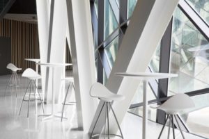
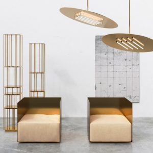
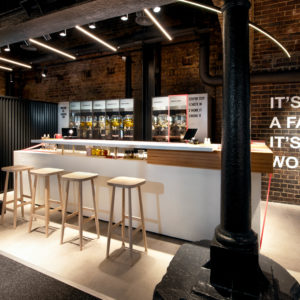
The office, café and the car lift all sit within the white volume of the building’s shell but are slightly reinterpreted. In turn, a lively environment full of activity is activated; mezzanine platforms, stairs, and walkways float amidst the mysterious black cages, such that cars and people are constantly circulating about. The café and automobile workshop sit together to create an unusual juxtaposition. Despite the use of concrete and steel material palette, a layer of luxurious materials have been added; walnut wood and brushed bronze.

Every detail is thought out including the graphic identity to reflect the bold and straightforward graphics of road signs. While the main signage is clear and direct, a second layer of signage augments the functional with the reflective. Meant to be slowly discovered, quotes are silkscreen-printed throughout the lounge and waiting area for customers to thin and pause.
Design: Neri & Hu
Photography: Pedro Pegenaute
