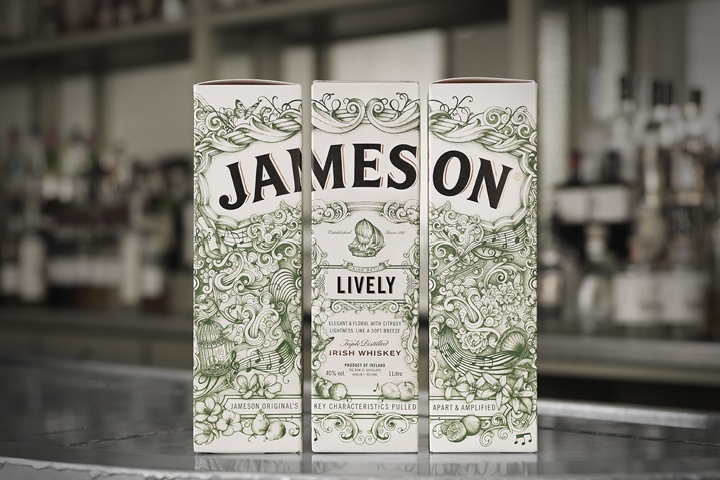

A Super Premium Travel Retail Exclusive with focus on taste. The idea behind the Deconstructed Series is to showcase the richness of expressions that are created through pulling Jameson Original’s components apart – (Pot Still Whiskey, Grain Whiskey, Oak contribution) – and then reconstructing and amplifying them. The design uses rich illustrations and refined details to capture the taste of each whiskey.
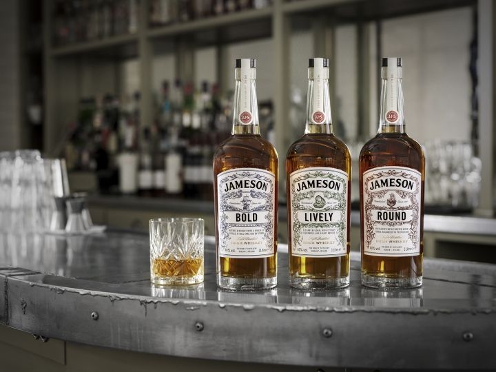
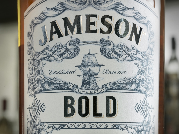
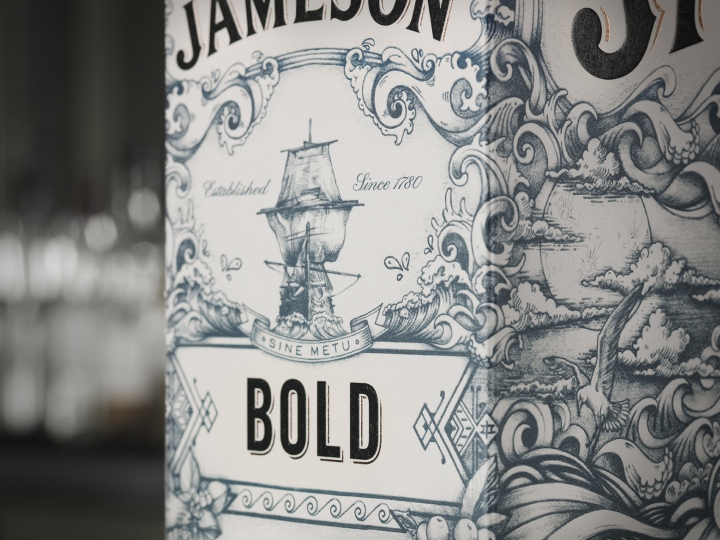
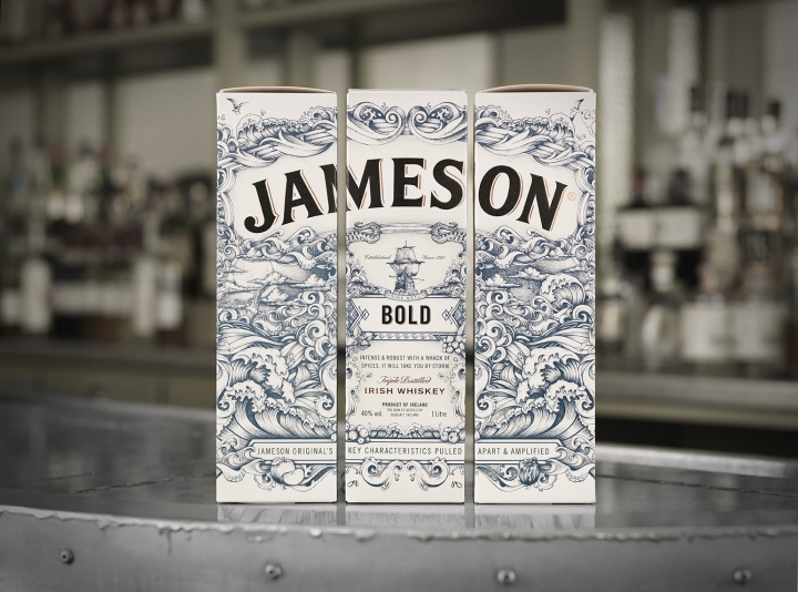
The ship on the original Jameson Crest is an important design element for the Jameson brand. Using the idea of a ship as a focal point, three unique ships symbolize the different blends’ unique personalities and express the taste of the whiskey while maintaining references to the Jameson world. Jameson BOLD is illustrated with a ship with a strong and rebellious attitude capturing the intense taste of the whiskey.
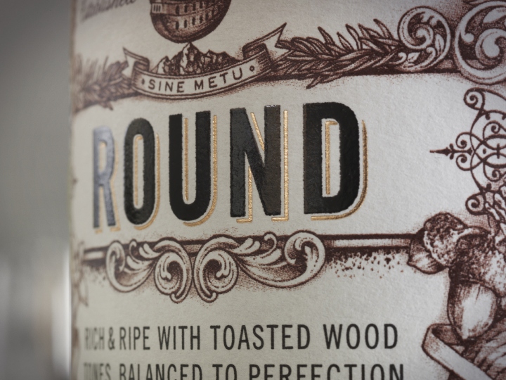
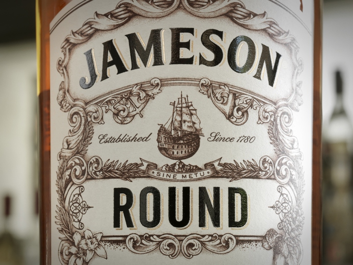
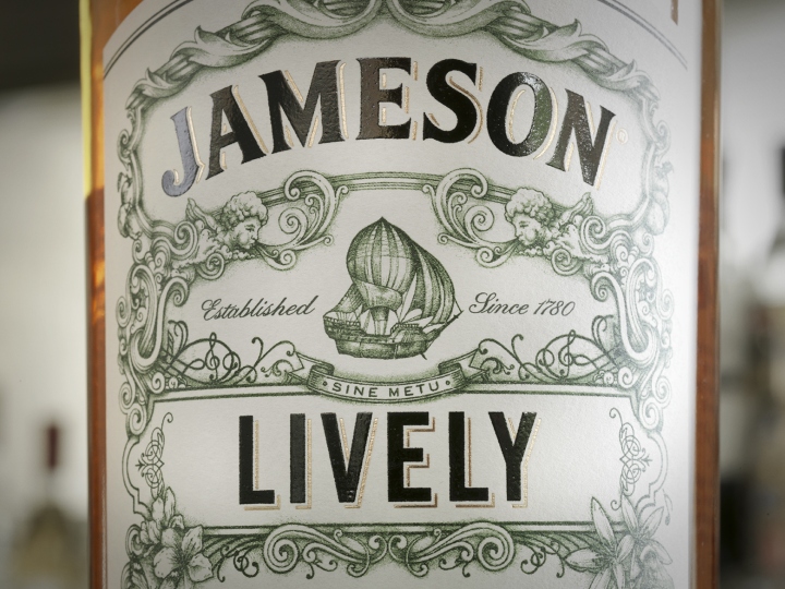
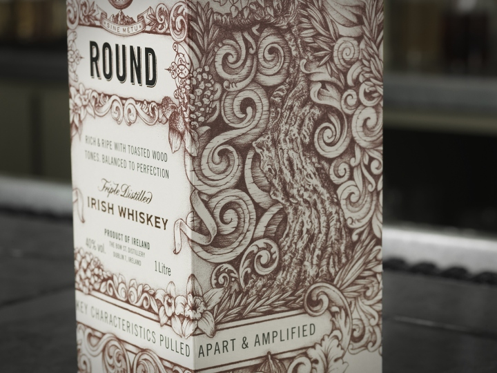
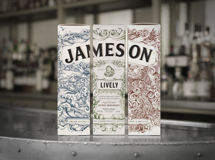
The ship that illustrates Jameson ROUND is plump and chubby. It balances carefully on the tip of a rock to symbolize the well-balanced character of the whiskey. The Jameson LIVELY ship is shaped almost like an air-balloon. It’s a ship that at any given moments will start floating in the air – symbolizing the lightness and crispiness of the whiskey.
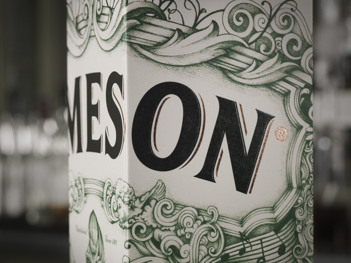
Each blend has its own unique colour and illustrative details. The design uses original illustrations made by Greg Coulton, a renowned Irish illustrator, beautifully capturing each blends’ personality in a unique and captivating narrative, intensely detailed, multi-layered and crafted.
The deconstruction idea is strengthened through the use of secondary packaging The idea is to merchandise the packaging in such a manner that the Jameson Logo is reconstructed and the words make a complete sentence. The Deconstructed series talks about Whiskey in a new way, focusing on taste and character. The series’ handcrafted approach invites consumers to unique, yet approachable taste experience.
Design: Pond Design

http://www.packagingoftheworld.com/2016/12/jameson-whiskey-deconstructed-series.html


Add to collection


