

Around the time when Ricardo Martín started his photographic practice in San Sebastian, he was certainly not the only young photographer there, nor the only person selling photographic materials in the city. He had entered a world where he competed both with other new photographers and, of course, with those who had already set up practice there.

But San Sebastian was not lacking, either, in an audience that was interested in having itself photographed, thanks to the celebrated topographic features of the place, and to the resultant flow of people and their resources within both the city proper and surrounding areas.” Lee Fontanella.

When starting the design process, the main concern was to create an easy going experience with a bold concept, since the exhibition had to contain more than 100 re-edited black and white pictures, original photographs, and the original cameras Mr. Martín used along his career. Furthermore, because of the nature of the images, they could hardly be organized in a linear or chronological order and the visiting time was estimated to be over one hour.

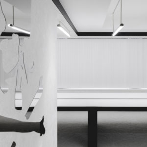
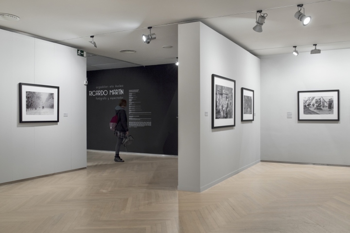
Taking all those critical factors into account and the exhibition theme, Hiruki Studio proposed to arrange the existing space into smaller exhibitions using a “camera obscura” concept: the shell of each section should be dark, but the inside, containing the photographs, should be brighter and lighter.

In order to make the walkthrough more dynamic each space has his own shade of gray so the visitor could actually perceive how the themes area changing. The gallery was divided into six micro-exhibits, and with the intention of grabbing visitors’ attention, six 2.3 x 2.5m “totems” were designed: they are located at the entrance of every section as introductory elements with texts and a small glimpse of a photograph to allow visitors learn about what is coming up next in an easy and attractive way.
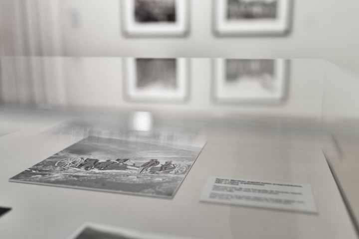
Besides, the Totems work as small “breaks” within the tour, helping the visitors re-focusing attention within the long tour.
Design: Hiruki Studio
Photography: Oscar Guillén



Add to collection

