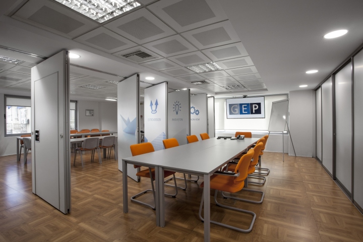


GEP is the leading provider of occupational health and safety services in Greece. GEP provides high-quality services meeting the needs of modern business. The company provides services to more than 180,000 employees in 1,600 enterprises of all economic sectors, with a network of totally 9,000 facilities all over Greece. The services of the company are delivered on a 24/7 basis. GEP was initially located in smaller offices which could not accommodate the company’s needs in space and functionality. The relocation project focused on solving both problems as well as building a new image for the company which is on a positive track for further development. GEP welcomes daily a big number of clients, as a result the image of the offices must always be neat, cleaned and organized.

Due to the necessity of continuous trainings and meetings needed in place, the briefing focused on designing a calm and easily adaptable space for employees. Due to the 24/7 support that GEP offers to its clients, the lighting design and work station specifications were considered as an important part of the brief. The project was delivered within the timeframe and the agreed budget. In 2016, the offices were renovated in order to bring a fresh image to its identity. Pictograms and signage were used in order to create a friendlier environment for the employees, with motivational content.

The colors used in the offices, were inspired by the blue logo of the brand and selected for the offices in order to give a happy touch. The architecture of the whole space follows the square logic of the logo. Open spaced offices are combined with some private ones, in order to maximize the capacity of the space, keeping though some privacy needed for the meetings. Finally, the reception -as it is the first image seen when someone enters the offices- is taken highly into consideration. The history and values of the company are presented on the walls, the desk of the reception follows the dynamism of the brand, using though modern furnitures in white. The modern, friendly, functional and renewed image of the offices is underlined and placed throughout the space.
Design: Stirixis
Architect: Jenny Chalkiadaki
Project management: Stirixis
Photograph credit: Stirixis
