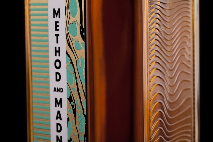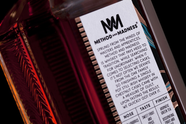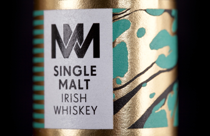
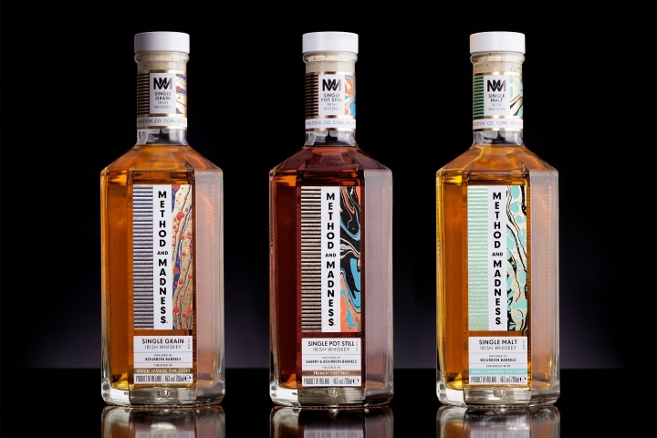

Method and Madness: Design studio M&E creates the bottle and identity for new experimental whiskey brand from Midleton. Method and Madness is a new range of experimental super premium whiskeys from The Midleton Distillery, Ireland, designed to push the boundaries of Irish Whiskey. Inspired by the Masters and Apprentices working side by side at the new micro distillery, the brand identity strives to convey the sense of excitement of when tradition and innovation are combined. The brand identity uses two opposing patterns throughout all the labelling and packaging.

The use of straight lines symbolises method and order, while the marbled patterns reference madness and liquid experimentation. Design studio M&E was commissioned to design a completely new bottle and identity for Method and Madness. The identity for this new brand reflects it’s name, and the juxtaposition between the words method and madness served as a very interesting starting point for the designers. M&E wanted to create a bespoke bottle that celebrates the liquid and the process behind it’s creation.

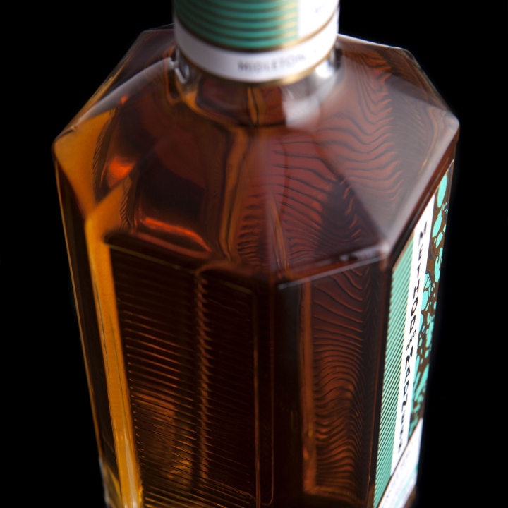
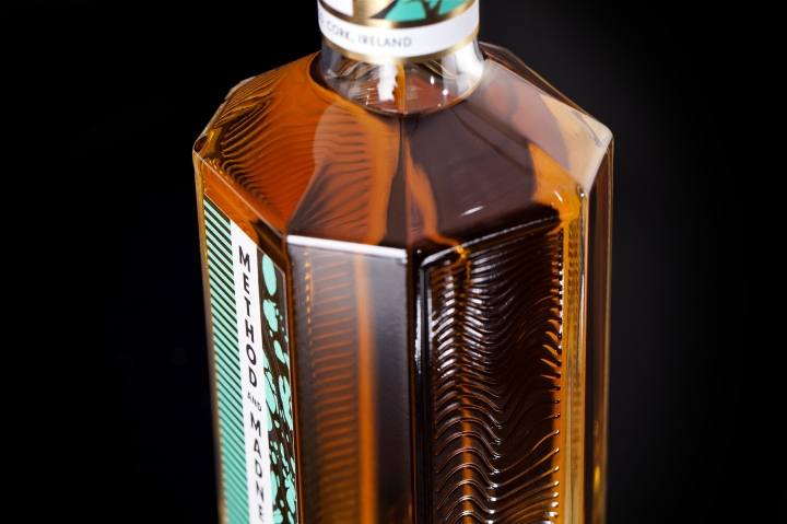
Although the bottle design takes cues from laboratory glassware found in the micro distillery and the paneling of a whiskey cask, the designers also took inspiration from outside of distilling and Ireland, wanting a departure from traditional whiskey branding and design. The octagonal shape of the bottle was designed to refract and bounce light. The side panel embossings were created to produce a kaleidoscope of patterns within the bottle, bringing method and madness together.

The paper marbled patterns featured on the labels were custom made by M&E for each release, using a colour palette identifying each type of whiskey. Working on the project over the last year, M&E drew inspiration for the colour palettes from their visits to the micro distillery. It was important to M&E that elements of the identity are modular to allow the brand to expand it’s range without repetition, since the brand will continue to release new expressions forming the next generation of Irish whiskey.
Design and photography: M&E
