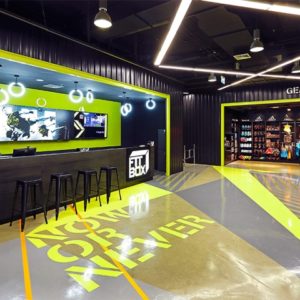
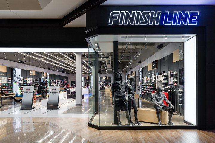

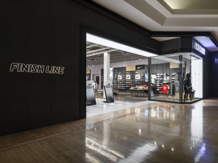
To capture the attention of a younger demographic who sees athletic wear as a style choice, Finish Line needed to re-imagine their in-store experience. They wanted to bring the product back into the spotlight and create an easy-to-navigate environment geared for an audience accustomed to immediacy and convenience. Dark cladding and broad illumination add contrasting flair to the storefront.
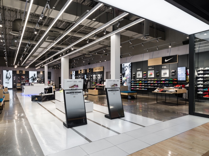
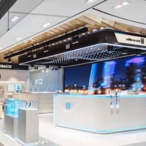
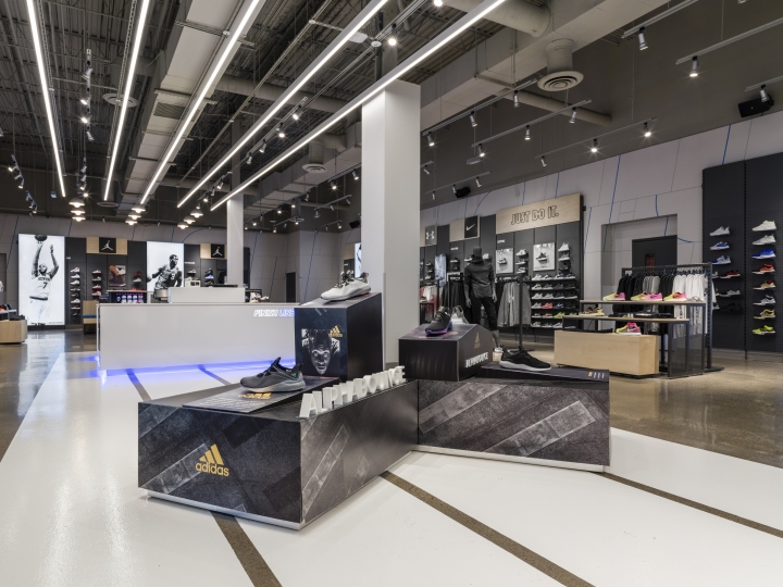
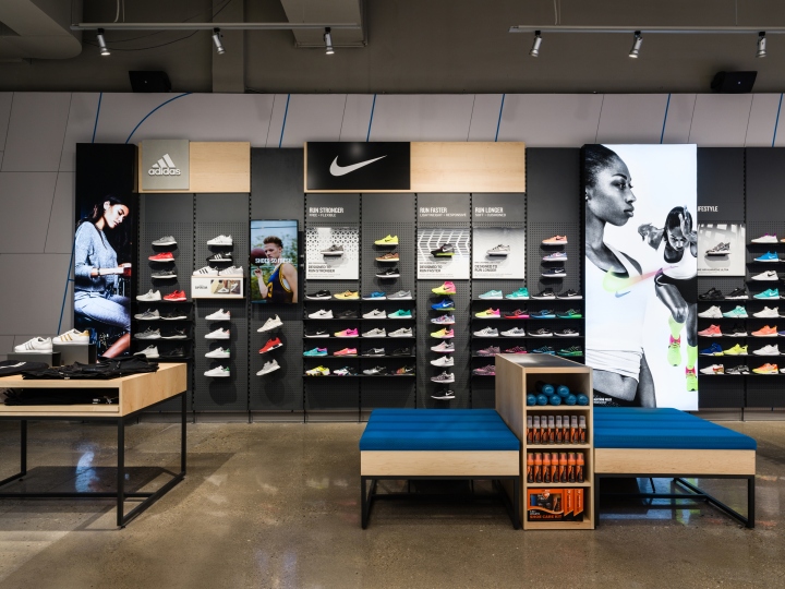
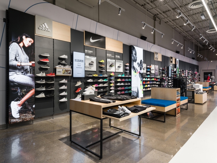
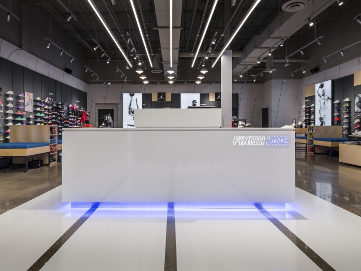
Track lines and negative linear lights overhead drive traffic from the entrance through the store. Stark white features against a dark backdrop creates energy within the space while allowing merchandise and corresponding imagery to take center stage. The design organizes the different shoes by brand and edits the selection to create a more manageable collection. Flexible fixturing allows for easy circulation and vendor personalization. Blue underbody LEDs at the cashwrap provide a vibrant, stylish finish to the brand’s refresh.
Designed by CallisonRTKL
Photography by Mo Daoud


Add to collection
