
1. Concept
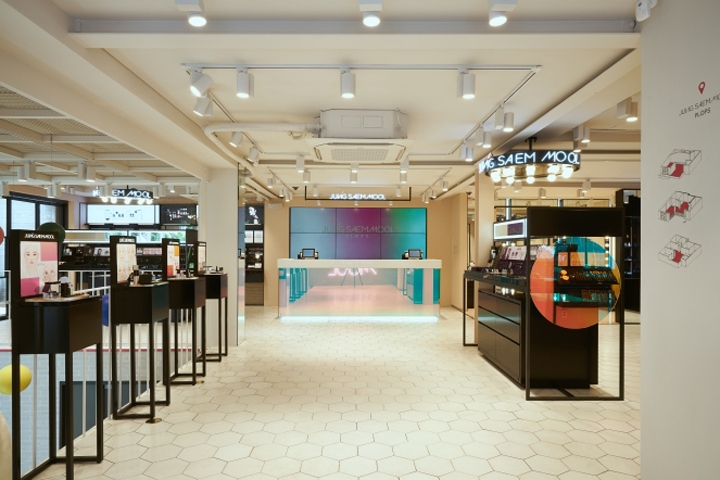
Jung Saem Mool flagship is a playground where customers can directly experience and play with make-up unlike regular retail shops that sells makeup products. The flagship store was inspired by Jung Saem Mool’s philosophy which states that ‘make-up’ is not just a trend of a certain era, but also a representation of an individual’s beauty, through its unique features, colors, and textures.
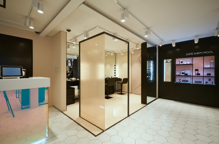
PLOPS, another name for the flagship store, is a space where people can find their own colors and makeup looks that suits them. In the process of space planning we used a variety of dots, lines, faces, and figures to express its volume and space. Just like how we use colors and shadows to create volume on our face. For example, lines of the 2D frames are gathered to form a space or divide regions creating zones.
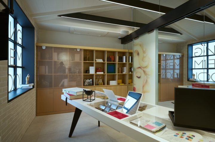
Depending on the view point, the space can show 3D characteristics due to use of lines, face, and figures. The flagship store is composed of three floors. On the basement floor , there is a space called ‘JOY’ where customers can enjoy viewing collaborative art works. The first floor, ‘TRY’ is a space where customers can test out and purchase make-up products. The second floor, ‘Play’ is a space where people can get familiar with make-up. Here customers can learn makeup techniques from makeup artists and see the brand’s identity.
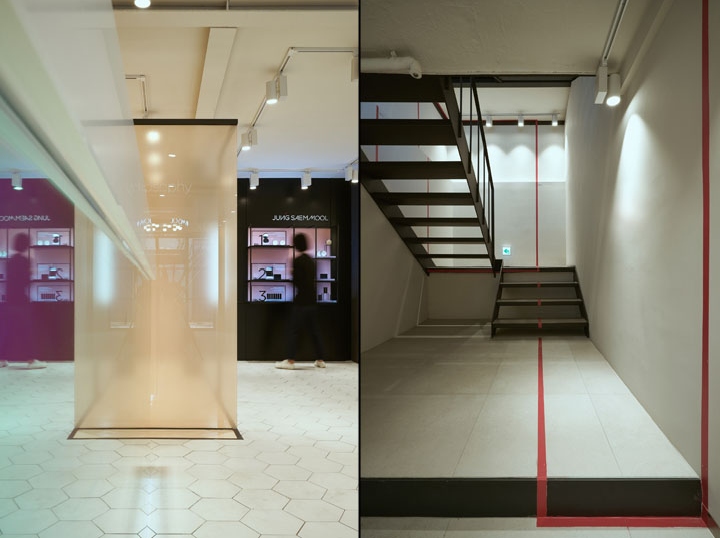
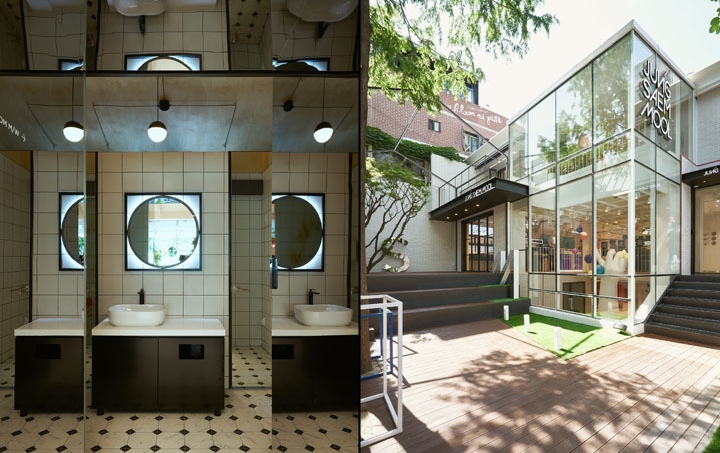
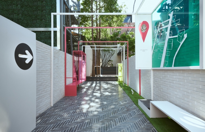
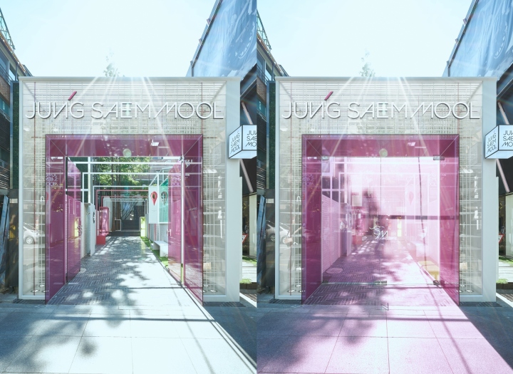
When you think of Sinsa-dong Garosu-gil you can imagine the streets where retail stores are closely lined up next to each other. Unlike other stores, customers will have to go through an access road to reach our building. This feature was built to create a uniqueness that will make us stand out among other retail stores. We also took the concept of street furniture by creating scenes with frames: for each scene, we planned STREET SIGNAGE, BUS STOP, STREET MAP and etc., creating a natural yet unique scenery.
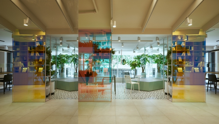
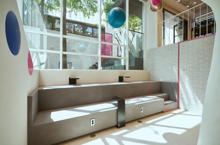
The scenes of Street furniture’s frames were composed by placing colored glass between the frames, resulting in an attractive combination of light, colors, and trees. The benefit of this approach is that it creates clear routes through the space, as well as an extra wall space which provoke people’s interest. The level of the terrace is raised by the stairs which naturally connects the retail space. The tree fascinated us so we wanted to make an open space that surrounded the tree and it is framed by the gable formation, which is also creates the space for street events. In the space created by the gable formation, trees and scaled initial structures finished by reflective mirror materials. The space created by the gable formation has trees and scaled initial structures finished by reflective mirror materials which is used to create an area where people can take photos and rest while being entertained.
*1st Floor (TRY)
The first floor ‘TRY”, a space where you can purchase an play with product, expresses Jung Saem Mool’s brand color. Using color and shapes as design elements, the skin color painting matched with the black furniture expresses tone and manner. The steel frame which supports the furniture were thinly created to express the face line, color, and texture in space. Also to highlight the line elements in the make-up service area the space was framed by the line creating territoriality, which divided the space visually.
*2nd Floor (PLAY)
The second floor, ‘PLAY’ is a space created based on the concept of an beauty library. It is a space where customers can experience make-up themselves. The space is composed of an atelier space including photographs and illustrations. Along with the atelier space there is also a dreamy cosmetic garden.
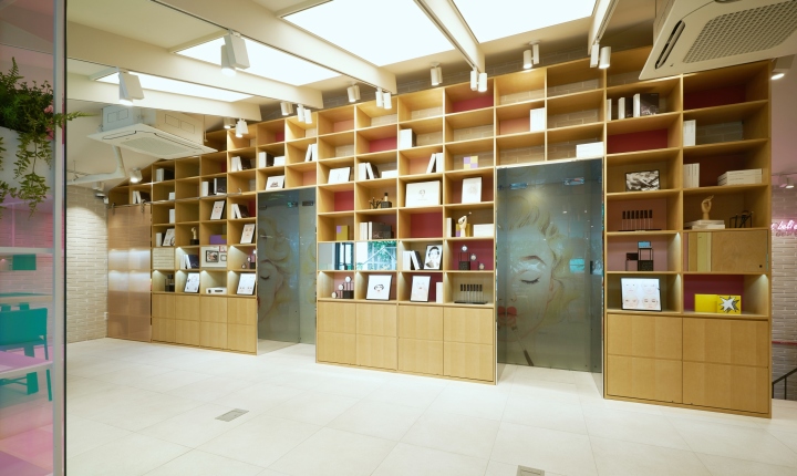
To make it look like natural light was entering the user space, gable formation was incorporated to the celling along with skylights. One side of the wall was designed as a beauty library that forms a display space for artist collections. Colorful glass was used on the bookshelf to illustrate a color palette that represents the diverse colors of Jung Saem Mool products. Additionally, the two doors, that resembles an opening in the bookshelf, lead to two distinctive areas. When you close the glass door that has the illustration of Marilyn Monroe you can see her full face, where the pop art illustration adds humor to the space. The door frame was finished with a super mirror, giving the space a sense of reflection and depth.
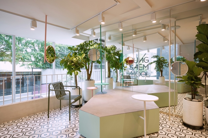
In this space, visitors may utilize the community table that has a multi-use function. The customers can create their own seasonal make-up looks and the table can also be used in make-up classes enhancing the use of space. By coordinating the artistic inspiration of Jung Saem Mool Beauty and the artist’s positive energy, the Atelier Room shows the identity of Jung Saem Mool Beauty. One side of the wall is covered with a mirror, creating a reflective visual effect on the room.
The cosmetic garden is surrounded by dichroic colored glass walls giving the space an illusionary feeling as if you were entering another world. Hexagons were cut to design benches that can be either divided or combined. Also, to express rich texture, mirrors were placed in various angles along with tress, tables and color painted pipes.
Design: Design Soo
Photography: Lee Pyo Jun


Add to collection
