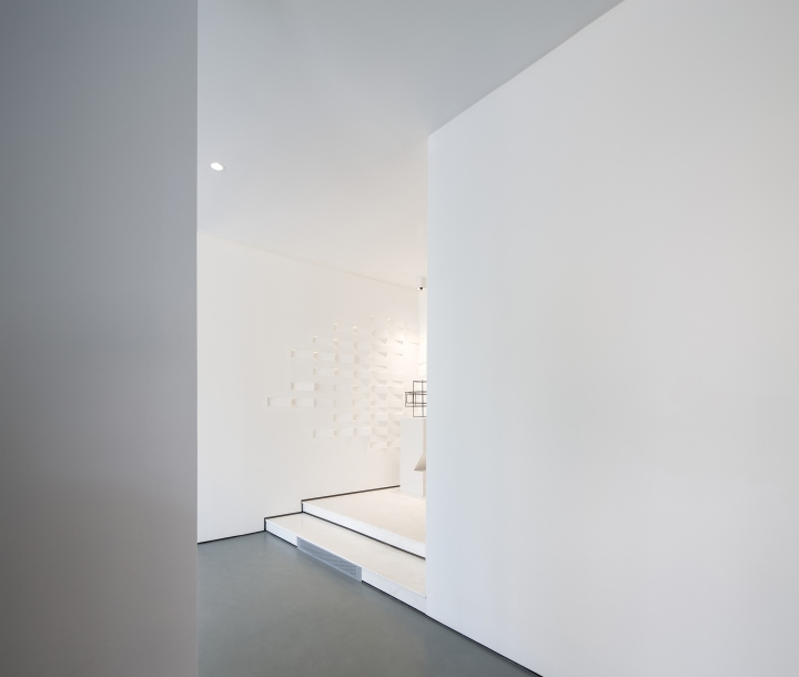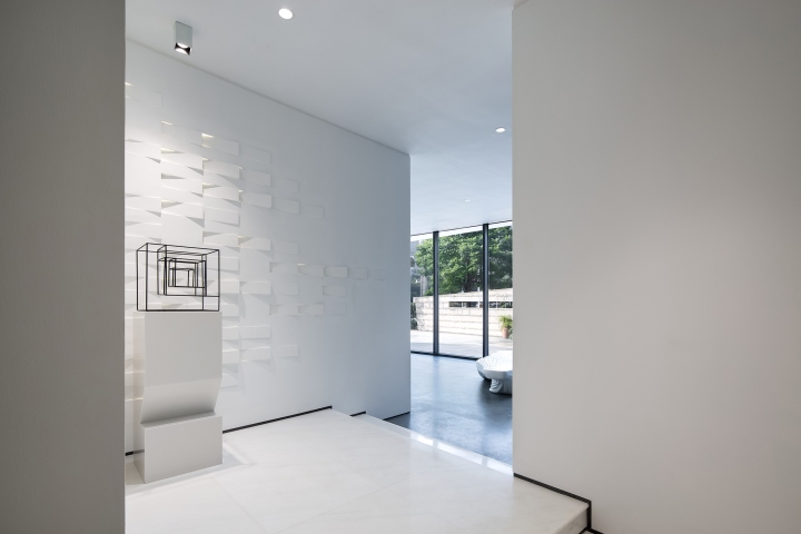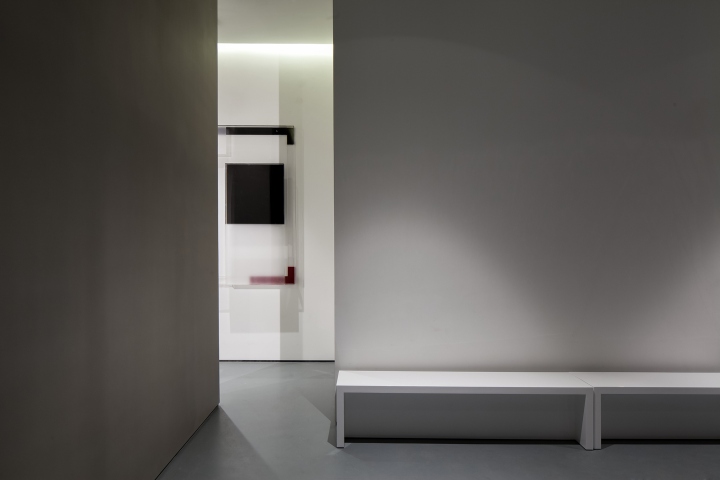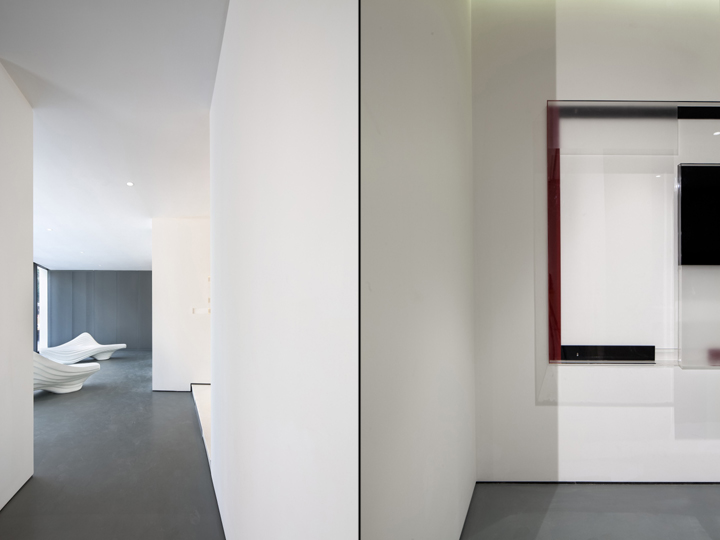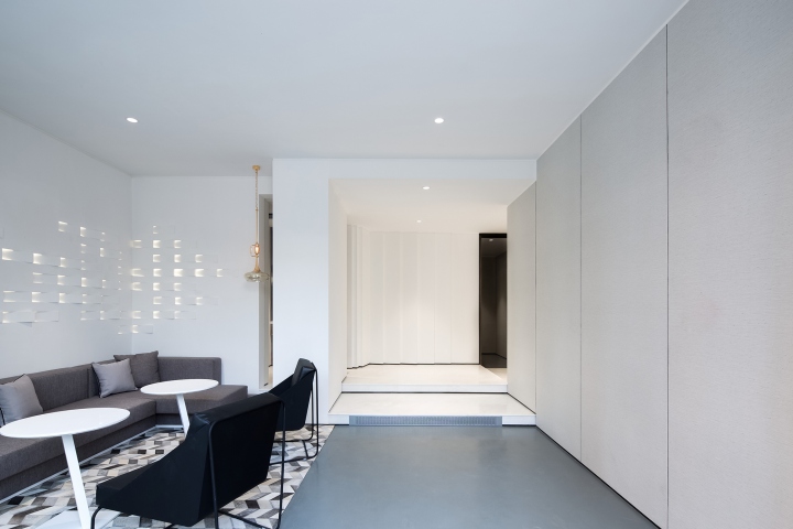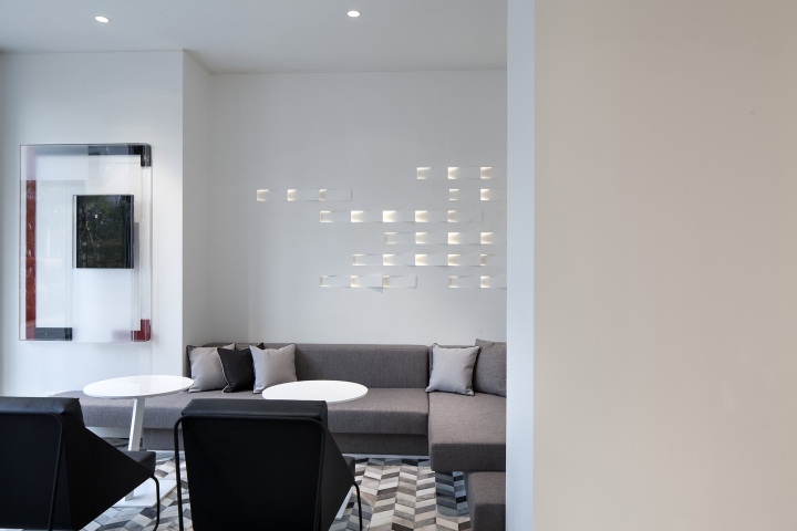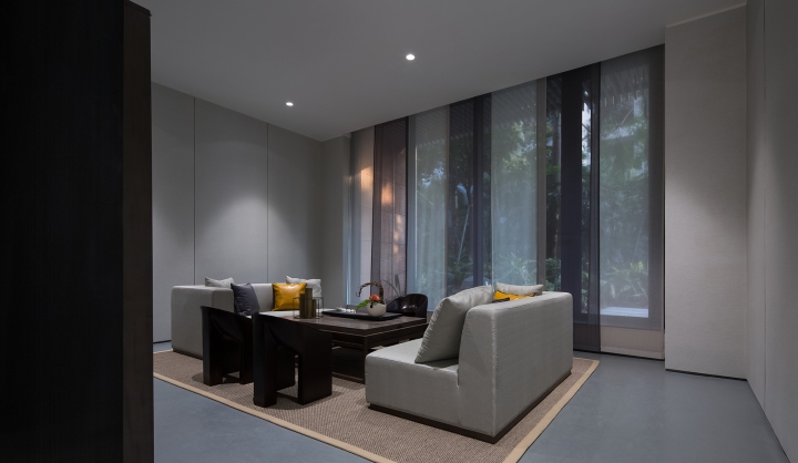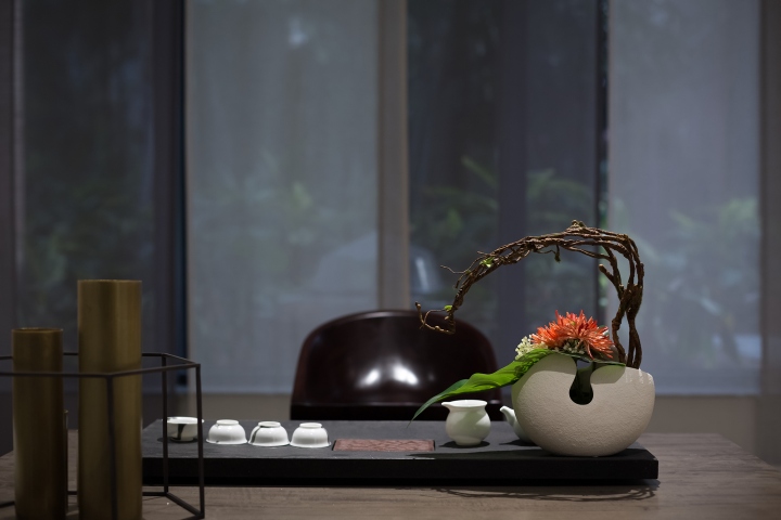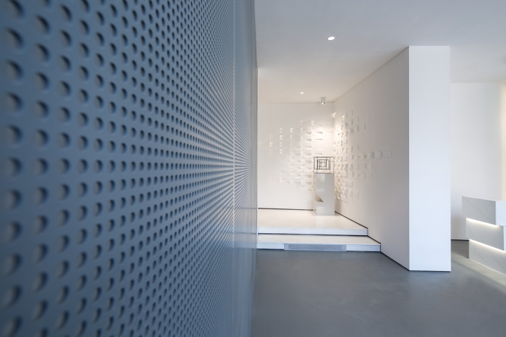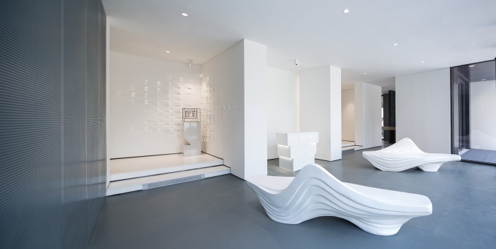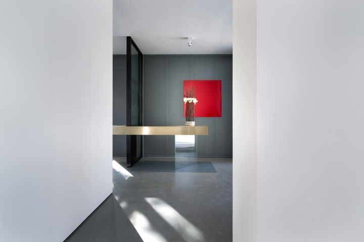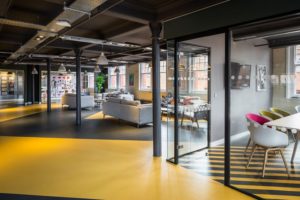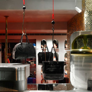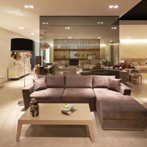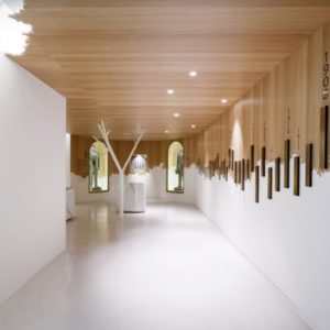
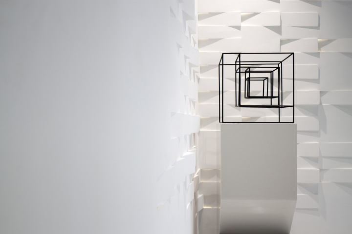

Different from traditional real estate sales gallery, this project emphasizes more on conceptual feature, aiming to present the environmental, modern and creative branding spirit to visitors. With white as the background color, the whole space conveys a pure aesthetics of minimalism. White is open to all possibilities and it embraces future to the largest extent. Touched up by the abstract artistic ambience, the space is overwhelmed with a deep and delicate aesthetic perception.

The architectural design concept is extended to the interior design, which is inspired by the visual shock brought by the in-and-out relation of architectural volumes and the artful rotation of bricks. Such design language is refined and applied into interior design, where the overlapping and staggered composition of the bricks creates a geometrical aesthetics on the wall; the subtle lighting layers gives the space a more dynamic impression; the illumination orientation even enhances the beauty of the geometrical abstraction of the space. Attracted and guided by the feature wall, one will be amazed by the pure and unified scenery and display ambience both sensually and visually.

It used to be a small residential with many solid walls, which is a challenge for renovation. And showroom and business chatting room have separate entrances, which causes an inconsistent sense of space. Starting from the creative layout, designers attempt to break through the limitation of the existing site condition by integrating the two spaces and part of façade as a whole. The glazed curtain wall, gently rotating to face the main road as if a delicate showcase, becomes the entrance of the sales gallery that attracts the view from outside. The corridor connecting reception hall, AV room and modeling display room appears long and narrow because of the structure wall, where steps are designed to make the visit journey more interesting.

The application of U-Home system in the sales gallery creates a more environmental-friendly and comfortable space experience. But it relatively limits the use of wall materials – instead of luxurious upholstery or stone wall, the perforated aluminum board wrapping not only meets functional requirement but also gives the space a sense of futuristic industrial design. The use of GRG materials at corner area is not only a nice textured detail, but also avoids eye-sore gaps and creates an elegant and minimal effect in the space.
Design company: BLVD INTERNATIONAL
Designers: Liu Honglei, Liang Xiaomei, Wang Ting, Xia Menghan
Photographer: Ouyang Yun
