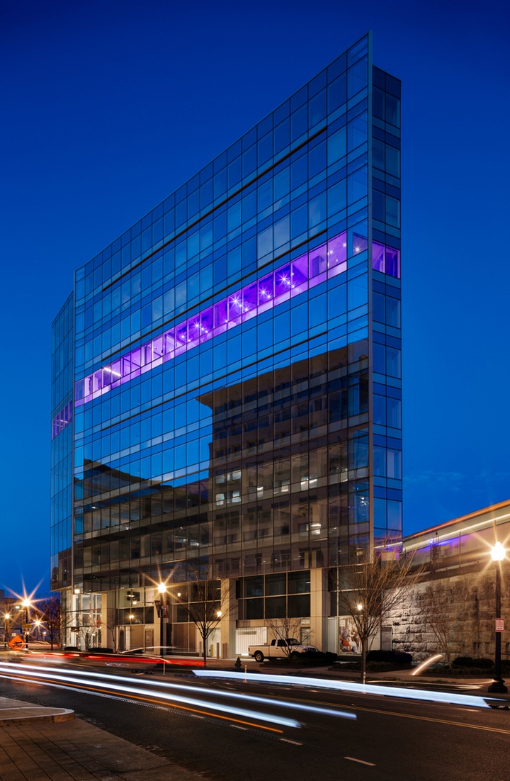

Gensler designed the offices of interior solutions provider MOI, located in Washington D.C. MOI followed the industry trend of downsizing when they moved to their new Gensler designed office in the NoMa neighborhood of Washington, DC, shrinking from a 12,000 SF office to an 8,900 SF space. To improve employee and team productivity, the space was designed to be free address/activity-based and support employees working outside of the office as needed with a robust telework policy. The space was geared towards guests as well as staff and appeals to the left and right brain by incorporating art and technology throughout.

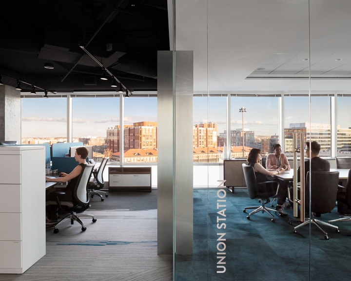
The move to NoMa not only saved nearly half a million dollars in rent a year that MOI is able to reinvest in their space and employees but it allowed the company to become a part of the community, engaging in events and working with neighbors like the NoMa Bid. A huge part of the appeal of the neighborhood was the proximity to Union Station making transportation between MOI’s four offices more efficient. The change in location has had a huge impact on employee engagement between MOI’s DC and Baltimore based employees leading to more collaboration and innovations.

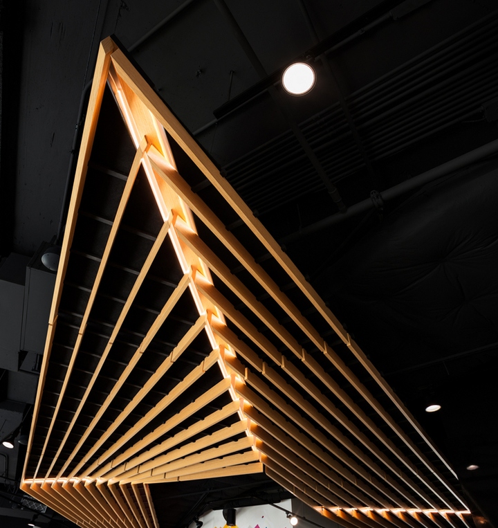
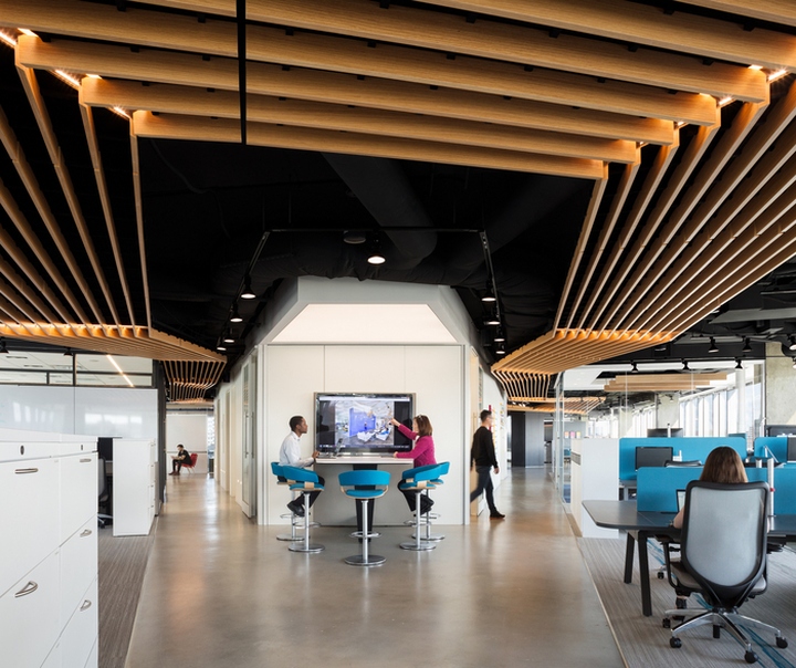
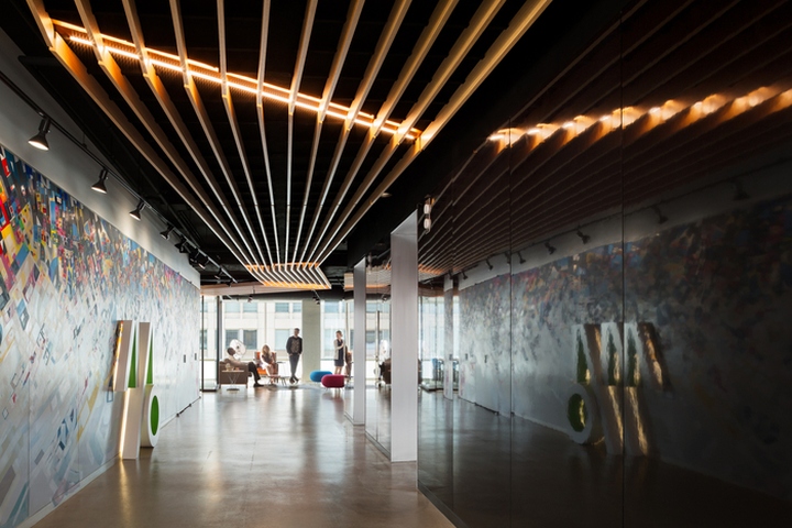
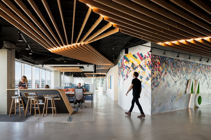
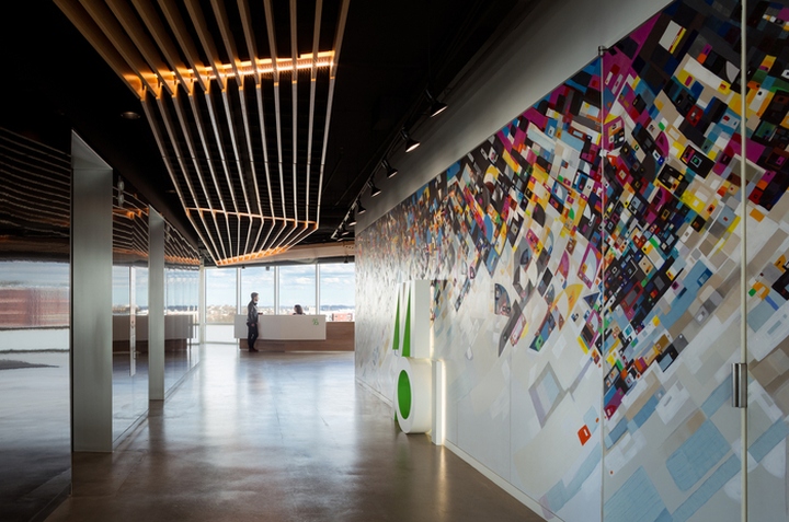
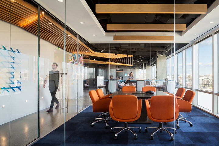
The design of the office itself incorporates the NoMa aesthetic of urban artwork and the views of the train tracks. As you step off the elevator into the MOI office you are greeted by a mural hand painted by artist, Justus Roe. The mural was inspired by a bird’s eye view of DC and sets the tone of the rest of the space. The colors of the finishes throughout the office come directly from the mural and delineate social areas from work and focus spaces. The warm colors of orange, yellow, and pink are used in collaborative areas while the blue comes in as a neutral in the work areas. The wood ceiling feature was inspired by the train tracks and works as a wayfinding device unifying the space.

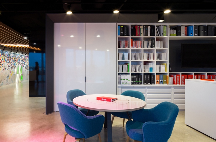
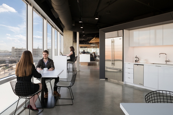
Due to the free address design collision points were purposefully incorporated to create energy between people and an opportunity for collaboration. These spaces include the café, which like a kitchen in a home, is the soul of the space. Other collision areas are the library and production centers which include technology to make the reduction in space more efficient. The physical library was replaced with a virtual platform that allows MOI to keep up with industry changes on a daily basis, request information in real time, and collaborate with clients in a more fluid manner.

There was an active push to incorporate elements that helped different learners engage including visual, audio and tactile items. The entire space has sound masking to help with focus and sound privacy. It can be adjusted through an app to become a sound system and play music for events when entertaining clients. The lighting system is also app controlled down to the single bulb and can be changed to any color on the spectrum making the office highly flexible. In each conference room you can find a tactile/fidget toy to help staff who find it hard to concentrate for long periods have a “fidget outlet”.

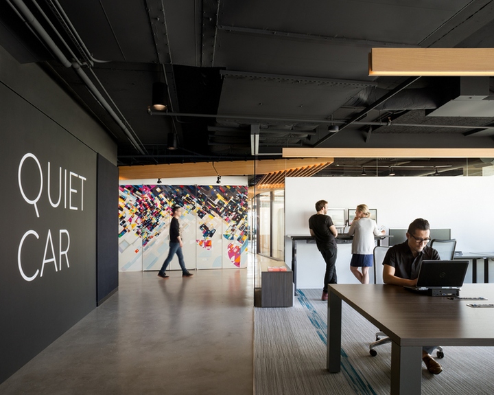
All of the desks are set up with a universal docking station, soft phones that can be programmed to any phone number, monitors and shared supplies making the ease of use seamless from one area to another. Employees are encouraged to choose their daily desk based on the task they need to complete that day. Options include a touchdown area where staff can pop in and out between offsite meetings, individual work areas or collaborative spaces. One of the most unique spaces is the Quiet Car, inspired by the train car, where employees can escape to engage in heads down work. Phones and loud conversation are not permitted in this area and the sound masking is very robust. Due to the nature of MOI’s business the space is regularly toured by clients, to facilitate this with staff an iPad tour is available and every furniture item in the office is pin-ready on a custom Pinterest board.

The MOI DC office redefines what a furniture dealership should be making it a game changer in the industry. The technology and design showcased in this space have already started to be incorporated in our clients’ spaces as well as our business partners. From height adjustable desks that put the control in the hands of the user, to embedded technology and visually stimulating artwork, the space Gensler designed for MOI leaves the viewer with a memorable impression and an increased sense of creativity.
Design: Gensler
Lead Designer: Hansoo Kim
Photography: Devon Banks


https://officesnapshots.com/2017/07/10/moi-offices-washington-dc/
