
Cross-pollination and encounter are key words in the design of the renovation of the Dental Sciences Building, part of the Faculty of Medical Sciences of the Radboud University and the Arnhem Nijmegen College. The renovated building combines theory and practice in education, research and patient care. With a façade, a new central atrium and new installations, the building is making a sustainability transition aimed at energy saving, an increase in comfort, flexible use and a contemporary look.

The right separation and connections between users, between practice spaces and teach and instruction rooms, changing and flexible use – including the longer term – and the choice of quality materials prepare the building for the future. After earlier plans to construct a new building, the principal opted for the renovation of the prominent Dental Sciences Building, beloved by the university community. This offered a great opportunity to showcase the potential of the oft-maligned concrete architecture from that period.

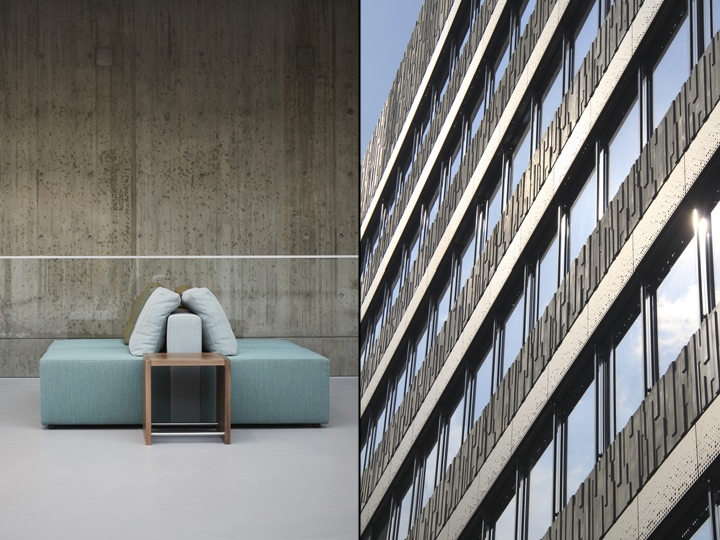
Like a Phoenix, the building was resurrected after 47 years, basking in its new-found glory. It is one of the few buildings designed by the architect Dijkema that will be retained on campus. People, who have last seen the building years ago, have to look twice before they notice it has changed: the new façade of the high-rise is an interpretation of the old façade, the light elements in the old are now heavy and vice versa. Furthermore, a closer inspection reveals that the metal façade sections have a special transition from light to dark thanks to the glass.

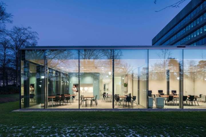
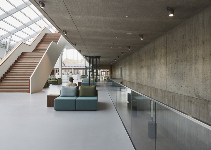
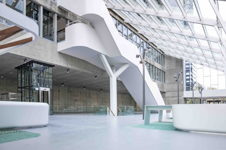
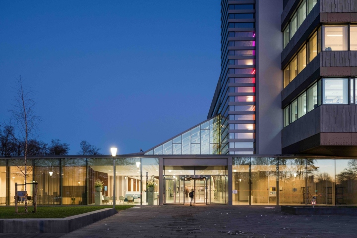
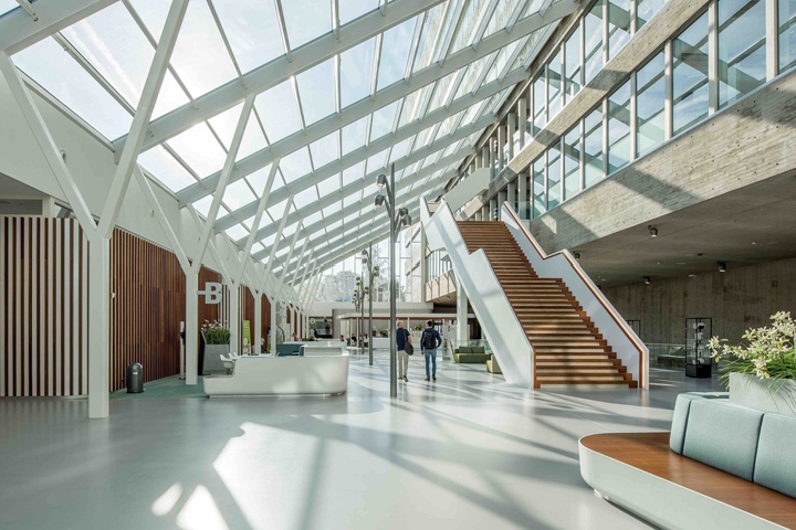
But especially the plinth course has changed: as it was once closed and felt hard is now transparent and inviting. This has improved the connection to and the significance for the campus. Building and surroundings mark the entrance to the campus. In its original situation, the low-rise building was very confusing. The downstairs clinic and the teach practices in the high-rise building were difficult to find. A major intervention in the renovation was the introduction of a clear and inviting ‘Kliniekenplein’ (Clinic Square) in the form of a central atrium, which furthermore introduces light into the heart of the building.

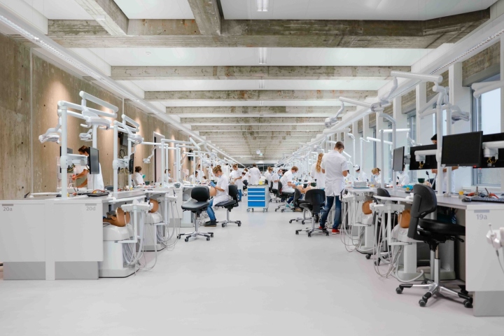
Next to the atrium lies a series of beautiful lit treatment rooms which become a suitable place for children and people afraid of the dentist through its smart routing and soft materialisation. The focus was using existing qualities and, if possible, designing by following the original building structure. The powerful concrete construction of the high-rise building is now visible. The heavy concrete floor beams are visible and increase the spatial feeling.Working on the special concrete construction in the high-rise building, the weight balance literally guided the design process.

Removing the concrete weight allowed the placement of new façades with triple glass, light-weight concrete and anodised aluminium, with sun protection. The tectonic nature of the building has always been the starting point. Beautifully intricate stairwells, tiled floors and wall coverings have been restored to their former splendour. The craftsmanship in the formworkedconcrete core walls, cleaned of paint, characterize and provide guidance. The dental precision of the users contrasts nicely with the robustness of the building. The pallet of dark and light, fresh, smooth materials and colours completes the born-again nature of the sturdy building.
Design: Inbo
Photography: Jan de Vries Fotograaf, Eric Scholten, Alexander van Berge, Eric van ‘t Hullenaar
