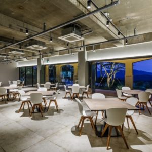


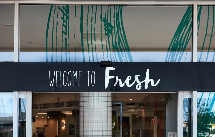
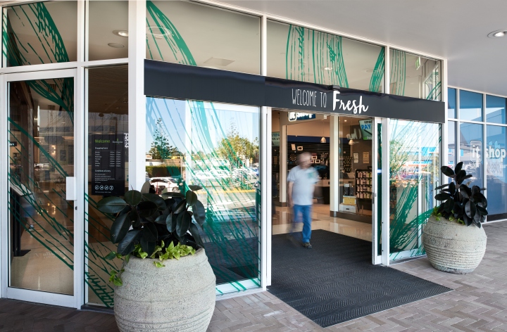
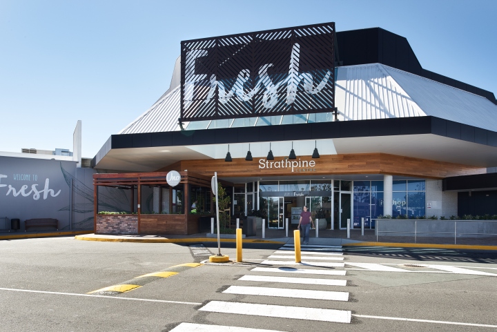
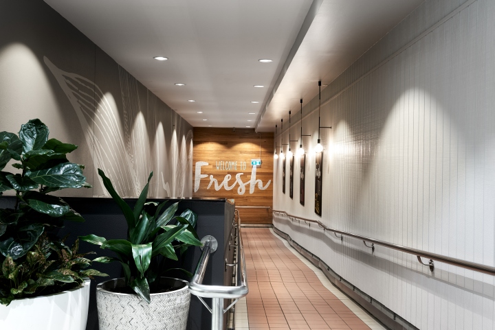
Strathpine is at the heart of so many memorable moments. In collaboration with Michelle Taylor Retail Design Concepts, Dovetail Design Group have taken traditional concepts of fresh food and revived these into an artistic presentation of environmental graphics and signage design for the local shopping precinct. Distinct, bold graphic statements are reaffirmed by a variety of fresh food and native plant motifs.
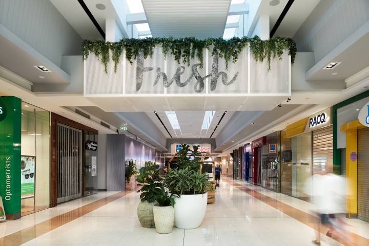
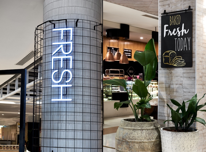
A number of combinations are expressed through pairing three-dimensional applications overlaid with two-dimensional elements, from perforated metal mesh with stencilled lettering to fabricated black masonite chalkboard with applied digitally printed graphics. Other components have been incorporated with special lighting effects to provide illumination that is layered, airbrushed and theatrical.
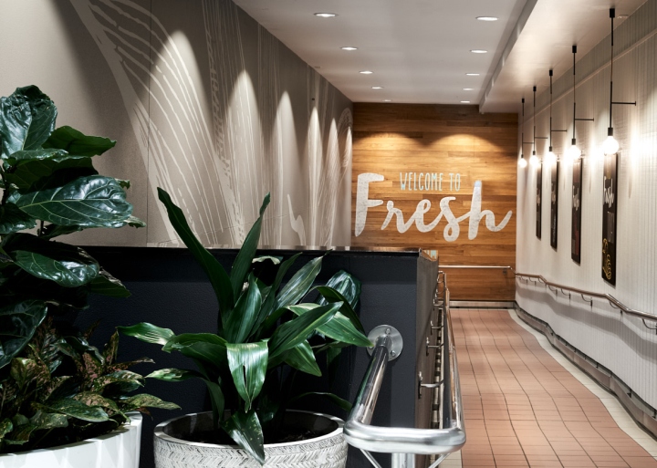
Fun and whimsical typography is distressed and imperfectly rolled to generate a consistent language that is unpretentious and welcoming, whilst the scale of artwork has been manipulated to create drama and provide a unifying voice throughout the centre, making small spaces less confining and large spaces more embracing.
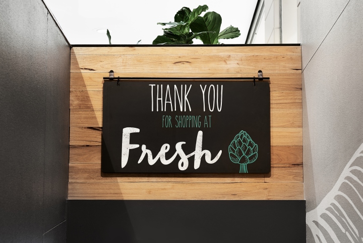
The final outcome is a cool and understated design that establishes a genuine sense of place by highlighting beauty in the non-perfect, all working to generate a unique and wholesome shopping experience that connects people with quality produce.
Design: Dovetail Design Group
Photography: Ryan Linnegar Photography



Add to collection


