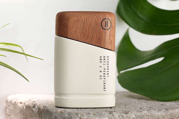

Overview
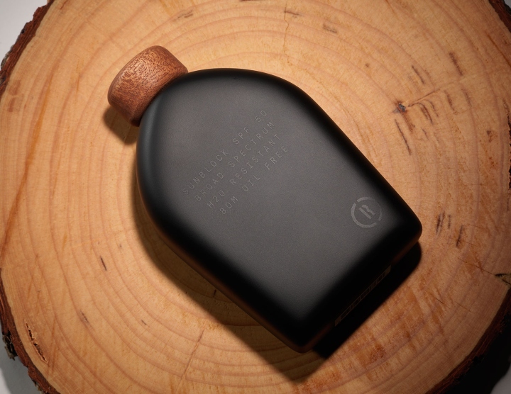
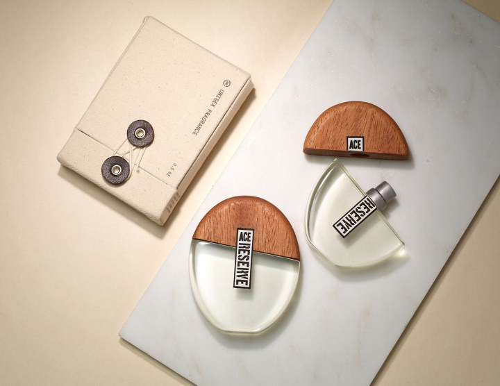
I was assigned by Art Center College of Design to create and design forms, packaging, and branding for a sub brand of Ace Hotel within the category of personal care. Ace Hotel is a chain of boutique hotels headquartered in Portland, Oregon. Known for remodeling old buildings, each Ace location can vary look and feel, inspired by the city that each hotel is in.

Concept
Ace Hotel does a good job taking care of its guests and has a wide variety of different products from clothing to stationery. Fundamental personal care item are provided such as shampoo, conditioner, and body wash, but there is room to provide other essential personal care items that would be needed during their stay.

Ace Reserve
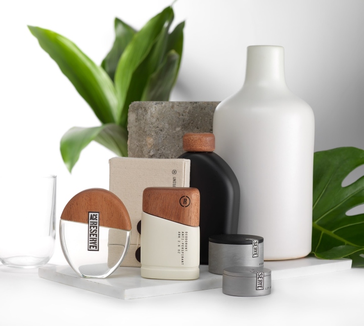
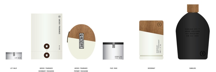
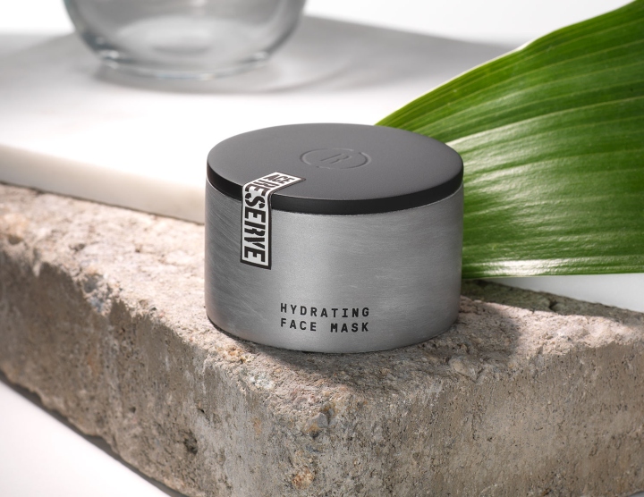
Ace Reserve supplies guests with unisex personal care items for every moment of their stay from preparing, exploring, to relaxing. The sub brand will be able to meet the needs for an extended personal care line that furthers the care this detail-oriented hotel puts into bringing guests the comfort of home during their stay.

Inspiration
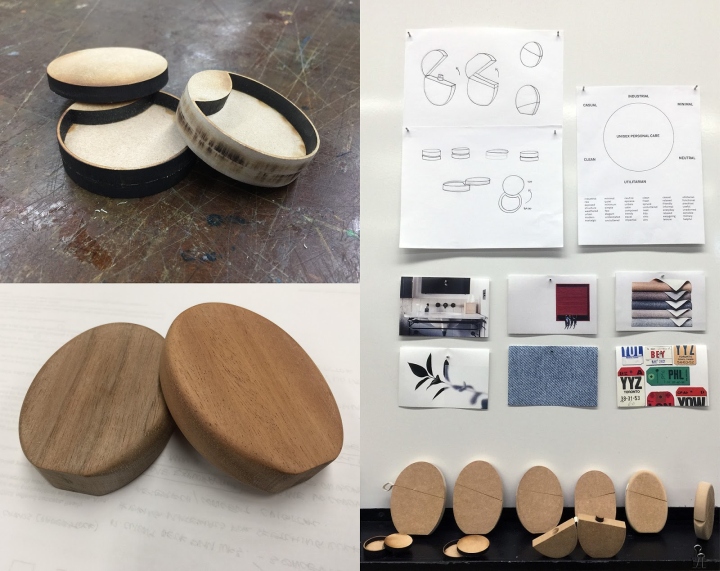
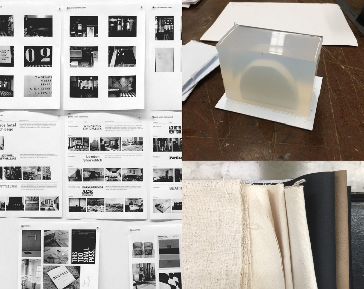
Each location of Ace Hotel has a different feel and look, but what the hotels have in common are an industrial look and feel since many of the hotels used to be former factories. To extend the feeling into Ace Reserve, I wanted to look into World War 2 to extend the aesthetic into the form language and type choice of the line.

Logo
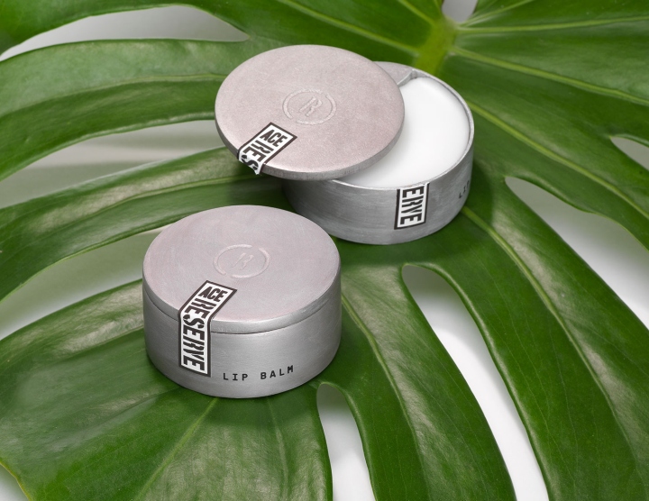
The sub brand will provide uniformity of a personal care line that will be easily recognizable throughout different locations. Looking at the primary logo, I combined the hotel logo along with the stencil typefaces used in signage to create the logo for Ace Reserve. This personal care line interchanges a primary logo of the full name, Ace Reserve, and a secondary logo, which serves as a logo mark.
Design: Jodi Chan


http://www.packagingoftheworld.com/2017/11/ace-reserve.html
